
Won-deals timeline with enterprise polish for account executives.
Create a free account to customize and publish this design.
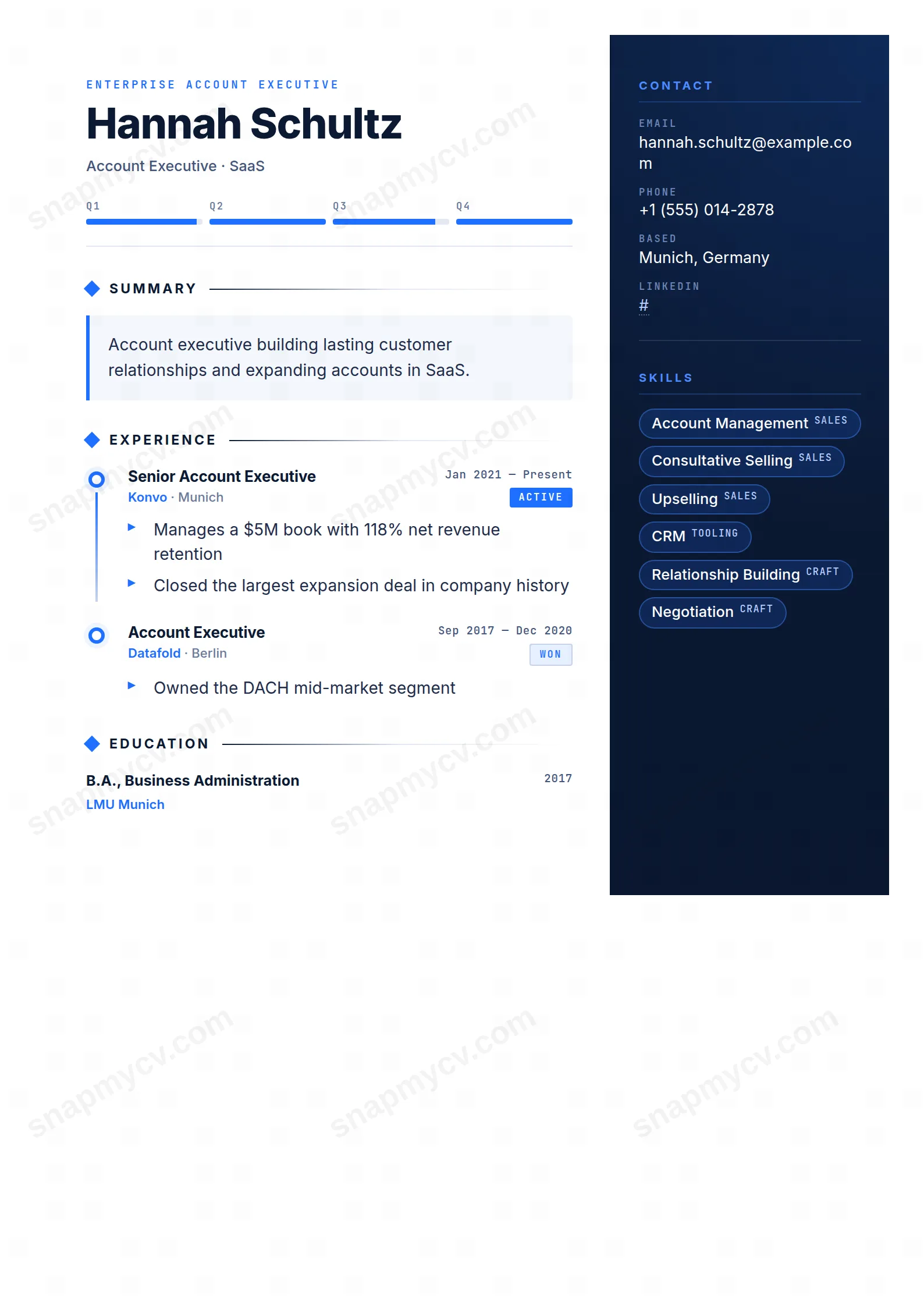
A won-deals timeline runs through the page with enterprise-grade polish around it. Quota attainment and logo wins get structural emphasis, not just adjectives.
Best for: account executives and enterprise sales. Free to fill in, restyle, download as a PDF, or publish at your own SnapMyCV link.
Applicant tracking systems: Light styling. Mostly parseable but uses sidebars, columns or visual elements that may confuse stricter ATS.A template's styling never changes the advice that matters most — lead with achievements, quantify your impact, and tailor the content to each role.
New to writing a CV? Read our step-by-step CV guide and ATS tips, then come back and make this design your own.
The layout runs on a two-part split: a white main column carrying the narrative and a deep navy sidebar (#0b1a33) pinned to the right for reference data. A single bright-blue accent (#1f6fff) does all the signalling, so nothing competes for attention. It marks the timeline dots, the chevron bullets, the skill-pill edges, and the left border of the #f4f7fd summary panel. Keeping one accent across a dark and a light field is the deliberate move here: the eye tracks blue and reads the document as one instrument rather than two stitched-together halves.
Typography reinforces the sales-metrics framing. A JetBrains Mono eyebrow sits above a 36px Inter name, and that monospaced-versus-humanist pairing is doing real work. Mono type reads as data, as terminal output and dashboards, so the eyebrow, the Q1 to Q4 quota band, the 'Won' and 'Active' pills, and the date stamps all feel like system-generated figures. Inter handles the prose in the main column at a comfortable reading weight. The result frames you as a number before a recruiter reaches a single sentence, which is exactly the first impression a quota-carrier wants to engineer.
This template is built for people whose case is revenue. Enterprise and SaaS account executives, business development reps, sales managers, and customer success leads all fit, because the vertical won-deals timeline and the quota band exist to frame attainment, ARR, deal size, and named logos. If your strongest evidence is a run of hit or beaten numbers, the design flatters it and gives every figure a place to sit.
Be honest about who it fights. Anyone whose value lives in long-form explanation or in visual work is poorly served, because the chevron bullet list rewards short metric-led lines and punishes paragraphs. Designers, researchers, writers, and academics who need space for narrative, publications, or a body of work will find the navy sidebar and the 'Won' pills reading as sales theatre that does not match their story. Career-changers with thin quota history are also exposed here: an empty-looking timeline draws the eye straight to the gap the layout was designed to celebrate.
Feed the two zones different content. The white column is for motion: each role sits on a ringed blue dot along the spine, so lead every achievement bullet with the number (percent of quota, ARR closed, average deal size, win rate) and keep the line short enough that the chevron list stays scannable at a glance. The #f4f7fd summary panel wants three or four sentences of positioning, not a life story, and the headline above it should name your patch or segment rather than a generic title. The navy sidebar is for fixed reference: contact rows, rounded skill pills covering your stack and sales methodology, certifications, and languages, all in the crisp white and pale blue the dark field is tuned for.
The common mistakes are predictable. People overload the sidebar until the skill pills wrap into an unreadable block, so cap it at the items a recruiter actually screens for. Others write prose bullets that spill past one line and break the tidy chevron rhythm. And many forget the timeline reads top-down as a deal history, so put your most recent, highest-value role first and let the automatic 'Won' and 'Active' pills mark status. Aim for four to six roles and five or six pills; beyond that the design loses the clean pipeline-dashboard feel that is its whole point.
It stays readable but loses its punch. The #0b1a33 sidebar drops to a near-black block and the white and pale-blue text keeps enough contrast to scan, but the #1f6fff accent that unifies the timeline dots, chevrons, and pills flattens into mid-grey, so the visual hierarchy weakens. The layout and the monospaced pills still parse in black and white; you just lose the single-accent guidance that makes the colour version feel like one instrument.
Sometimes, so test before you trust it. The text is real selectable text rather than images, and the headings are conventional, so most modern parsers cope. But the navy sidebar is a genuine second column, and some applicant tracking systems flatten multi-column pages and read the sidebar out of sequence. Copy the PDF into a blank document first and confirm your contacts, skills, and roles still appear in a sensible order before you submit.


