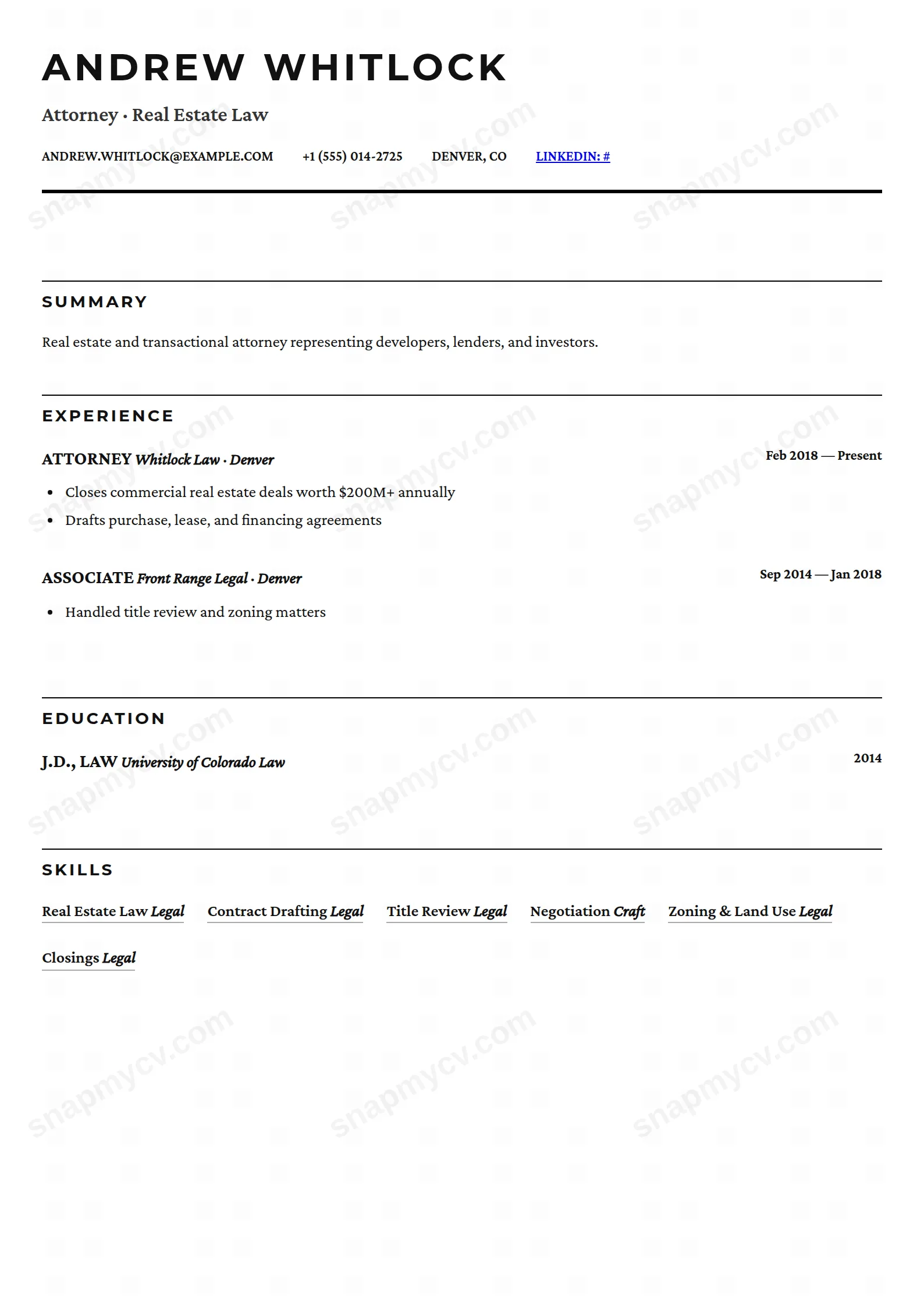
A clean, typography-focused template for a professional look.
Create a free account to customize and publish this design.

Typography-focused and quietly disciplined, with nothing on the page that doesn't carry information. A first template that's hard to outgrow.
Best for: first CVs and anyone who values restraint. Free to fill in, restyle, download as a PDF, or publish at your own SnapMyCV link.
Applicant tracking systems: ATS-friendly. Single-column, standard section headers, parses cleanly in most applicant tracking systems.A template's styling never changes the advice that matters most — lead with achievements, quantify your impact, and tailor the content to each role.
New to writing a CV? Read our step-by-step CV guide and ATS tips, then come back and make this design your own.
Minimalist Starter commits fully to one idea: remove everything that is not information. The entire CV is set in Inter, a neutral humanist sans, in near-black #111827 on white, so nothing on the page competes with the words. Your name lands at 30px in a heavy 800 weight and pulls the eye first, while a quiet grey block of contact details sits to its right to balance the header. A single 2px black rule closes the header and is the only graphic element the layout permits. There is no sidebar, no accent colour and no panel shading, just a 780px column that reads straight down.
The restraint is engineered, not lazy. Section titles are deliberately shrunk to 11px uppercase labels in soft grey #9ca3af with wide letter-spacing and a hairline underline, so they file the page into zones without ever raising their voice above your actual content. Roles print in bold with company and dates dropped back into muted grey, which builds a clear hierarchy from job title down to detail. Skills and hobbies appear as pale grey #f3f4f6 pill badges, the one soft flourish in an otherwise flat design. The payoff is a page that looks composed even when you are still light on experience, because the whitespace and typography do the organising.
This template is built for students, recent graduates and anyone assembling one of their first CVs, where looking organised and credible matters more than looking designed. It carries no photo, no rating bars and no colour, so it never feels padded when your history is internships, part-time roles, coursework and side projects. It also opens up a wide set of sections, including projects, certifications, languages, volunteering and awards, so you can foreground whatever you genuinely have rather than leaning on job titles you do not yet own.
Be honest about where it is the wrong fit. If you are a designer, illustrator or anyone whose portfolio is the point, this flat single column gives you nowhere to show visual range, and a photo-led or two-column layout will serve you better. Senior candidates with fifteen years of dense history will also strain the open spacing, because the design wants a tidy single page and rewards editing, not volume. Choose it when clarity is your strongest asset.
Because everything stacks in one column, order is your only lever, so lead with the section that makes your strongest case. A graduate should usually run education and projects high, then internships, then skills, while someone with real work history can push experience to the top. Write verb-led, specific bullet points and let the highlight lists do the heavy lifting, since the plain typography rewards well-structured writing and exposes filler. Reserve the pale grey pill badges for concrete tools and languages, not soft buzzwords like team player, because each badge reads as a discrete claim.
The common mistakes with this style are all about crowding. People fight the generous spacing by cramming in a wall of entries, which kills the calm the design is trading on, so trim to a single page and keep only entries that earn their place. Keep your headline under the name short and accurate, hold bullet points to one or two lines each, and let a handful of strong items breathe rather than stacking a dozen weak ones. With no colour or sidebar to hide behind, the writing is fully exposed, which is exactly why honest, edited content lands so well here.
Extremely well, because it is effectively greyscale already. The palette is only near-black #111827 ink, muted greys for dates and section labels, and pale #f3f4f6 pill badges on white, so a mono printer or a photocopier reproduces it almost exactly as it appears on screen. Nothing depends on colour to carry meaning, so no information is lost.
Yes. The pill badges are styled spans of ordinary text, not images or graphics, so a parser reads them as plain words in a single-column flow with conventional section headings above them. That said, they sit inline as separate chips, so keep each badge to a real tool or language rather than a long phrase, which keeps the extracted list clean and sensible.