
Formal and structured template for legal professionals.
Create a free account to customize and publish this design.
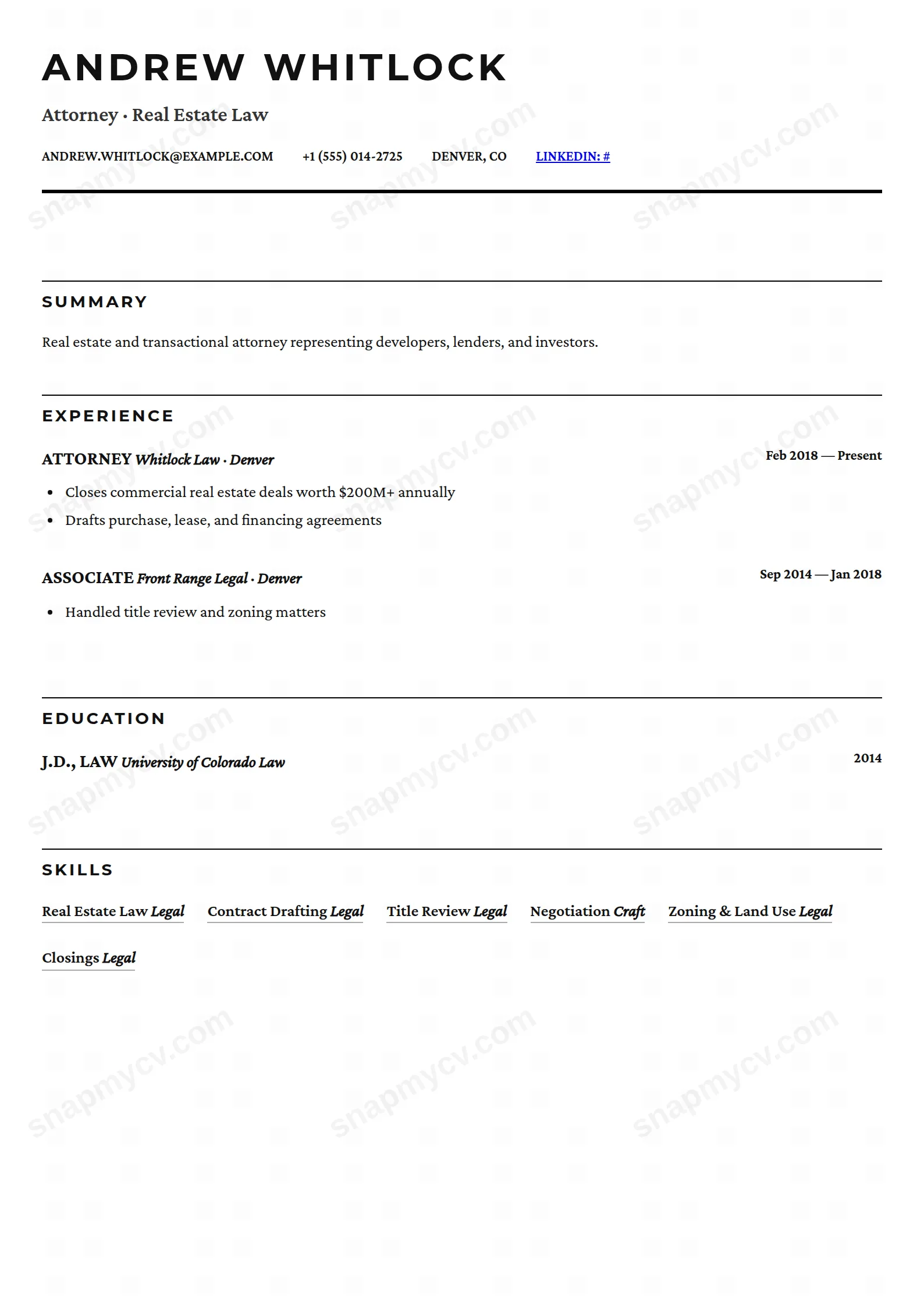
Formal structure with conservative typography in the register legal recruiting expects. Matters and admissions are organized for partner-speed review.
Best for: lawyers and legal professionals. Free to fill in, restyle, download as a PDF, or publish at your own SnapMyCV link.
Applicant tracking systems: ATS-friendly. Single-column, standard section headers, parses cleanly in most applicant tracking systems.A template's styling never changes the advice that matters most — lead with achievements, quantify your impact, and tailor the content to each role.
New to writing a CV? Read our step-by-step CV guide and ATS tips, then come back and make this design your own.
Legal is a one-column CV that reads like a well-set brief. The body runs in Crimson Pro, a serif chosen to carry long justified passages without fatigue, while every heading switches to Montserrat set in uppercase with wide letter-spacing. The palette is strictly monochrome: near-black #111 body text, a slightly softer #333 for the headline beneath your name, and one thick 3px rule under the header that anchors the whole page. There is no colour, no sidebar and no ornament, because the design trusts typography and structure to carry the authority instead.
Hierarchy is drawn with rules rather than tint. Each section opens with a thin black line across the top of its Montserrat title, and every entry sets the role or qualification in uppercase bold against an italic employer or institution, with dates pushed hard to the right margin. Summary and description text is justified to clean block edges, so a litigation history or a list of matters handled sits on the page with the composed, printed-document look of court paperwork. The whitespace is disciplined but generous, letting the eye track from one squared-off block to the next.
This template is built for the legal profession in the strict sense: solicitors, barristers, associates and trainees, in-house counsel, paralegals, legal executives and judicial clerks. The formality is a deliberate signal, so it also reads well for adjacent conservative fields such as compliance, regulatory affairs, tax and academia, anywhere a measured, document-like CV earns more trust than a designed one. If greyscale gravitas is the message, the black-on-white restraint does the work.
It is the wrong choice if you want personality on the page. Designers, marketers, product and startup people who need colour, an avatar or a visual portfolio will find the monochrome serif austere and dated for their field. It also suits people with real substance to justify: the justified blocks and uppercase role lines look thin if you only have a line or two of experience, so early-career applicants outside law may feel the layout exposing empty space rather than flattering it.
Because the layout is text-first and fully justified, it rewards precise writing. Keep summary sentences tight and of even length so the justified block edges do not open up rivers of white space, and lead each role with the strongest matter first since the uppercase bold title is the anchor the reader lands on. Use the bullet highlights under every role for jurisdictions, deal values, reported cases or matters handled rather than vague duties, and let the right-aligned dates carry the chronology so you never repeat them in the body. The skills section renders as a flowing grid of underlined badges and the languages section as simple name-and-level pairs, both ideal for practice areas, bar admissions and working languages without clutter.
The common mistake is treating it like a modern resume and stuffing it with short fragmented lines, which fights the justified serif and leaves ragged gaps. Aim instead for a three or four line summary, two to four substantive bullets per role, and full employer names in the italic slot so the contrast against the uppercase title reads clearly. One page suits a trainee or paralegal, while a senior practitioner can run to two, and the single column means content simply flows on cleanly without a sidebar to balance.
Yes, better than most. The design is already pure black on white with no colour to lose, so a greyscale or black-and-white print looks identical to the screen version. The 3px header rule and the thin lines above each Montserrat title stay crisp, and the Crimson Pro body keeps its contrast, which is exactly why the document reads well when a chambers or firm prints your application.
It starts from a strong position: a true single column with conventional headings and no sidebar or tables for a parser to stumble over, so name, roles, dates and bullets come through in reading order. The one thing to watch is that the body is a serif and the role titles are uppercase bold, so before applying, paste the rendered PDF into a plain-text editor and confirm nothing is dropped or reordered.


