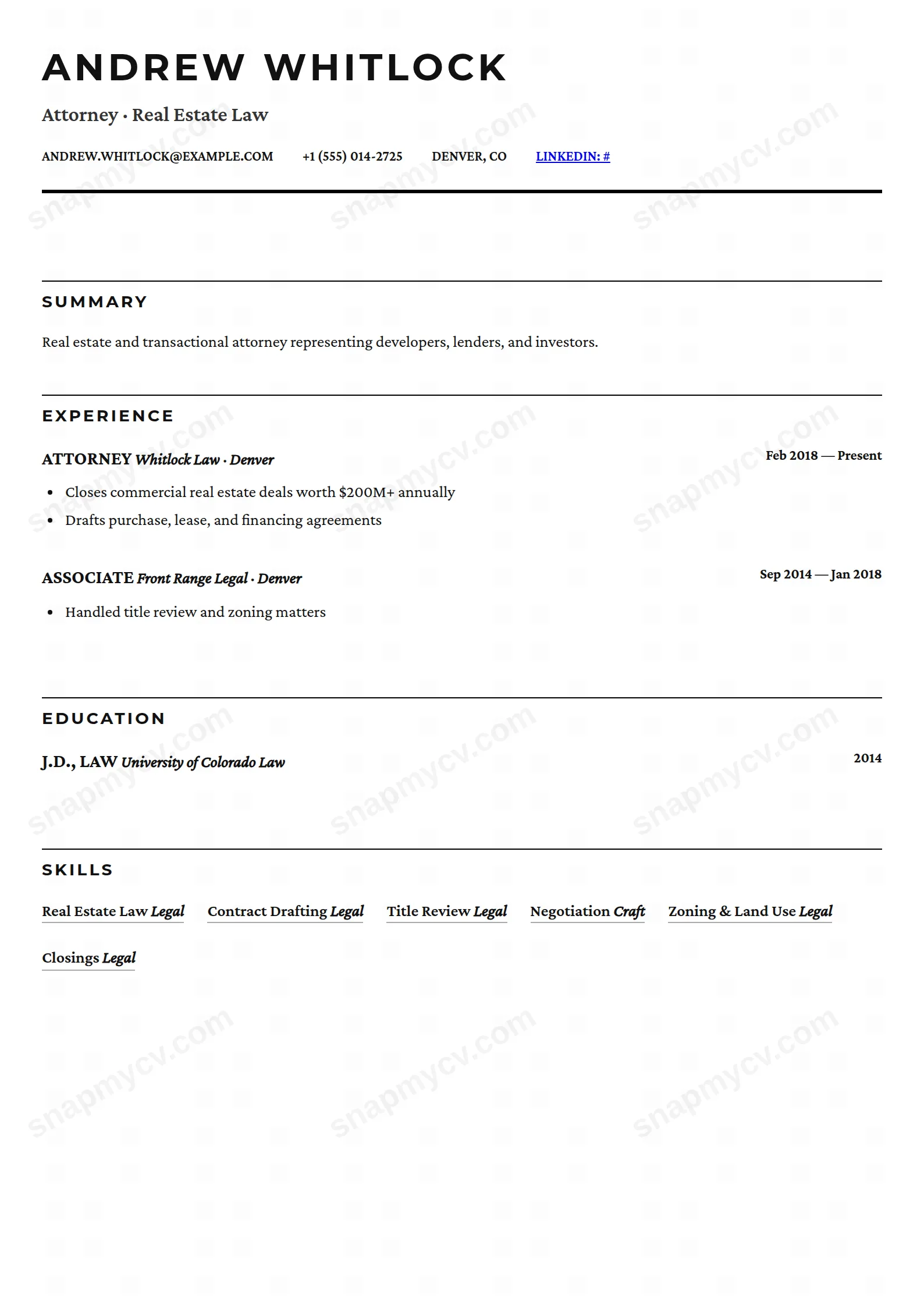
Light and elegant serif typography with generous whitespace.
Create a free account to customize and publish this design.

Light serif typography floated in generous whitespace. Elegant, calm, and unusually pleasant to read — which recruiters notice more than they admit.
Best for: professionals who want understated elegance. Free to fill in, restyle, download as a PDF, or publish at your own SnapMyCV link.
Applicant tracking systems: ATS-friendly. Single-column, standard section headers, parses cleanly in most applicant tracking systems.A template's styling never changes the advice that matters most — lead with achievements, quantify your impact, and tailor the content to each role.
New to writing a CV? Read our step-by-step CV guide and ATS tips, then come back and make this design your own.
Airy Serif does its work with type and space, not with colour blocks or a sidebar. The name anchors the page centred in Playfair Display at 42px, heavy enough to read as a masthead, with an italic headline in soft grey beneath it and a row of contact details fenced above and below by a delicate double rule. From there a single column, capped at 800px, runs straight down the page so the reader never breaks stride looking for a second track of information.
The palette is intentionally muted so hierarchy comes from weight and placement rather than hue. Near-black ink (#111827) carries names and section titles, two mid-greys (#4b5563 and #6b7280) step companies and dates back a register, and the palest hairline (#e5e7eb) trails off each heading instead of a hard bar. Body copy sits in Lora at a 1.7 line-height for genuine breathing room, section titles return to Playfair so the two serifs answer each other, the summary is justified like a printed paragraph, and dates drop into a small wide-tracked sans-serif. It reads like a page from a book, not a filled-in form.
Airy Serif flatters people whose craft is language and judgement: writers, editors, academics, lawyers, policy and consulting professionals, and anyone in publishing or the arts. The centred Playfair masthead and italic headline read as composure and taste, and the justified Lora summary gives a considered argument room to land before a single role is scanned. If your value is articulated in sentences, this layout is on your side.
It is the wrong choice for a CV that has to carry volume. Engineers, salespeople with long metric-heavy histories, and anyone juggling a dozen tools or certifications will fight the generous 1.7 line-height and the 800px single column, both of which spend vertical space freely. There is no sidebar to park skills, no two-column grid to compress a long career, and no accent colour to flag a standout number. If you need density or a punchy modern signal, pick a tighter layout and leave this one to the text-forward roles it was drawn for.
Write to the header first. The italic grey headline is built for one confident positioning line, so resist stacking two clauses into it, and keep the contact row short enough that it stays on one line inside the double rule. Let the justified summary do the heavy lifting in two or three tight sentences, because justification exposes ragged, padded writing badly. In experience entries, open each with a strong verb and keep dates terse, since the small wide-tracked sans-serif sizes them to sit quietly beside the Playfair role titles rather than compete with them.
The skills render as quiet underlined text, not bars or filled pills, so a long keyword dump looks like clutter here; list a handful of real, specific competencies and stop. The most common mistake with this style is treating its whitespace as free space and letting a two-page CV creep toward three, at which point the airiness that names the template collapses. Trim ruthlessly, favour fewer roles described well over many described thinly, and let the hairline-ruled headings and roomy leading breathe onto the printed page.
Yes, because the design already relies on greys rather than colour, so a black-and-white print loses almost nothing. The contrast between near-black ink (#111827) headings and the mid-grey (#4b5563, #6b7280) company and date text still separates cleanly, and the pale #e5e7eb hairlines stay as faint dividers. The one thing to check is that those hairlines do not vanish entirely on a low-toner office printer.
Less than a compact multi-column template, by design. The 800px single column, 1.7 line-height, and justified summary all spend space deliberately, so this comfortably suits an early-to-mid career or a senior profile that has been edited down to its strongest roles. If you have fifteen-plus years of dense, tool-heavy history to fit, the airiness that defines the layout will be the first thing you lose.