
Full-bleed coral header with bold typographic hierarchy for art directors.
Create a free account to customize and publish this design.
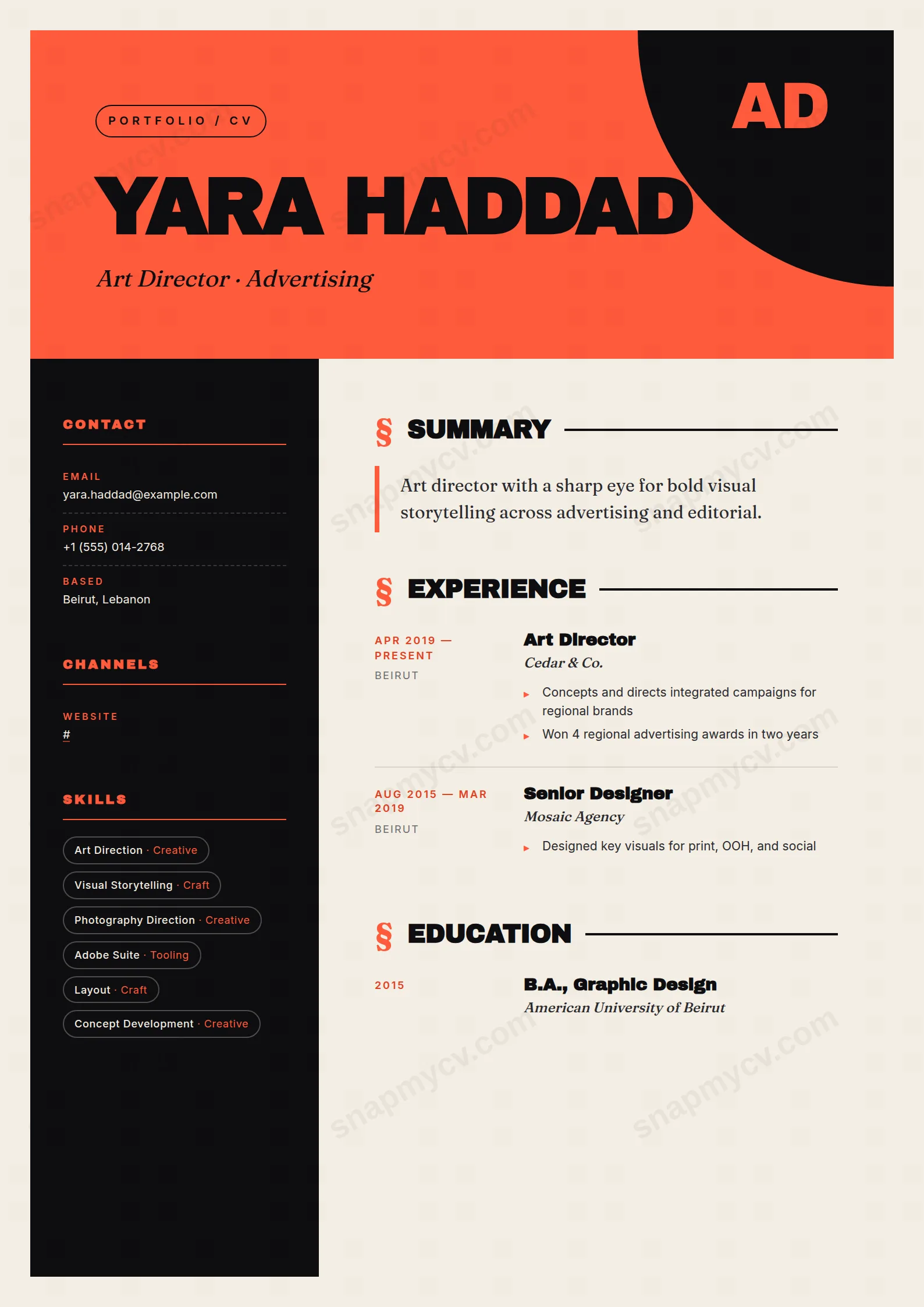
A full-bleed coral header and decisive typographic hierarchy show art direction instead of describing it. The layout itself is the first portfolio piece a reviewer sees.
Best for: art directors and senior visual designers. Free to fill in, restyle, download as a PDF, or publish at your own SnapMyCV link.
Applicant tracking systems: Light styling. Mostly parseable but uses sidebars, columns or visual elements that may confuse stricter ATS.A template's styling never changes the advice that matters most — lead with achievements, quantify your impact, and tailor the content to each role.
New to writing a CV? Read our step-by-step CV guide and ATS tips, then come back and make this design your own.
The whole layout is engineered to open like a magazine rather than a document. A full-bleed coral (#ff5b3c) banner carries an oversized 'AD' monogram in Archivo Black and an off-black quarter-circle cut into the corner, so the first thing a reader meets is a composed graphic mark, not a name and a phone number. Your name sits in that same heavy Archivo Black, uppercase and tightly kerned, while the headline drops into Fraunces italic. That collision of a blunt grotesque against a high-contrast serif is the masthead trick that editorial covers use, and it is the reason the header labels itself 'Portfolio / CV' with a straight face.
Underneath, the bone-white (#f4eee4) page does the quiet work. It keeps the coral and the deep ink (#0e0e10) sidebar from feeling clinical, warming the contrast into something closer to printed paper than a screen. Three typefaces are held to strict roles: Archivo Black for structural weight, Fraunces italic for voice, and a plain body face for reading. Each main section is flagged with a coral section mark and a solid rule, so the hierarchy is announced typographically instead of with boxes or shading.
This is a portfolio-CV for people whose taste is part of the pitch: art and creative directors, brand and editorial leads, designers, photographers and studio founders. The design assumes it is the cover sheet to a body of work, and it earns its keep when the reader already expects craft. If your target is a bank, a law firm or a heavily automated corporate ATS pipeline, the coral banner and dark sidebar work against you, and a single-column, restrained template is the safer choice.
It also rewards people who have real outcomes to show. The Fraunces italic headline and the pulled-out summary put your positioning centre stage, so a candidate with a vague or generic personal statement will look exposed here rather than flattered. Senior creatives with a clear point of view get the most from it.
Respect the two-column split. The deep ink sidebar is for contact details, channels, skills as outlined pill tags, languages and certifications, so keep each skill to a single crisp term, because multi-word tags break the pill shapes and crowd the dark column fast. The bone main column is where narrative lives: a short voiced headline, the summary behind its coral left border, then experience running as a date-and-place column beside Archivo Black role titles, Fraunces italic employers and coral bullets.
The common mistake is overfilling. This template trades on whitespace and the coral accents, so a wall of ten-line responsibilities buries the design and pushes the layout onto a second, weaker page. Aim for three to five outcome-led bullets per role, a two or three line summary, and roughly eight to twelve pill skills. Let concrete results carry the writing and let the type and rules carry the styling.
The section headings are standard and the underlying markup is clean text, but this is a two-column design with a dark ink sidebar and a coral header, so aggressive parsers can misread the layered layout. Before submitting through an applicant tracking system, copy the rendered CV into a blank document and confirm every role, date and skill still appears in a sensible order.
It holds better than most colour-led designs because the structure does not depend on hue. In greyscale the coral banner reads as a mid-tone grey and the deep ink (#0e0e10) sidebar stays clearly darker than the bone page, so the two-column separation and the section rules remain legible. You lose the warmth and the coral accents, but the hierarchy and the Archivo Black weighting still carry the page.


