
Premium black header band with gold rules for bankers.
Create a free account to customize and publish this design.
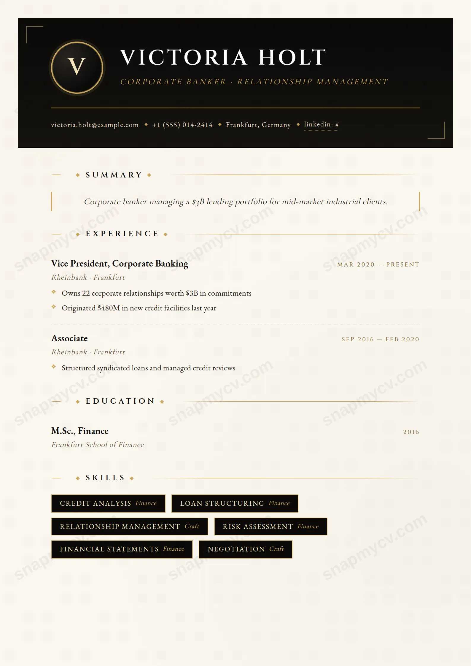
A premium black header band ruled in gold. Conservative in exactly the way banking hiring is conservative, with typography that implies the deal toys are real.
Best for: bankers and corporate finance professionals. Free to fill in, restyle, download as a PDF, or publish at your own SnapMyCV link.
Applicant tracking systems: Light styling. Mostly parseable but uses sidebars, columns or visual elements that may confuse stricter ATS.A template's styling never changes the advice that matters most — lead with achievements, quantify your impact, and tailor the content to each role.
New to writing a CV? Read our step-by-step CV guide and ATS tips, then come back and make this design your own.
Banker Black runs a single warm gold (#c9a961) across a near-black field (#0b0a09), and the discipline is in how little the gold does. It appears as hairline rules and section headings only, never as a fill or a block, so the eye reads it the way it reads gilt edging on a private banking statement: a signal of finish rather than an attempt to grab attention. The near-black is deliberately not pure #000, which keeps the surface from feeling flat and lets the gold sit warm rather than harsh against it.
The rest of the work is done by negative space and a measured hierarchy. Generous margins and clear breaks between sections give each block room to breathe, so the page feels composed instead of crowded. Headings step down in weight in an orderly way, body text stays fully legible against the dark ground, and nothing competes with the content. The result is a page that signals expense through restraint, which is the whole point of the palette.
This is a template for people whose credibility rests on discretion: private wealth managers, senior relationship managers, investment and client-facing executives, and anyone who regularly presents to a high-net-worth or board-level audience. In those rooms a dark, gold-detailed page reads as considered and premium, and it matches the standard the reader already expects from the role.
Be honest about who should walk away. If you are early in your career, applying at volume through job boards, or working in fields that reward warmth and approachability over gravitas, the dark ground and luxury cues will feel like overreach. It is also a poor fit if you will be printing in bulk, since the ink-heavy background is built for screen and PDF. The premium read only survives if your track record genuinely carries it.
Let the gold rules do the structural work and do not fight them. Lead immediately with senior, quantified outcomes: assets under management, revenue booked, client retention, portfolio performance, deal size. Those numbers belong at the top of your experience, phrased tightly, because the disciplined hierarchy rewards precision and punishes padding. Keep each role to a handful of sharp lines rather than dense paragraphs, and trust the negative space to frame them. The most common mistake is trying to fill every gap, which collapses the whitespace that makes the palette read as luxury in the first place.
Keep the section count lean so the measured spacing survives. A focused summary of two or three lines, a strong experience block, and a short credentials or education section is enough; long skills lists and filler sections dilute the effect. Write in the same register as the design, precise and unadorned, and avoid decorative language that undercuts the restraint. Preview the PDF export before you rely on it, since the dark background is best judged on screen at full contrast.
It is built for screen and PDF, not the printer. The #0b0a09 ground is ink-heavy and the gold detailing loses its warmth in greyscale, flattening to a mid tone that reads far less premium than it does in colour. If a hard copy is likely, judge the export first and treat printing as a compromise rather than the intended use.
Often, yes. The gold-on-black language is tuned to seniority and client-facing gravitas, so on a mid-level or early-career profile it can signal more standing than the track record supports. It works best when your outcomes, such as AUM or board exposure, genuinely match the premium the palette promises.


