
Kanban-style pipeline layout for business development professionals.
Create a free account to customize and publish this design.
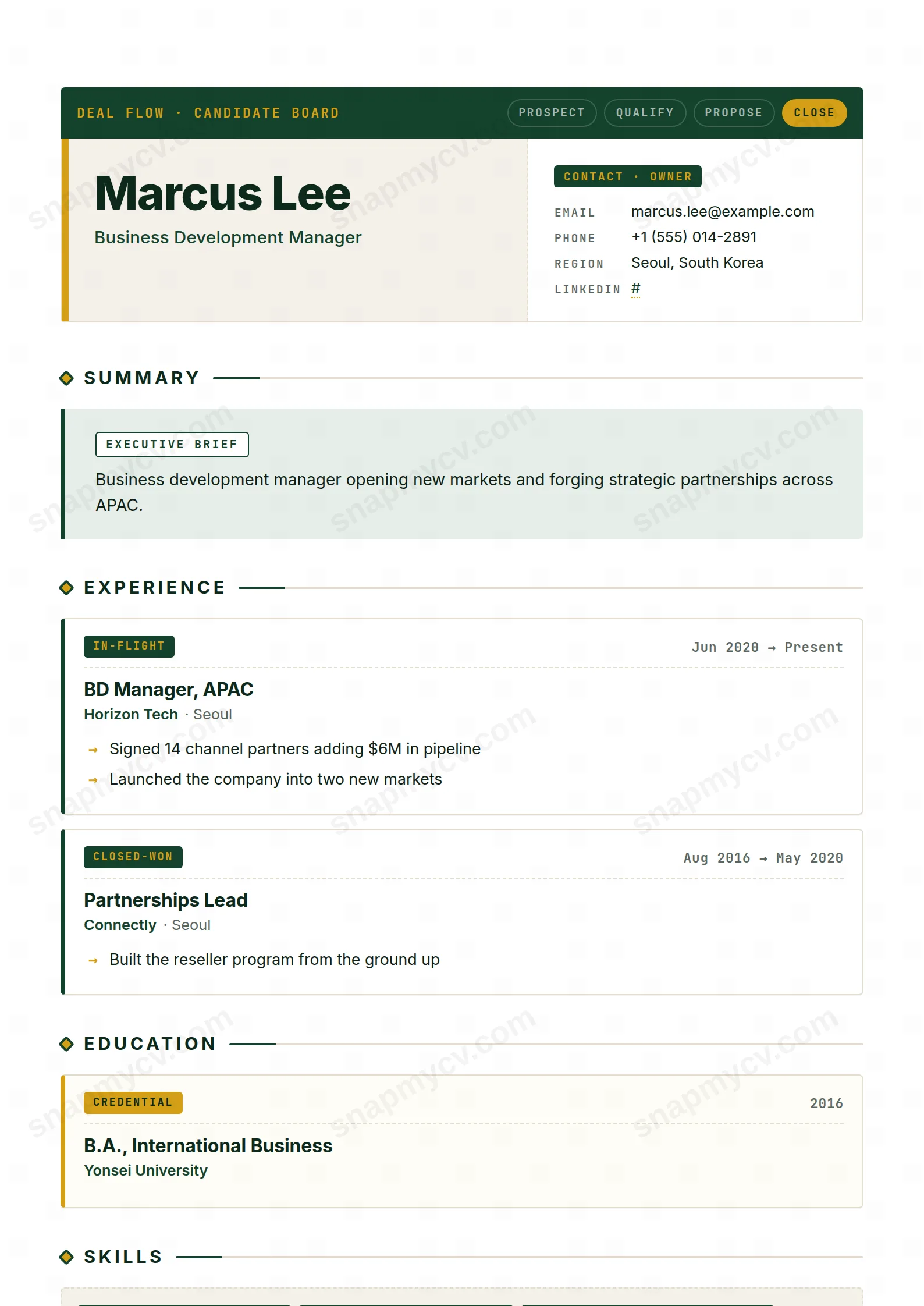
A kanban-style layout that presents your career the way you present a quarter: pipeline stages, moved deals, and partnerships in motion. Form matches function for BD work.
Best for: business development and partnerships professionals. Free to fill in, restyle, download as a PDF, or publish at your own SnapMyCV link.
Applicant tracking systems: Light styling. Mostly parseable but uses sidebars, columns or visual elements that may confuse stricter ATS.A template's styling never changes the advice that matters most — lead with achievements, quantify your impact, and tailor the content to each role.
New to writing a CV? Read our step-by-step CV guide and ATS tips, then come back and make this design your own.
BD Pipeline borrows the visual grammar of a sales CRM and applies it to a career. The masthead is a JetBrains Mono strip reading DEAL FLOW · CANDIDATE BOARD, with the four pipeline stages PROSPECT, QUALIFY, PROPOSE and CLOSE laid out left to right, only CLOSE lit in mustard #d4a017 against a deep green #14432d field. That single choice does a lot of work: it signals momentum and a bias toward closing before a reader has read a word. Directly beneath, a two-column split sets your name and headline in heavy Inter on a cream #f4f1ea panel with a mustard spine, balanced by a compact CONTACT · OWNER card, so the page opens like a live record someone is actively working rather than a static document.
The typographic system is deliberately two-voiced. Inter carries the human content, names, headlines and prose, while JetBrains Mono handles every label, date range and status tag, which is what makes the layout feel like software instead of stationery. Roles arrive as kanban cards stamped IN-FLIGHT or CLOSED-WON, projects read as INITIATIVE, education as CREDENTIAL and awards as RECOGNITION. Diamond section markers and dashed cream dividers set a tight rhythm, and arrow bullets pull the eye across each line toward a result. The green, mustard and cream palette stays disciplined, so the effect reads crisp and intentional rather than gimmicky.
This template is engineered for revenue people: business development reps, account executives, sales managers, partnerships leads and growth roles whose work is genuinely measured in a pipeline. The deal-stage vocabulary is not decoration, it is a filter. If your achievements are numbers, ARR booked, quota attainment, win rate, contract value, the CLOSED-WON tags and arrow bullets give those numbers a stage to stand on. Hiring managers in sales orgs read this fluently and will recognise a candidate who thinks in the same terms.
Be honest with yourself if you are not in that world. Academics, engineers, designers, clinicians and public-sector applicants will find the IN-FLIGHT and DEAL FLOW framing forced, and a monospaced status tag on a research post reads as costume. The dense mustard-and-green colour system is also assertive, so anyone who needs to look measured and neutral should choose a calmer single-column template. BD Pipeline is a strong point of view, and it only pays off when your actual career matches it.
Treat every experience card as a closed deal: lead with the outcome, then supply just enough context to make it credible, because the arrow bullets are built to carry figures, not paragraphs. Aim for three to five bullets per role, each anchored by a metric, and let the monospaced date range and the IN-FLIGHT or CLOSED-WON tag do the status-signalling so you never restate it in prose. Your headline sits large beside the CONTACT · OWNER card, so make it a genuine positioning line, not a job title, and use the EXECUTIVE BRIEF summary as a tight two-line pitch rather than a career history.
Populate the structural features on purpose. The dot-marked skill chips on their dashed cream board look best when grouped into filled categories instead of a long undifferentiated list, and the two-up certifications grid with mustard top-rules is the right home for named methodologies like MEDDIC, SPIN or Challenger. Keep language tiles to real proficiencies, since the clipped green tiles draw attention. The most common mistake here is overloading the cards until the white space collapses and the kanban logic disappears, so cut ruthlessly; the negative space and the dashed dividers are load-bearing parts of the design, not gaps to fill.
The document is clean single-column HTML with real text headings, so most applicant tracking systems read the roles, dates and bullets in a sensible order. The coloured tags, diamond markers and JetBrains Mono labels are purely visual styling and carry no parsing meaning, so the safe check is to copy the rendered CV into a blank document and confirm every entry survives as plain text before you submit.
It degrades better than most colour-forward layouts because the structure does not depend on colour. The deep green #14432d header prints as a strong dark band, the mustard #d4a017 accents drop to a mid grey that still reads as emphasis, and the cream #f4f1ea panels stay near-white, so the kanban cards and dashed dividers remain legible. You lose the momentum cue of the lit CLOSE stage, but hierarchy and readability stay intact on a mono printer.


