
Conservative navy and gold layout with serif headers for auditors and consultants.
Create a free account to customize and publish this design.
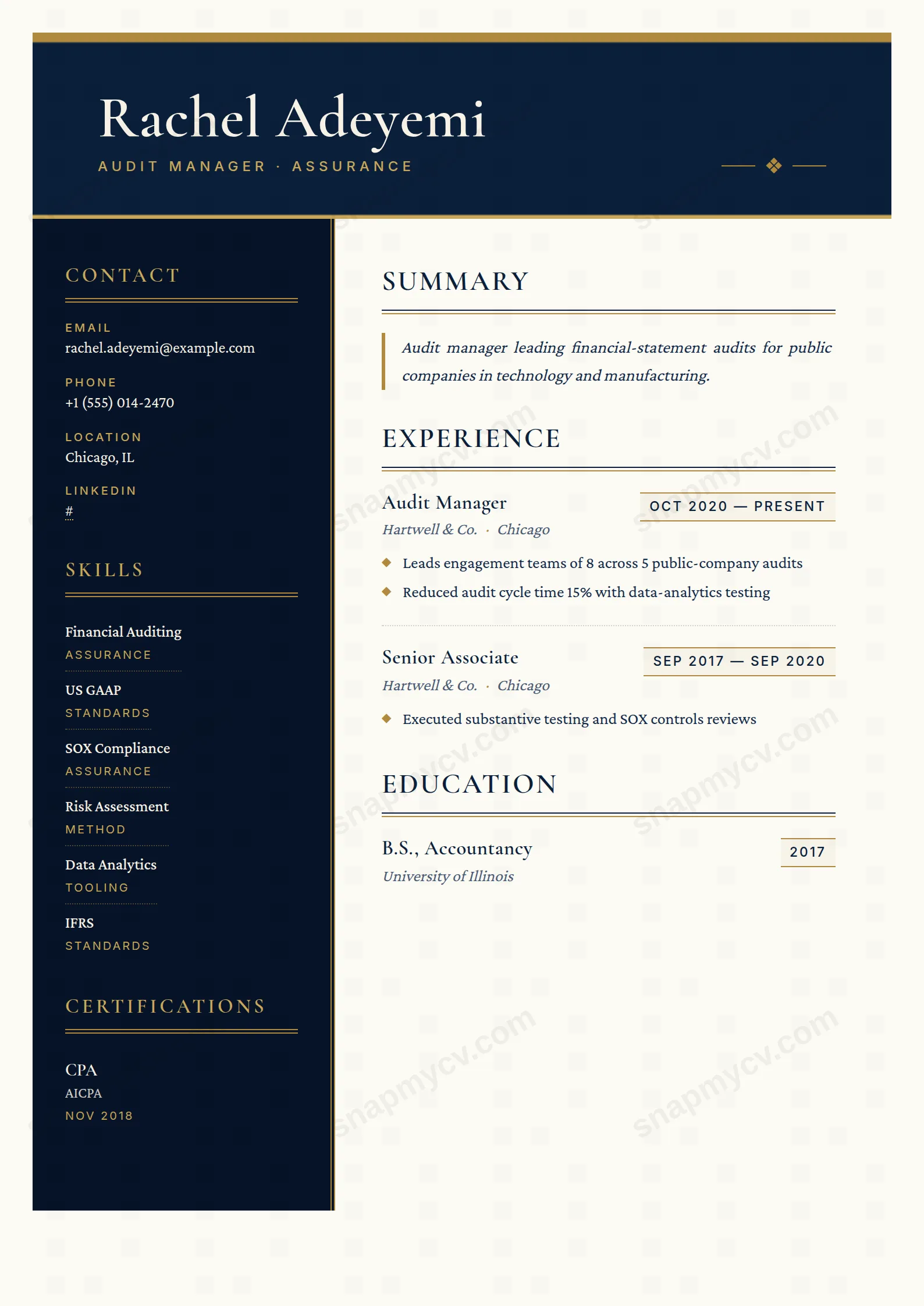
Conservative navy and gold under serif headers — the house style of audit, made personal. Engagements, certifications, and sector coverage in expected order.
Best for: auditors, accountants, and Big Four applicants. Free to fill in, restyle, download as a PDF, or publish at your own SnapMyCV link.
Applicant tracking systems: Light styling. Mostly parseable but uses sidebars, columns or visual elements that may confuse stricter ATS.A template's styling never changes the advice that matters most — lead with achievements, quantify your impact, and tailor the content to each role.
New to writing a CV? Read our step-by-step CV guide and ATS tips, then come back and make this design your own.
Every choice in Big Four is engineered to signal method. The deep navy header (#0b1f3a) sets your name in Cormorant Garamond at a commanding 38pt, then caps it with a solid gold bar above and a thinner gold-soft line below, with a single diamond monogram floated between two hairlines. The darker navy sidebar (#061327) is fenced by a 4px double gold border, the framing you would find on a partner's letterhead, not a job board upload. Nothing here is decorative for its own sake; the double rules and diamonds read as controls, ticked and reconciled.
The typography is a deliberate three-part system. Cormorant Garamond carries names and section titles, Crimson Pro sets the body as a warm serif on ivory paper (#fbfaf4), and Inter appears only as uppercase, letter-spaced labels and gold-outlined date chips. Section titles rest above a two-line double rule of navy over gold, the summary sits italicised behind a gold left border, and bullets are marked with small gold diamonds rather than plain dots. The effect is quiet authority: warmth from the serif and ivory, discipline from the gold ruling and restraint from the near-total absence of anything that shouts.
The name is honest about its niche. Big Four is built for auditors, management consultants, chartered accountants, tax and transaction advisers, and corporate finance professionals who report to conservative, credential-led firms where a CFA or ACA still moves the needle. The gold-on-navy formality flatters people whose credibility rests on rigour and pedigree, and the serif body signals that you take documents seriously.
It is the wrong tool for creative, startup or design roles where personality and colour play matter more than provenance, and it is a poor fit for anyone with a thin credential list, since the sidebar's certification and language blocks will look conspicuously empty. If your field rewards visual boldness or you are early enough in your career that qualifications are still sparse, a lighter, single-column layout will serve you better than this heavily framed, letterhead-style design.
Treat the 260px sidebar as your credential ledger. It holds contact details, skills with optional category tags, languages with proficiency, certifications with issuer and dates, and interests as bordered tags, so put your ACA, ACCA, CPA or CFA here where the gold accents make them pop, and keep each entry to a line. The main column then belongs to summary, experience, education, projects, awards, publications and volunteering, in that priority order. Let the italicised, gold-bordered summary stay tight at two or three sentences of genuine positioning rather than a paragraph of adjectives.
The experience block is where people go wrong. Each entry pairs a Cormorant role with an italic firm name and a gold-ruled date chip, a structure that looks bare if you fill it with vague prose, so quantify engagements, client outcomes and figures under the gold-diamond bullets. Aim for three to five bullets per recent role and fewer as you go back. The commonest mistakes are overstuffing the sidebar until the double gold border feels crammed, and writing summary text long enough to break the justified block. Restraint is the whole point of this design; respect it and the navy and gold do the persuading for you.
It survives better than most colour-heavy templates. The deep navy header (#0b1f3a) and darker sidebar (#061327) drop to strong near-black panels, the ivory body (#fbfaf4) stays effectively white, and the gold rules and diamonds read as light grey lines that still separate sections. You lose the warmth and the gold's shimmer, but the double-rule hierarchy and the sidebar framing remain legible, so a photocopied or greyscale-printed copy still looks structured rather than muddy.
It is sized for a mid-to-senior professional with a real track record, not an entry-level one-pager. The 260px sidebar wants a genuine spread of contact details, skills, languages and several certifications to avoid looking sparse, while the main column carries summary, experience, education and optional projects, awards, publications and volunteering. Roughly ten to fifteen years of experience across three or four roles fits well; push far beyond that and the justified body plus double-rule section breaks start to feel dense.


