
Tombstone-style company logos with prospectus formality for board members.
Create a free account to customize and publish this design.
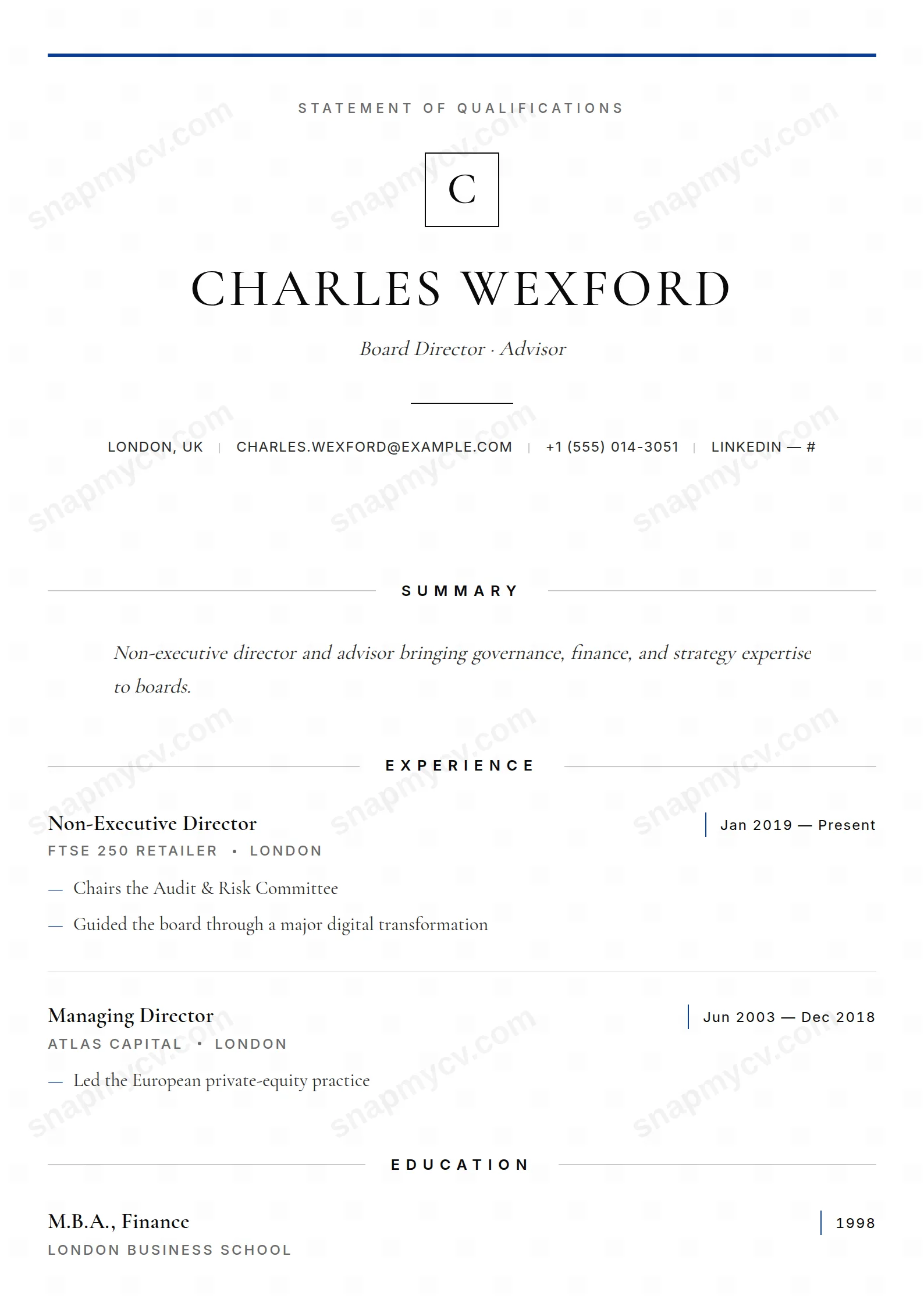
Tombstone-style company marks and prospectus-grade formality, modeled on the documents boards actually read. Directorships, committees, and governance experience get the gravity they deserve.
Best for: board candidates and non-executive directors. Free to fill in, restyle, download as a PDF, or publish at your own SnapMyCV link.
Applicant tracking systems: ATS-friendly. Single-column, standard section headers, parses cleanly in most applicant tracking systems.A template's styling never changes the advice that matters most — lead with achievements, quantify your impact, and tailor the content to each role.
New to writing a CV? Read our step-by-step CV guide and ATS tips, then come back and make this design your own.
Board Member is built to look like an instrument, not a resume. It runs as a single centred column on a pure white field (#ffffff), with ink-black Cormorant Garamond carrying the body and Inter handling every label in small, wide-tracked capitals. A 3px prospectus-blue rule (#0b3d91) opens the page above a bordered monogram, then your name lands large in spaced uppercase with an italic headline beneath it. That same blue recurs deliberately as hairline accents, as the dash bullets inside each role, and as a faint closing rule at the foot, so the eye reads one continuous formal document rather than a stack of job entries.
The restraint is engineered, not accidental. Section titles sit centred between two thin grey rules (#c9c9c9) at a wide 0.42em letter-spacing, which slows the reader and signals ceremony. Dates hang off a slim blue left border in tabular figures so columns of years align cleanly, and languages and custom fields use dotted leader lines like a disclosure schedule. There is no photograph, no colour block, no sidebar competing for attention. The generous white space and justified italic summary give the page the unhurried authority of something meant to be read slowly by people who sign things.
This is a statement of qualifications for non-executive directors, board candidates, chairs, trustees, senior partners, general counsel, and advisers whose value is judgement and tenure. The eyebrow that reads Statement of Qualifications sets that register before a single line is read, and the format flatters governance, audit, risk, and committee work far better than a task-by-task job history would. If your worth is measured in mandates held and boards served, this design speaks your language.
It is genuinely the wrong choice for anyone early in their career or in fast-moving creative and technical fields. A junior candidate has too little tenure to fill this much ceremonial white space without looking thin, and the serif-and-hairline formality reads as stiff for design, startup, or product roles that reward a warmer, denser layout. If you need to show a photo, a skills grid, or a portfolio link, this template deliberately gives you nowhere to put them.
Because the layout is so spare, every word carries load. Keep the headline to one precise line, write the summary as measured prose rather than a keyword dump (remember it renders justified and italic, so short choppy sentences look ragged), and open each role with its mandate and the outcome that followed. Feed the dash-bulleted highlights with governance results, not routine duties, and use the custom section with its dotted leaders for directorships, board memberships, and committee seats, which is exactly the disclosure-schedule look those leader lines were built for.
The common mistake is treating empty space as a problem to solve. It is not; the calm is what signals seniority, so resist padding roles or stretching the summary to fill the page. Let the blue-bordered dates do the chronological work and keep entries chronological so the tabular figures line up. Two pages of well-chosen mandates read as more senior than five crowded ones, and a handful of substantial roles suits this format far better than a long tail of short ones.
It survives greyscale better than most coloured templates because the prospectus-blue (#0b3d91) is used only for thin rules, dash bullets, and the date border, never for text you must read. In black and white those accents simply drop to a mid-grey while the ink-black Cormorant Garamond body and the grey section rules (#c9c9c9) are unaffected, so hierarchy and legibility stay intact. You lose a little of the formal blue signature, but nothing structural.
Yes, within reason. The single justified column and the dotted-leader custom section are designed to list directorships, trusteeships, and committee seats compactly, so a substantial governance history fits comfortably across two pages. The format rewards selecting your most significant mandates rather than listing every appointment, because the wide letter-spacing and generous white space start to look crowded once you push much past two pages.


