
Brand-monogram header and color blocks for brand managers.
Create a free account to customize and publish this design.
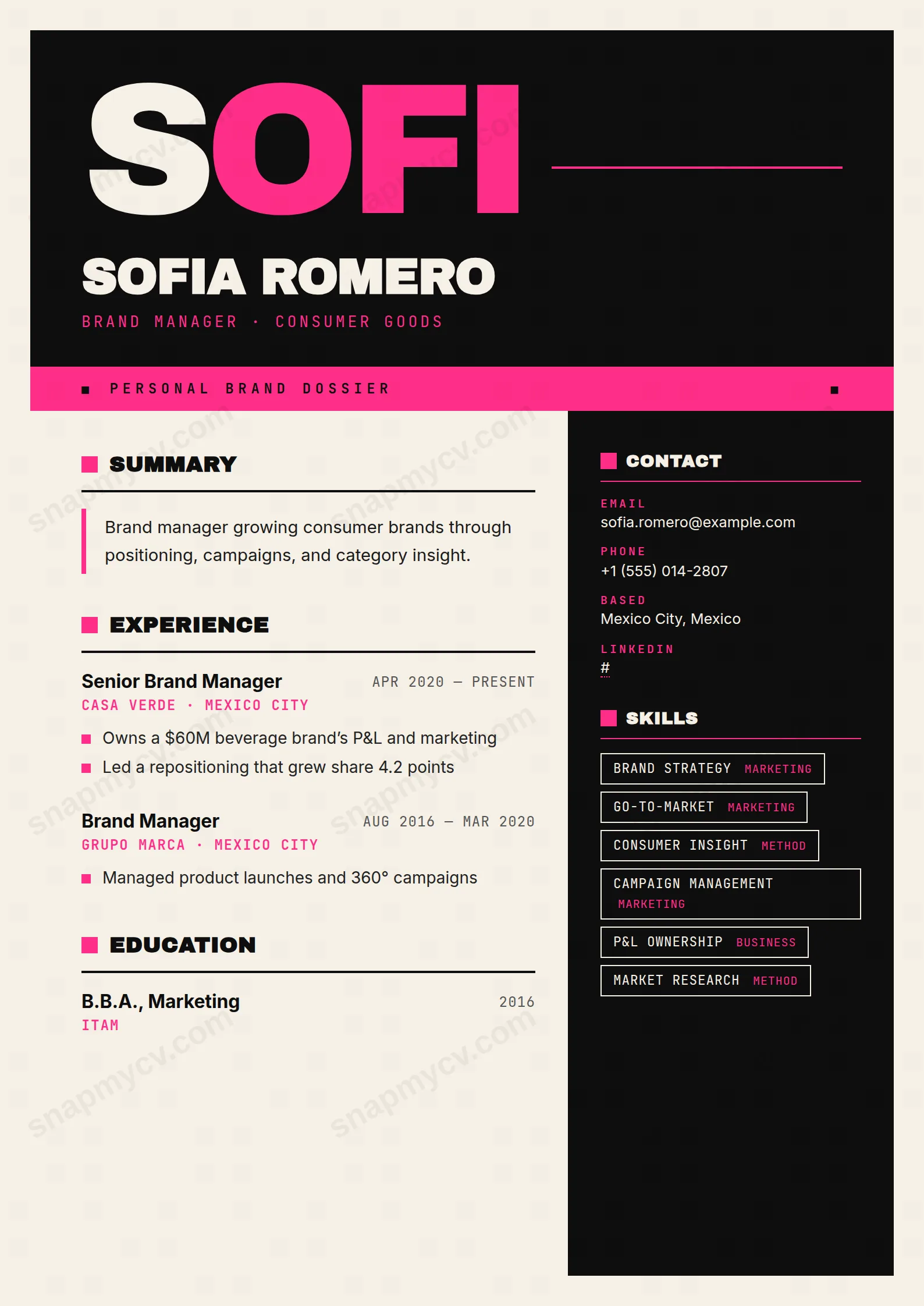
A monogram header and disciplined color blocks demonstrate exactly the consistency you'd bring to someone's brand. Guidelines energy, applied to your own story.
Best for: brand managers and marketing leads. Free to fill in, restyle, download as a PDF, or publish at your own SnapMyCV link.
Applicant tracking systems: Light styling. Mostly parseable but uses sidebars, columns or visual elements that may confuse stricter ATS.A template's styling never changes the advice that matters most — lead with achievements, quantify your impact, and tailor the content to each role.
New to writing a CV? Read our step-by-step CV guide and ATS tips, then come back and make this design your own.
Brand Steward is built on the logic of a brand identity, not a document layout. The matte-black header (#0E0E0E) anchors an oversized Archivo Black monogram in hot pink (#FF2E88), your name locked uppercase beneath it, and a JetBrains Mono headline set in spaced small caps. The hot-pink band reading 'Personal Brand Dossier' is the deliberate framing device, the kind of confident label a brand manager would actually ship rather than a decorative flourish.
The choices underneath are disciplined. The body sits on a warm-white canvas (#F6F1E7) rather than clinical white, which softens the high-contrast pink and keeps the page from feeling like a poster. Type does real work here: Archivo Black for section titles with a pink swatch and a hard underline, Inter for readable narrative copy, and JetBrains Mono as a labelling system that tags every contact row, skill, and certification. The result is hierarchy you can scan in a second, with the pink reserved for structure and emphasis so it signals rather than shouts.
This template is made for people who steward identity for a living: brand managers, brand strategists, and the marketing, creative, and communications professionals whose job is taste. It is a CV that demonstrates design judgement instead of merely claiming it, so it suits candidates whose work is launches owned, brand equity grown, and campaigns shipped, and who can back the styling with metric-led proof.
Be honest about where it does not belong. The matte-black header, hot-pink accents, and mono labelling read as expressive and design-forward, which is exactly wrong for law, finance, medicine, academia, or any conservative institution that expects restraint. It also punishes vague copy: with the pink and black doing the talking, thin or waffly wording is exposed rather than hidden. If your field values sobriety over flair, or your material is light on concrete outcomes, choose something quieter.
Treat the two columns as two different jobs. The wide main column is for narrative, so put your summary and experience there, framed as outcomes rather than duties. The summary sits behind a pink left rule, so keep it to three or four sharp lines that earn that pull-out treatment, and let the square pink experience markers carry short, specific, verb-led bullets. The 280px black sidebar is your facts column: skills render as outlined mono badges, languages as a ranked list, and certifications and hobbies fill out the dark aside, so move concrete credentials there and keep the story clean.
The common mistake is overloading the sidebar until the mono badges wrap and the dark column looks cramped, so cap skills at a scannable dozen and trust the ranked structure. Because the JetBrains Mono labels tag every row, inconsistent capitalisation or overlong entries break the system fast, so keep contact lines, skill names, and certification titles tight and uniform. Aim for one page: a punchy headline, a disciplined summary, three or four roles with a few metric-led bullets each, and a curated sidebar. The design rewards editing, not volume.
It can, because Brand Steward pairs a coloured header with a 280px dark sidebar, and some applicant tracking systems flatten multi-column layouts in an unpredictable order. The underlying HTML is written in a logical sequence and the headings are standard, but before you submit, copy the whole CV into a blank document and confirm your sidebar skills, dates, and contact details come out in the right order. If a role runs everything through an older ATS, favour a single-column template instead.
The layout survives greyscale better than most colour-heavy designs because its hierarchy comes from structure, not hue. The matte-black header, hard underlines, square markers, and the pink left rule all translate into tonal contrast, so the page still reads as organised. The hot pink (#FF2E88) drops to a mid-grey, so the monogram and the 'Personal Brand Dossier' band lose their punch, but nothing becomes illegible against the warm-white canvas.


