
Full-width dark band with embossed name for C-suite executives.
Create a free account to customize and publish this design.
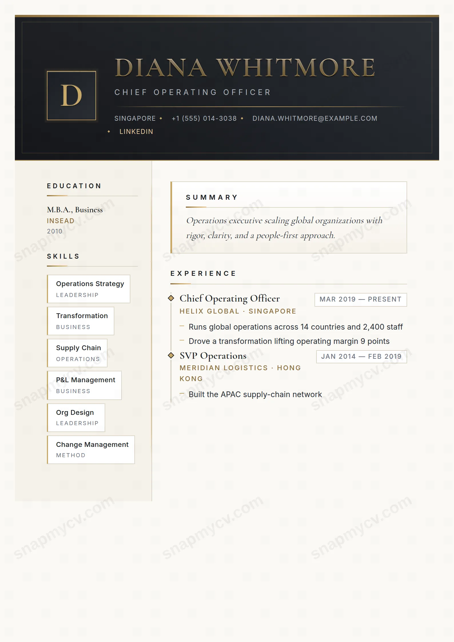
A full-width dark band carries an embossed name treatment, and everything below it is disciplined and spare. The page communicates seniority before a single bullet is read.
Best for: C-suite executives and senior leadership. Free to fill in, restyle, download as a PDF, or publish at your own SnapMyCV link.
Applicant tracking systems: Light styling. Mostly parseable but uses sidebars, columns or visual elements that may confuse stricter ATS.A template's styling never changes the advice that matters most — lead with achievements, quantify your impact, and tailor the content to each role.
New to writing a CV? Read our step-by-step CV guide and ATS tips, then come back and make this design your own.
C-Suite Steel is built around a single dramatic gesture: a full-width graphite header that runs from #1c1f24 to #2a2e35, capped by a thin champagne-gold strip and closed with an inset hairline frame. Inside it sits an 86px monogram plate holding your initial, and your name in Cormorant Garamond, uppercase and widely letter-spaced, filled with a brushed champagne gradient from #f3e3c1 down to #a8884a. The intent is engraving rather than ink. The name reads as milled metal on a machined panel, which is why the header does so much of the work before a single line of experience is read.
Beneath the band the page drops onto warm ivory and paper stock and splits into a 240px left rail and a wider main column, the two divided by a soft champagne edge. Every detail is chosen to echo the header's precision: rotated diamond markers on each experience entry, dash bullets, boxed date chips, and an italic Cormorant summary set off by a gold left border. Inter carries body copy and labels while the serif is reserved for names and headings, so the two typefaces never compete. The restraint is the point. The metal accents only read as expensive because everything around them is quiet.
This template is calibrated for senior leadership: chief executives, divisional directors, board and non-executive candidates, partners, and operators making a deliberate step into the C-suite. The gravitas of the dark band and the metallic name treatment reward a title that already carries weight, so it flatters people whose remit is obvious and undersells people who are still building one. If you are early-career, changing industries, or applying somewhere that prizes plain modern minimalism, the champagne-and-graphite theatricality will read as costume rather than credential, and a cleaner single-column layout will serve you better.
It also assumes you have enough genuine board-relevant material to justify the two-column split. The left rail is designed for skills, languages, certifications, education, awards, and interests, while experience, a leadership summary, projects, publications, and volunteering anchor the main column. If those rails would sit half-empty, the whitespace exposes the format instead of the person, and the design turns against you.
Treat the header as a nameplate and keep it spare: your name earns the champagne fill, so resist adding a long tagline that fights the engraved effect. Let the italic Cormorant summary state your leadership thesis in two or three lines directly under the band, then push quantified outcomes into the main column, one diamond-marked role at a time, using the boxed date chips for tenure. Lead each entry with P&L, headcount, growth, or transformation figures rather than duties, because the sparse detailing leaves nowhere for filler to hide.
In the 240px left rail, curate hard: list only board-relevant credentials so the gold accents land on what matters, and keep each label short enough to sit on one line against the narrow column. The most common mistake with this style is overfilling, packing both columns until the ivory breathing room disappears and the diamonds, dash bullets, and champagne edge blur into noise. Aim for three to five strong roles, a tight rail, and generous margins so the steel-and-gold craft stays legible.
The headings are conventional and the underlying markup is clean structured text, which most applicant tracking systems read without trouble. However, this is a 240px-rail two-column design with a coloured header band and a metallic name fill, and some older parsers reorder or drop multi-column content. Before applying through a strict portal, copy the rendered CV into a blank document and confirm the left rail and main column appear in a sensible reading order.
The champagne gradient on the name and the gold strip and left border reduce to mid greys, so the engraved effect softens and some accent contrast is lost against the graphite band. The name stays readable because it relies on the uppercase Cormorant letterforms and letter-spacing, not colour alone, and the diamond markers, dash bullets, and date chips still register in mono. If greyscale printing is likely, expect a more subdued, executive look rather than the full metal-on-steel impact.


