
Skills-first reorder with transition-story callout for career changers.
Create a free account to customize and publish this design.
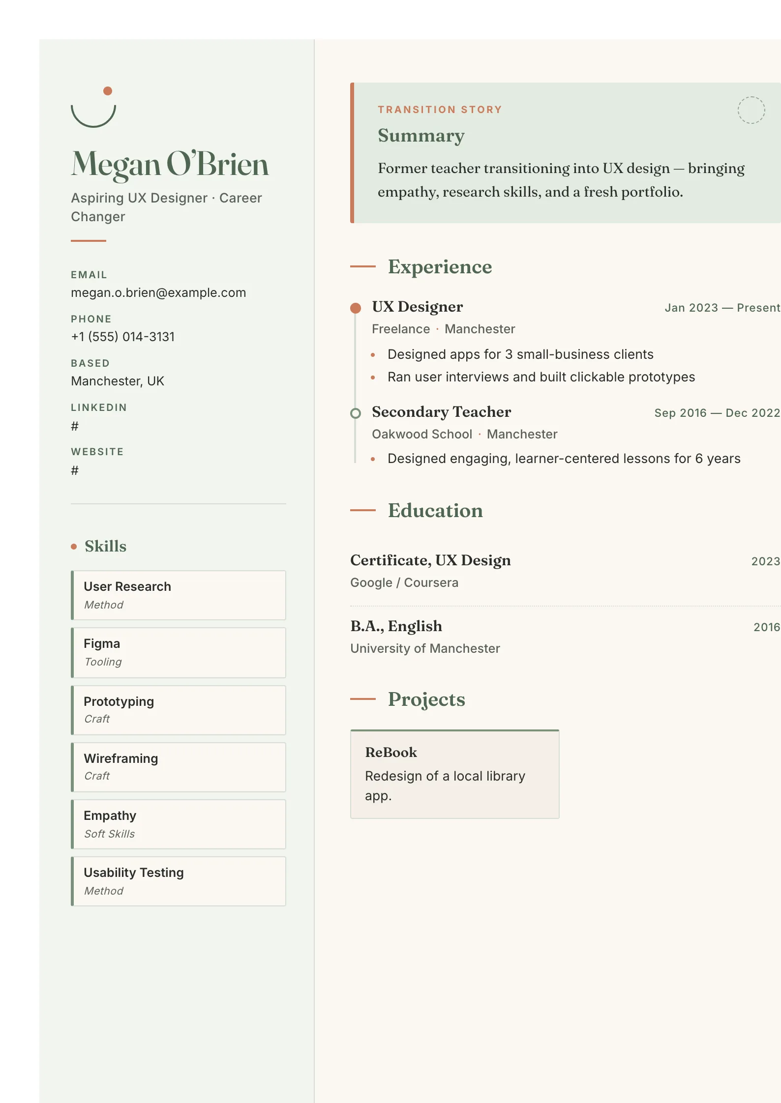
Reorders the classic CV so transferable skills lead and chronology follows, with a dedicated callout for your transition story. Recruiters see what you can do before they see what you used to be called — exactly the order a career change needs.
Best for: professionals pivoting into a new industry or role. Free to fill in, restyle, download as a PDF, or publish at your own SnapMyCV link.
Applicant tracking systems: Light styling. Mostly parseable but uses sidebars, columns or visual elements that may confuse stricter ATS.A template's styling never changes the advice that matters most — lead with achievements, quantify your impact, and tailor the content to each role.
New to writing a CV? Read our step-by-step CV guide and ATS tips, then come back and make this design your own.
Every choice in Career Switcher works to make a change of direction read as intentional. The 280px sidebar sits on a soft sage panel (#f1f5f0) beside a bone-white main column (#faf7f2), a low-contrast pairing that keeps the page calm rather than corporate. Deep sage (#4f6651) carries the headings while terracotta (#c97b5a) appears only where it earns attention: the hairline rules, the list markers, and the first node on the experience timeline. That restraint matters, because a switcher's CV can easily look busy, and the palette here stays quiet enough for the words to lead.
Typography splits the labour between two faces. Fraunces, a warm serif, sets your name, section titles and item headings, giving the document a considered, editorial weight. Inter handles contact labels, dates and skill tags, so the small functional text stays crisp and legible. The signature touch is the Transition Story callout that replaces a bland summary: a sage-tinted box with a dashed circle motif and serif body copy, sitting under a hand-drawn open arc and single terracotta dot above your name. The reader meets your narrative first, not a job title that no longer fits.
This layout is built for people crossing a line: a teacher moving into UX, an analyst stepping toward product, a clinician heading for health tech, or anyone returning after a break. Because skills, languages, certifications and hobbies all live in the sidebar, the design foregrounds capability over chronology, which is exactly the reframing a switcher needs when recent job titles do not match the target role.
It is a poor fit if your story is a straight vertical climb in one field, where a reader expects seniority signalled through an unbroken title progression rather than a transferable-skills argument. It also suits softer, human-facing sectors better than severe ones. In conservative finance, law or heavy engineering, the sage-and-terracotta warmth and the hand-drawn reset arc can read as too informal, and a plain single-column format will land more safely.
Start with the Transition Story callout, because it is the first thing read. Keep it to three or four sentences that name where you are coming from, where you are heading, and the throughline connecting them. Then load the 280px sidebar deliberately: lead the skill tags with capabilities relevant to the new field, use certifications to prove you have already invested in the move, and let languages and hobbies fill out the human picture. The sidebar is narrow, so favour short tags over long phrases that wrap awkwardly.
In the main column, the connected timeline rewards momentum. Write each role as transferable, outcome-led highlights rather than duties, so the sequence reads as progress toward your target rather than a list of unrelated jobs. Two or three tight roles hold the timeline better than six thin ones. The projects sit in a two-column card grid, ideal for portfolio pieces, side work or a career-change capstone that evidences the new direction. The common mistake is overfilling: this template breathes on whitespace, and cramming every past job flattens the deliberate pivot it is designed to stage.
The headings are conventional and the markup is clean, but this is a coloured two-column design, and some applicant tracking systems read multi-column layouts out of order or skip sidebar content entirely. Since your skills and certifications live in that sidebar, run the plain-text test first: copy the rendered CV into a blank document and confirm the sequence still makes sense. For a posting that demands a strict single-column file, submit a simpler template instead.
It holds up better than most coloured templates because the design leans on layout, not colour, for structure. The 280px sidebar, the connected timeline and the Fraunces-versus-Inter contrast all survive a black-and-white print. The terracotta accents on rules and the first timeline node fade to a mid-grey, so they lose their pop but never obscure text, and the soft sage panel simply reads as a faint tint behind the sidebar.


