
Prix-fixe menu-card layout with dotted leaders for chefs.
Create a free account to customize and publish this design.
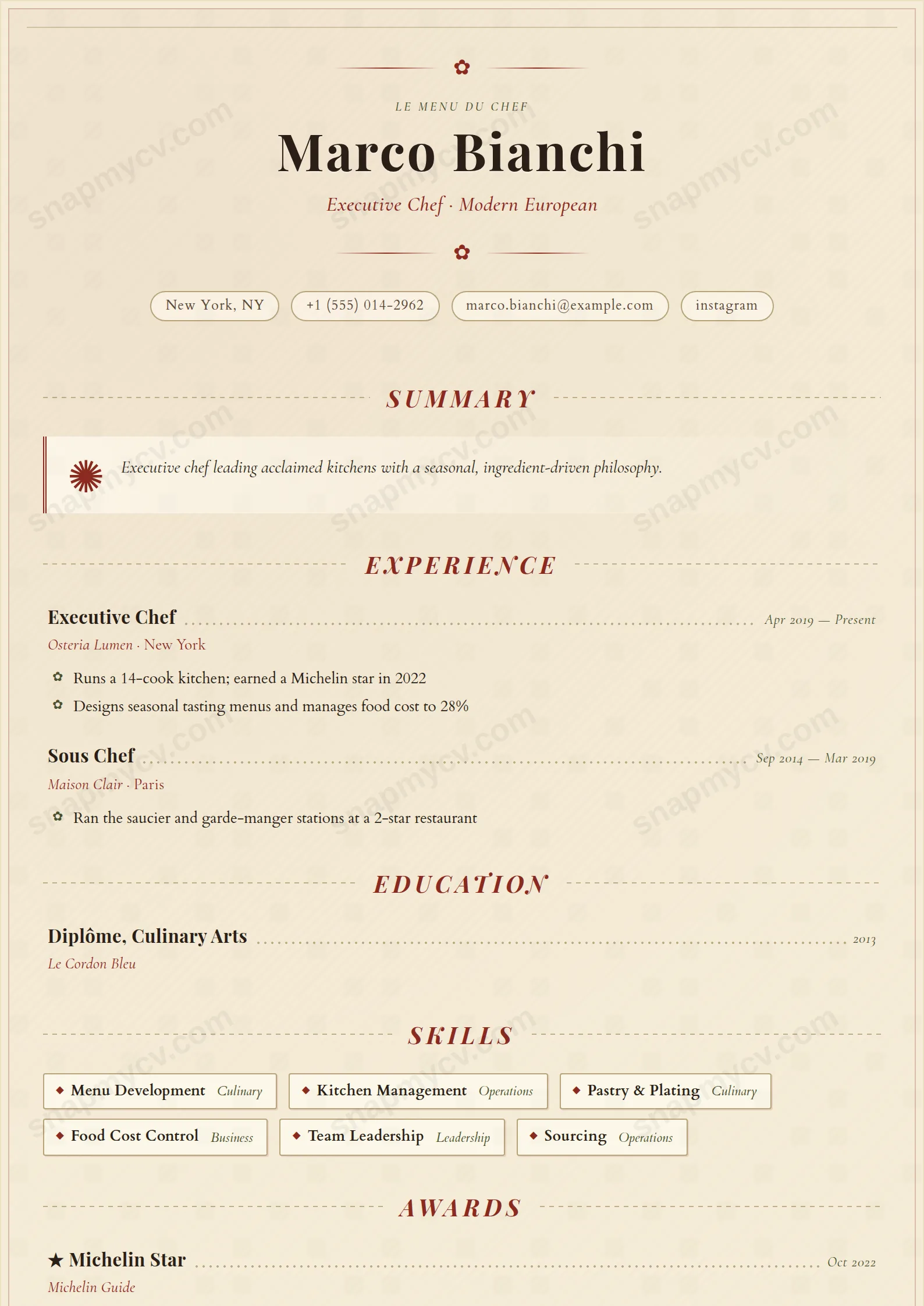
Laid out like a prix-fixe menu card, dotted leaders and all. Stations, signature menus, and kitchens you've run read like courses — a CV that smells faintly of service at 7 PM.
Best for: chefs, sous chefs, and kitchen leadership. Free to fill in, restyle, download as a PDF, or publish at your own SnapMyCV link.
Applicant tracking systems: Light styling. Mostly parseable but uses sidebars, columns or visual elements that may confuse stricter ATS.A template's styling never changes the advice that matters most — lead with achievements, quantify your impact, and tailor the content to each role.
New to writing a CV? Read our step-by-step CV guide and ATS tips, then come back and make this design your own.
Chef de Cuisine borrows the grammar of a printed carte and applies it to a career. The page rests on a warm parchment wash (#f5ecd7) held inside a thin inset border in kitchen red (#8a2a1f), with a centred header, a small ornamental flourish above the name, and the name itself set large in Playfair Display over an italic Cormorant Garamond tagline. The colour discipline is the point: kitchen red carries every title and accent, deep olive (#4a5230) handles secondary notes, and body copy stays in soft ink (#2a1f17) set in Cardo, a bookish serif that keeps long descriptions legible under all the ornament.
Structure is where the menu metaphor earns its keep. Section titles are italic, letter-spaced small caps flanked by dotted rules, and each role or qualification runs as a prix-fixe line: title on the left, dotted leaders stretching across, dates set like a price on the right. The summary opens with a drop-cap ornament inside a double-ruled amuse-bouche panel, skills sit in boxed pantry chips, and languages align on leader dots with an italic proficiency level. It is deliberately single-column and decorative, so the eye travels top to bottom the way it would down a set menu.
This is a costume-specific template, and that is its strength. It is right for people who cook and serve for a living: chefs de cuisine, sous and pastry chefs, restaurant and food-and-beverage managers, sommeliers, bakers, caterers, and front-of-house leaders applying to restaurants, hotels, and private dining rooms where craft and warmth are the currency. In those rooms the parchment and kitchen-red palette signals fluency in the trade before a word is read.
Be honest about where it does not belong. If you are applying into corporate, finance, tech, healthcare, or any conservative office role, the flourishes and menu leaders will read as costume rather than competence, and a plainer template will serve you better. It also assumes a fairly compact career: the ornamental single column is happiest at one to two pages, so a fifteen-year, densely detailed history will fight the whitespace the design depends on.
Write against the ornament, not with it. Because the layout is already busy, keep prose crisp so substance shows through: treat the amuse-bouche summary panel as two or three confident lines, never a paragraph, and let the drop-cap ornament do the flourishing. In experience rows, keep role titles short enough to sit cleanly before the dotted leaders, and use the highlight bullets, which render as small fleuron marks, to carry the numbers that matter in this trade: cuisines, covers per service, brigade size, menu counts, food-cost and wastage figures.
Handle the structural features on their own terms. Group skills into stations or categories so the pantry chips stack in tidy rows instead of one long ragged line, and reserve the languages block, with its leader dots and italic levels, for genuine proficiencies rather than padding. The common mistake is over-filling: cramming every station and every plaudit until the parchment margins vanish and the menu-card calm collapses. Fewer, sharper lines per section let the dotted leaders and the double-ruled panels breathe, which is exactly what makes this design look plated rather than cluttered.
The headings use conventional names and the markup runs cleanly top to bottom, so most parsers follow it. But the dotted leaders, ornamental glyphs, and coloured accents are decorative, so copy the rendered CV into a blank document and confirm every role, date, and bullet survives in order before applying. For heavily automated job portals, a plainer single-column template will parse more predictably.
Reasonably well, because the design does not rely on colour alone to build hierarchy. The dotted rules, italic small-caps section titles, drop-cap panel, and prix-fixe alignment all survive as grey tones, so the structure stays readable. The kitchen red and deep olive flatten into similar mid-greys, so the accents lose some of their warmth, but nothing becomes illegible on a black-and-white print.


