
Hard-hat orange with structural beam dividers for civil engineers.
Create a free account to customize and publish this design.
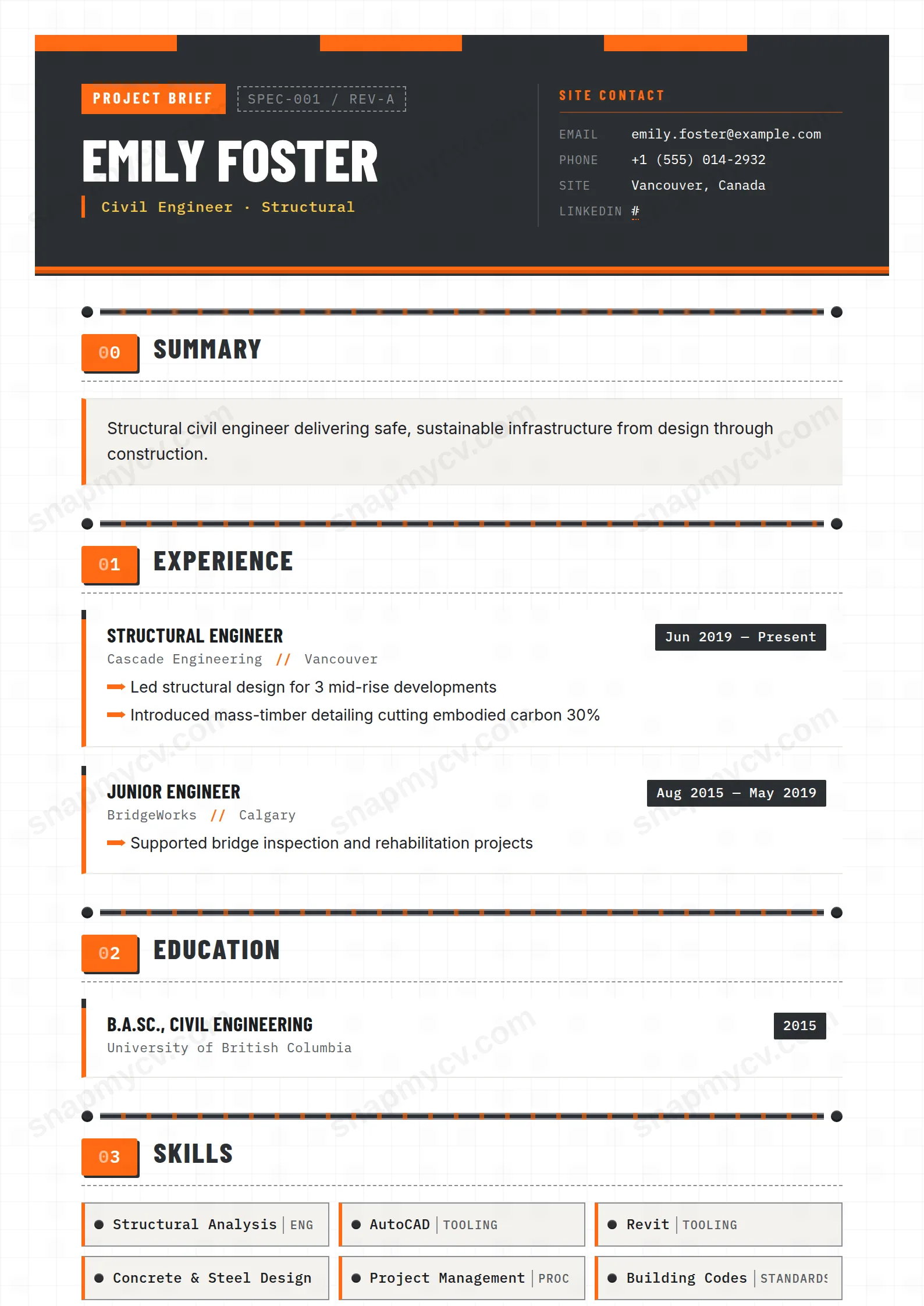
Hard-hat orange with structural beam dividers — an unsubtle nod that works because the rest of the page is rigorously engineered: clear hierarchy, dense but readable, projects front and center.
Best for: civil and structural engineers. Free to fill in, restyle, download as a PDF, or publish at your own SnapMyCV link.
Applicant tracking systems: Light styling. Mostly parseable but uses sidebars, columns or visual elements that may confuse stricter ATS.A template's styling never changes the advice that matters most — lead with achievements, quantify your impact, and tailor the content to each role.
New to writing a CV? Read our step-by-step CV guide and ATS tips, then come back and make this design your own.
The Civil Engineer template borrows its whole visual grammar from a construction site. The name sits in heavy uppercase Barlow Condensed inside a dark-steel band (#2c2f33), topped by a full-width safety-orange (#ff6a13) hard-hat stripe and a hazard-yellow strapline. Condensed type is a deliberate choice here: it lets long engineering titles and company names hold a single line without wrapping, and its industrial weight signals the trade before a reader has parsed a word. Contact details drop into an IBM Plex Mono block under a SITE CONTACT label, monospaced so they read like a project legend rather than a soft address list.
The body is where the restraint lives. A faint blueprint grid on warm paper sits behind everything, but Inter carries the actual copy, so the decorative layer never fights legibility. Each section opens with a riveted I-beam divider and a numbered orange plate (01, 02, 03) that throws a hard concrete-grey shadow, giving the page a stamped, engineered rhythm. Experience becomes cards with a thick orange left edge, bullets render as small orange arrows, skills as bolted plates, and the whole document is sealed with a diagonal-stripe footer beam reading LOAD-TESTED, APPROVED FOR CONSTRUCTION. The hierarchy is loud at the header and quiet in the detail, which is exactly right for a technical field.
This is built for the built environment: civil, structural, geotechnical and site engineers, project and construction managers, quantity surveyors, and graduate engineers who want a CV that clearly belongs on a job site. The industrial framing rewards hard numbers, so it flatters anyone who can write to scope, scale and outcome: project values, tonnage, programme dates, defects-free handovers. Chartered and ticketed candidates gain the most, because the numbered plates and bolted skill blocks give CEng, ICE, PMP and CSCS credentials somewhere confident to sit.
Be honest about who should skip it. If you are applying into conservative corporate functions like finance, law or academia, the hazard stripes and LOAD-TESTED footer will read as costume rather than credential. Designers, marketers and other creatives will find the fixed construction metaphor too literal to carry their own aesthetic. And anyone whose experience is thin on measurable site outcomes will feel the template asking for numbers it has nowhere to hide.
Treat the SCOPE callout that holds your summary as a one-paragraph project brief: three or four lines on who you are and the work you deliver, no more, because the box is sized for a brief and not an essay. Keep role and company names tight so the condensed uppercase headings hold their line cleanly, and let the orange-edged experience cards carry three to five arrow bullets each, every one led by a verb and closed with a result. Reserve the bolted skill plates for software and standards a reviewer scans for at a glance, AutoCAD, Revit, Civil 3D, Eurocodes, and the yellow hazard tags for genuine interests rather than filler.
The common mistake is treating the decoration as content and cramming every plate full. Because the sections auto-number 01, 02, 03, order them by what a hiring engineer reads first, usually summary, experience, projects, then certifications and skills, and do not add so many sections that the numbering runs long and the page loses its stamped cadence. Aim for a tight one to two pages: the design carries authority through structure, so dense walls of text work against it.
The underlying layout is single-column with conventional ordered headings and real selectable text, which most applicant tracking systems read cleanly, and the 01/02/03 plates are styling on top of normal section titles rather than replacements for them. The monospaced SITE CONTACT block and decorative I-beam dividers are the only elements a strict parser might stumble on, so before submitting through a rigid portal, paste the rendered PDF into a plain-text editor and confirm your name, roles, dates and skills still fall in a sensible order.
It leans hard on the hi-vis orange (#ff6a13), hazard yellow and steel-grey (#2c2f33) palette, so a greyscale print loses the colour coding that separates the header band, arrow bullets and skill plates from the body. It stays legible because the structure carries the hierarchy through the condensed header type, riveted dividers and card edges, but the safety-orange accents that give it character flatten to grey, so it is at its best viewed or printed in full colour.


