
A timeless serif layout with a refined, academic aesthetic.
Create a free account to customize and publish this design.
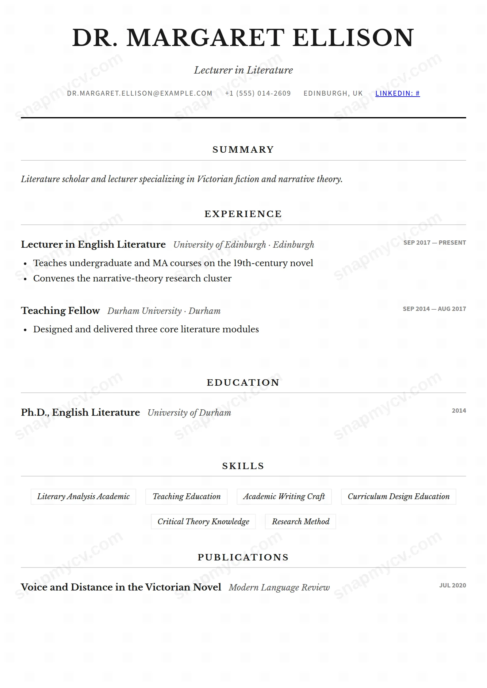
A timeless serif layout with a refined, slightly academic voice. The CV equivalent of a well-tailored navy suit — correct everywhere, dated nowhere.
Best for: traditional industries and academic-adjacent roles. Free to fill in, restyle, download as a PDF, or publish at your own SnapMyCV link.
Applicant tracking systems: ATS-friendly. Single-column, standard section headers, parses cleanly in most applicant tracking systems.A template's styling never changes the advice that matters most — lead with achievements, quantify your impact, and tailor the content to each role.
New to writing a CV? Read our step-by-step CV guide and ATS tips, then come back and make this design your own.
Classic Serif is a typographic design before it is a layout. Everything sits in Libre Baskerville, a warm book serif with real ink on the page, held to a single centred column no wider than 800px so the measure stays comfortable to read. The name leads in uppercase with open letter-spacing, an italic headline follows, and a firm 2px black rule seals the header the way a title page closes off from the body. The contact line runs across the centre in small uppercase Source Sans Pro, the only sans-serif in the design, so it reads as a quiet caption instead of fighting your name for attention.
The rest of the hierarchy is built from weight and rules rather than colour. Section titles are centred, uppercased and underlined with a thin grey hairline, which gives the document the mirror symmetry of a printed page. Summaries and role descriptions are justified and italicised in soft grey, dates drop to tiny bold uppercase sans-serif, and skills sit as italic badges inside fine bordered boxes. There is no sidebar to balance and no palette to manage, so the page succeeds or fails on the quality of its typesetting and its prose.
This template is right for fields where tradition is the signal: academics, lawyers, editors and publishers, civil servants, and finance or consulting professionals submitting to institutions that expect composure over flash. The centred, justified treatment flatters a strong narrative summary and dense experience entries, and it gives publications, awards and certifications a natural home, which makes it comfortable for research-heavy and scholarly careers.
Be honest about who should walk away. If you work in a visual or product field where a portfolio and colour do the talking, the monochrome, book-serif formality will read as stiff. Early-career applicants with thin content will expose the centred rules, which look bare when a section carries only a line or two, and anyone who wants a scannable, bullet-heavy one-pager will fight the justified italic prose the whole way. This design rewards people who actually have a paragraph to write.
Because the design lives on its prose, write full, well-edited descriptions and let the justified columns typeset themselves. Keep your headline to a single crisp line so the italic holds its weight, and keep the contact line short so it stays a caption rather than wrapping. Group skills tightly so the bordered badges form neat rows instead of scattering across the width, and lean on highlight bullets to break up your longest roles so a justified block never runs too many unbroken lines.
The most common mistake with this style is starving it. Centred hairline rules look deliberate only when each section beneath them carries real content, so prune anything thin before you publish and fold two weak sections into one strong one. Aim for substantial summary and experience blocks, three to five roles with a few highlights each, and a compact skills row. If a section cannot justify the space its centred title claims, it does not belong on this page.
The underlying structure is a genuine single centred column with conventional spelled-out headings like Experience and Education, so there is no multi-column order for a parser to scramble. The two things to sanity-check are the bordered italic skill badges and the tiny sans-serif dates, which are styling rather than structure. Download the PDF and copy its text into a blank document to confirm skills and dates land in a sensible reading order before you apply.
Better than almost any coloured template, because it is already built entirely from black type, soft grey prose and thin grey rules. There is no accent colour to wash out and no dark header block to turn muddy, so a greyscale office printout looks essentially identical to the screen version. The one thing to watch is that the soft grey summary text stays legible on a low-toner printer, since it is intentionally lighter than the black headings.


