
A traditional and clean layout with a balanced grid structure.
Create a free account to customize and publish this design.
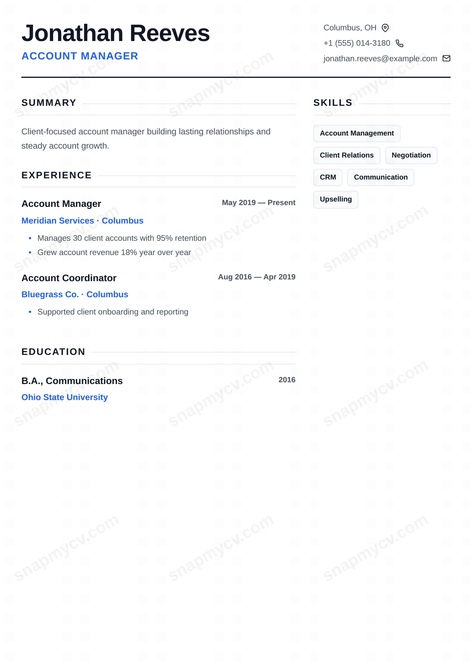
The traditional balanced-grid CV, done properly: clear sections, conventional order, no surprises. The safest possible layout — and safety, well-executed, gets interviews.
Best for: any role where convention is an asset. Free to fill in, restyle, download as a PDF, or publish at your own SnapMyCV link.
Applicant tracking systems: ATS-friendly. Single-column, standard section headers, parses cleanly in most applicant tracking systems.A template's styling never changes the advice that matters most — lead with achievements, quantify your impact, and tailor the content to each role.
New to writing a CV? Read our step-by-step CV guide and ATS tips, then come back and make this design your own.
Classic Starter is built around one typeface and one accent, and it commits to both. The whole page is set in Poppins, a geometric sans that stays friendly at small sizes, so your name reads as heavy near-black (#111827) at the top left while the job headline sits under it in spaced uppercase royal blue (#2563eb). That is the only colour in the document. Dates and bullet markers pick up the same blue, section titles run in tracked-out caps with a hairline rule trailing off to the page edge, and a firm 2px charcoal rule under the header separates your identity block from the body. Nothing competes, so the eye lands on the name first and the headline second, exactly as intended.
The layout reinforces that calm. A 2:1 grid puts summary, experience, projects and education in a wide left column and pushes skills, languages, certifications and awards into a slimmer right sidebar. Contact details align right behind small line-icons for location, phone, email and website, which keeps the top edge tidy without a heavy contact block. Skills render as soft rounded tags on a pale grey fill, a small texture change that breaks up the sidebar without adding a second colour. The generous whitespace is a deliberate choice, not an accident: it lets a short history look composed rather than empty.
The name is honest. Classic Starter is aimed at students, graduates, interns and career-changers assembling one of their first serious CVs. The two-column shape gives a thin work history somewhere to stand, because the sidebar foregrounds the skills, languages and certifications you already have while the wide column carries whatever experience and projects you can show. Recruiters scan it in seconds precisely because the single blue accent and the plain Poppins hierarchy never make them hunt.
It is the wrong pick if you are a senior professional with fifteen years of roles, long project lists and publications. The airy 2:1 grid that flatters a short history turns cramped when you force a dense record into it, and the restrained one-accent styling reads as understated rather than authoritative for executive applications. If your material naturally runs past two pages, a denser single-column or timeline layout will serve you better than this one.
Lead the wide left column with a tight three-line summary, then write experience and project entries as short, outcome-first bullets so the blue markers line up down the page. Keep the left column reserved for anything with dates and narrative, and treat the right sidebar as your evidence rail: put skills as specific tags rather than vague ones like team player, and stack languages, certifications and awards beneath them. Because the skill tags sit on pale grey pills, six to ten precise tags look intentional while twenty overflow the slim column and wrap awkwardly.
The common mistake with this style is adding colour. The design earns its calm from having exactly one accent, so a second highlight colour breaks the system and makes the page look busier than a fuller template would. The other mistake is padding a thin history to fill space; with light content the grid stays balanced on its own, so let the whitespace sit. Aim for one page, keep section titles to the standard set so the trailing rules stay even, and resist stretching bullets past two lines each.
The section headings are the standard ones an applicant tracking system expects and the text is real selectable text, not an image, so most parsers handle it. But it is a two-column design, so before you apply, copy everything out of your exported PDF into a blank document and confirm the right sidebar and left column still read in a sensible order rather than interleaving.
Yes, because the design never relies on colour to carry meaning. The name is already near-black #111827, the header rule is charcoal, and the blue only tints the job headline, dates and bullet markers, which all drop to legible mid-grey when printed in black and white. The uppercase tracked section titles and the 2px header rule keep the hierarchy clear even with no colour at all.


