
Clipboard-inspired layout with medical blue accents for physicians.
Create a free account to customize and publish this design.
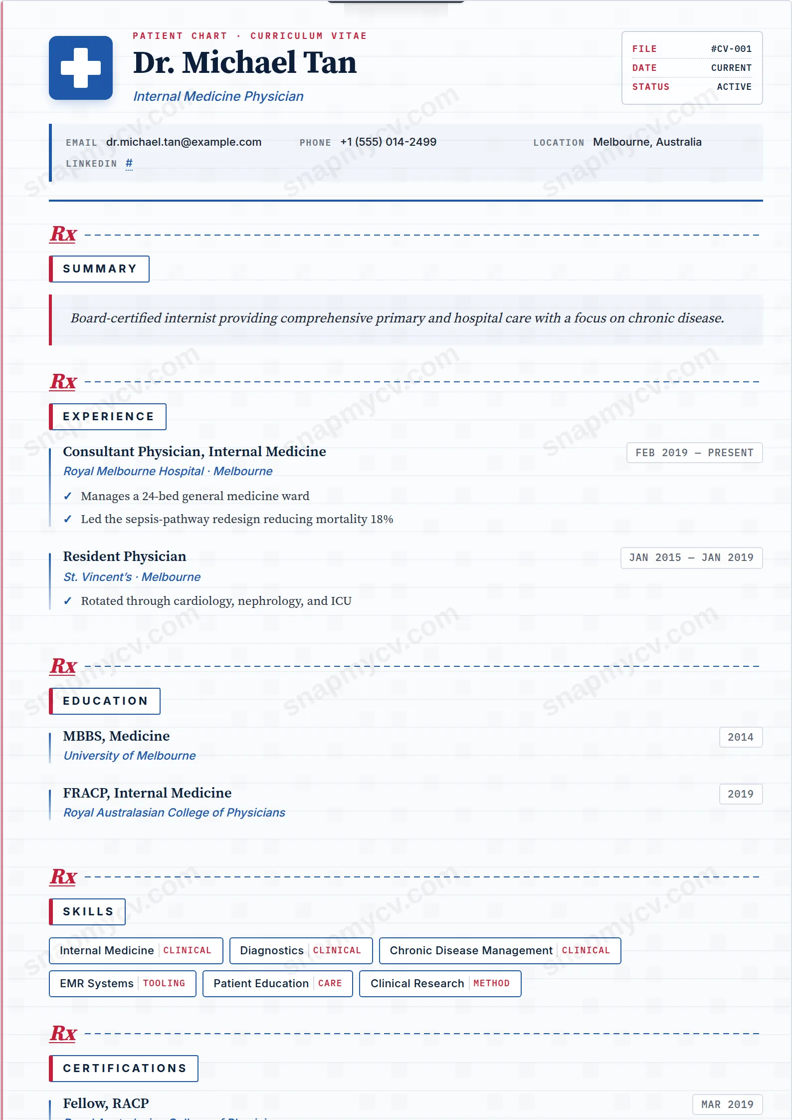
A clipboard-inspired layout in medical blue that mirrors how clinicians actually document: chronological, scannable, nothing buried. Designed to survive both human and ATS triage.
Best for: physicians, residents, and clinical staff. Free to fill in, restyle, download as a PDF, or publish at your own SnapMyCV link.
Applicant tracking systems: ATS-friendly. Single-column, standard section headers, parses cleanly in most applicant tracking systems.A template's styling never changes the advice that matters most — lead with achievements, quantify your impact, and tailor the content to each role.
New to writing a CV? Read our step-by-step CV guide and ATS tips, then come back and make this design your own.
Clinical Notes commits fully to the patient-chart conceit and earns it through restraint. The page reads as a faint clipboard: horizontal rules in pale medical blue (#1e58a8) run across a soft #fbfcfe to #f6f8fb paper gradient, a single crimson margin line drops down the left edge like a real prescription pad, and a metal clip anchors the top while a faint medical-cross watermark sits low on the right. A blue Rx cross badge, a 'PATIENT CHART · CURRICULUM VITAE' label and a monospaced FILE / DATE / STATUS panel finish the header. None of it shouts, because the ruled lines are pale and the crimson is spent only on the margin, the Rx marks and the accents.
Typography carries the diagnostic tone. Source Serif Pro sets the name at a confident 32px and runs the body, so the record still reads like considered prose rather than a form. IBM Plex Mono takes the chart labels, dates and vitals keys, which is where the clinical feel actually comes from, and Inter supplies crisp uppercase section titles. Each section opens with an italic red Rx mark over a dashed blue rule, achievements are ticked with blue check marks, and the footer stamps the record 'CONFIDENTIAL · PATIENT RECORD' with an 'M.D.' sign-off. The hierarchy is serif for substance, mono for data, sans for signposting.
This is a single-column template made for clinicians who want their CV to look unmistakably medical: physicians, residents, registrars, consultants and surgeons, and equally nurses, dentists and allied health professionals. The vitals strip that renders your contact details, the badge-style skills with optional category tags, and the separate clean grids for languages and certifications all suit a long clinical record that has to stay scannable across procedures, rotations and publications.
Be honest about where it does not belong. The Rx marks, prescription-pad margin and 'M.D.' sign-off are healthcare signals, so anyone outside medicine, a marketer, a developer, a finance analyst, will look like they are wearing a borrowed white coat. It is also a poised, quiet design rather than a bold executive statement, so if you want a CV that projects seniority through scale and colour this is not it. Pick it when the clinical framing is the point, not as a novelty.
Lead with a tight summary in the italic callout box, three or four lines at most, then let the ticked highlights do the heavy lifting. Because the check marks invite short evidence-led statements, write each as one clean line: a procedure and its volume, an audit and its outcome, a publication and its journal. The mono date column rewards accuracy and punishes vagueness, so give real months and years and keep them consistent down the page. Load your genuine skills into the badge row and use the category tags to separate clinical skills from technical or administrative ones rather than dumping everything into one long strip.
The common mistake is fighting the format with dense paragraphs under each role, which collides with the ruled lines and buries the ticked highlights the layout is built around. Keep experience entries to a few crisp bullets each and let the certifications and languages grids carry the credentials that would otherwise clutter the body. The design holds a substantial record comfortably, but only if you respect its rhythm: short lines, accurate dates, and one idea per tick. Overwrite it and the clean chart turns into a cramped one.
The section headings are standard and the single-column flow is parser-friendly, which is the important part. The ruled lines, crimson margin, Rx marks and check-mark bullets are purely decorative and are not read as text, but the medical chart framing is unconventional, so run the plain-text test first: copy the rendered CV into a blank document and confirm your name, roles, dates and bullets land in a sensible order before submitting through any tracking system.
It degrades gracefully because the design never relies on colour to carry meaning. The crimson (#c41e3a) margin and Rx marks and the medical blue (#1e58a8) rules drop to soft greys, while the real structure comes from the serif and mono type contrast and the ticked bullets, which stay legible in black and white. A greyscale print reads as a clean, faintly ruled chart rather than a broken colour design.


