
Bold red accent with quota callouts for sales executives.
Create a free account to customize and publish this design.
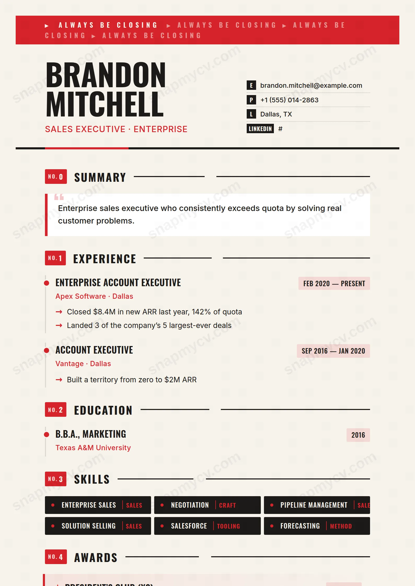
Bold red accents and quota callouts with no decoration wasted anywhere else. A sales CV that behaves like a good pitch: numbers first, confidence throughout, short.
Best for: quota-carrying sales executives and closers. Free to fill in, restyle, download as a PDF, or publish at your own SnapMyCV link.
Applicant tracking systems: ATS-friendly. Single-column, standard section headers, parses cleanly in most applicant tracking systems.A template's styling never changes the advice that matters most — lead with achievements, quantify your impact, and tailor the content to each role.
New to writing a CV? Read our step-by-step CV guide and ATS tips, then come back and make this design your own.
Closer treats the top of the page like a sales floor. A fire-red #d6232a band runs an "ALWAYS BE CLOSING" ticker across the full width, then your name lands in heavy uppercase Oswald, a condensed grotesque built for headlines, against a warm paper #f7f3ec ground rather than sterile white. Contact rows sit to the right, each prefixed with a small charcoal label chip (E, P, L, W), and a thick #1c1a18 rule capped by a red underscore seals the header. The colour is deliberate: red reads as urgency and appetite, charcoal keeps it from tipping into gimmick, and the paper tone warms the whole thing so the boldness feels considered rather than shouty.
Below the masthead the energy is channelled into structure. Sections carry numbered red "NO." badges, so the eye moves through the page in a fixed running order. The summary is set as a pull-quote with an oversized opening quotation mark and a red left border, and roles hang off a vertical timeline of red dots with arrow bullets that pull the reader toward each achievement. Skills render as dark badges, languages as red-topped cards, and awards become gradient stat callouts marked with a star. It is a single-column layout, so hierarchy is carried entirely by weight, number and colour instead of a sidebar split.
Closer is honestly aimed at anyone measured by a number: account executives, sales directors, business development and partnerships leads, SDR managers, and revenue-facing founders. The masthead ticker and the pitch-framed summary only land if your results are genuinely quantified, so this template rewards people who can point to percent-to-quota, deal sizes, pipeline generated and ramp time. The star-marked award callouts exist precisely to headline those figures.
Be honest about where it works against you. If you are in a conservative field such as law, academia, banking, medicine or the public sector, the fire-red band and the "ALWAYS BE CLOSING" ticker will read as brash before a reader gets to your substance. It also suits mid-to-senior operators with real outcomes to show; a graduate or career-changer with thin metrics will find the swagger writing cheques the content cannot cash. If your value is quiet craft rather than closing, a calmer template serves you better.
Write the line under your name as a positioning statement, not a job title, because it sits directly beneath a name set for impact and sets the tone for everything below. Treat the quotation-marked summary as a two-to-three sentence pitch in the first person voice a buyer would recognise. Because every experience entry is an arrow bullet on the red-dot timeline, each one should be verb-first and end in a result; vague duty statements look weakest in this format. Feed your strongest hard numbers into the gradient award callouts, since the star treatment is wasted on soft mentions.
The common mistake is volume. A single column with heavy type fills fast, so keep skill badges to roughly eight to twelve of your sharpest, or the dark tags turn into a grey wall that flattens the design. Aim for four to six roles, three or four bullets each, and let the whitespace on the paper ground do its job. Language cards and awards are accents, not filler, so leave them empty rather than padding them out.
The layout underneath is a clean, single-column structure with conventional ordered headings, which most applicant tracking systems read well. The ticker band, label chips and badges are styling rather than content, so your actual text stays legible to a parser. As with any coloured design, run the plain-text test before applying: copy the exported PDF into a blank document and confirm every role, date and bullet still reads in order.
The design leans on two tones, fire red #d6232a and charcoal #1c1a18, on a warm paper background, so in greyscale the red drops to a mid-grey while the charcoal stays near-black. The structure still holds because hierarchy comes from Oswald's heavy weights, the numbered badges and the timeline dots rather than colour alone. You lose the urgency the red signals, but the page stays readable, so a black-and-white print for an interview panel remains perfectly usable.


