
Blueprint-grid aesthetic with isometric markers for cloud and DevOps engineers.
Create a free account to customize and publish this design.
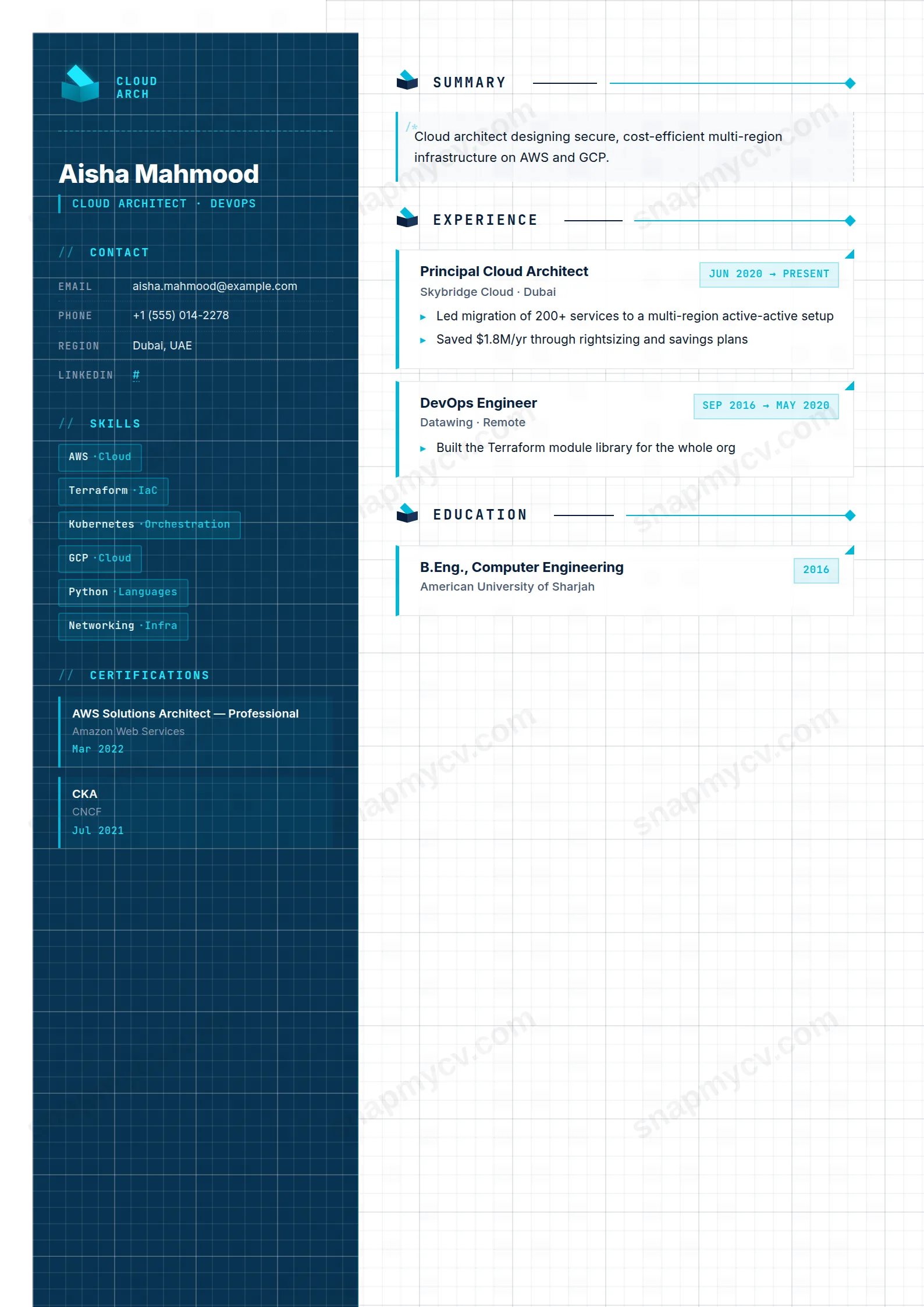
Blueprint grids with isometric markers nod to architecture diagrams while the content stays strictly organized: platforms, migrations, and scale numbers in clean tiers.
Best for: cloud architects and platform engineers. Free to fill in, restyle, download as a PDF, or publish at your own SnapMyCV link.
Applicant tracking systems: Light styling. Mostly parseable but uses sidebars, columns or visual elements that may confuse stricter ATS.A template's styling never changes the advice that matters most — lead with achievements, quantify your impact, and tailor the content to each role.
New to writing a CV? Read our step-by-step CV guide and ATS tips, then come back and make this design your own.
The design borrows the visual grammar of an architecture diagram and applies it to a resume. A 280px sidebar runs from deep navy #0a1f3d down to #061530 with a cyan glow, and it sits against a white main column ruled with a faint blueprint grid, so the page reads like a drafting-table plan rather than a letter. Cyan #00b8d9 and its brighter sibling #1de9ff carry the accent work across an isometric-cube emblem, isometric markers beside each section title, chamfered corners on the entry cards, and dotted divider lines. The typographic split does the heavy lifting: body copy is Inter for readability, while every label, date, and heading switches to JetBrains Mono, giving the whole document a compiled, engineered feel.
The detailing is deliberately code-flavoured rather than decorative. The summary opens with a literal /* comment inside a tinted panel, skills render as monospace chips, and certifications stack in cyan-bordered blocks down the sidebar. Date ranges use arrow notation inside boxed mono tags, and a SPEC · V1.0 / SCALE 1:1 stamp anchors the sidebar footer. Each choice reinforces the same idea, that this is documentation written by someone who thinks in systems, and the restraint keeps it from tipping into gimmick.
This is a specialist template for people whose work lives in diagrams and trade-offs: cloud and solutions architects, DevOps and SRE engineers, infrastructure and platform leads. The sidebar is purpose-built for what hiring teams in this space scan first, with dedicated blocks for skills, languages, certifications, and hobbies, so AWS, Azure, or GCP credentials sit high and visible instead of being buried in prose. If your value is measured in uptime, latency, and cost, the schematic styling signals fluency before a word is read.
Be honest about where it misfires. The monospace typography and code-comment motifs read as engineering culture, so they work against candidates in law, healthcare, education, hospitality, or client-facing creative roles where the aesthetic looks alien. It also assumes a technical, credential-heavy career: a junior with a thin certifications list or an early-career generalist will leave the sidebar looking sparse. If your field values warmth, narrative, or a conventional single-column format, choose something quieter.
Feed the structure what it expects. Keep skill chips terse (service names, tools, IaC stacks) so the monospace grid stays even, and use the optional category tag to group them rather than letting one long run wrap awkwardly. Treat the summary panel as a two or three sentence systems overview, not a paragraph of adjectives, because the /* comment framing rewards precision. In experience, write outcome-led highlights with real numbers on latency, cost, uptime, and scale, since the boxed bullet cards look best with crisp quantified lines.
The common mistakes are all about overfilling. Pasting a wall of prose into the summary panel or listing thirty skills collapses the clean chip grid into visual noise, and long certification names can strain the narrow cyan-bordered sidebar blocks, so favour the shorthand (SAA-C03 over the full title). Aim for four to six roles, three to five bullets each, and let the sidebar carry credentials and languages so the main column stays a focused engineering record.
The headings are standard and the content is real selectable text rather than images, which helps a scanner read it. Still, this is a colour-led two-column design, and some older applicant tracking systems flatten multi-column layouts in an unpredictable order. Copy the whole CV into a blank document first and confirm the navy sidebar and white main column still read sensibly before you rely on it for a heavily automated pipeline.
Reasonably well, because the design leans on contrast rather than colour alone. The deep #0a1f3d sidebar drops to a dark grey that keeps the white sidebar text legible, and the cyan #00b8d9 accents read as a mid-tone that still separates section markers and card borders. The blueprint grid and dotted dividers are subtle by design, so a black-and-white print looks clean, just less obviously cloud-branded than the full-colour version.


