
Terminal-inspired template with monospace headings and code-syntax accents for software engineers.
Create a free account to customize and publish this design.
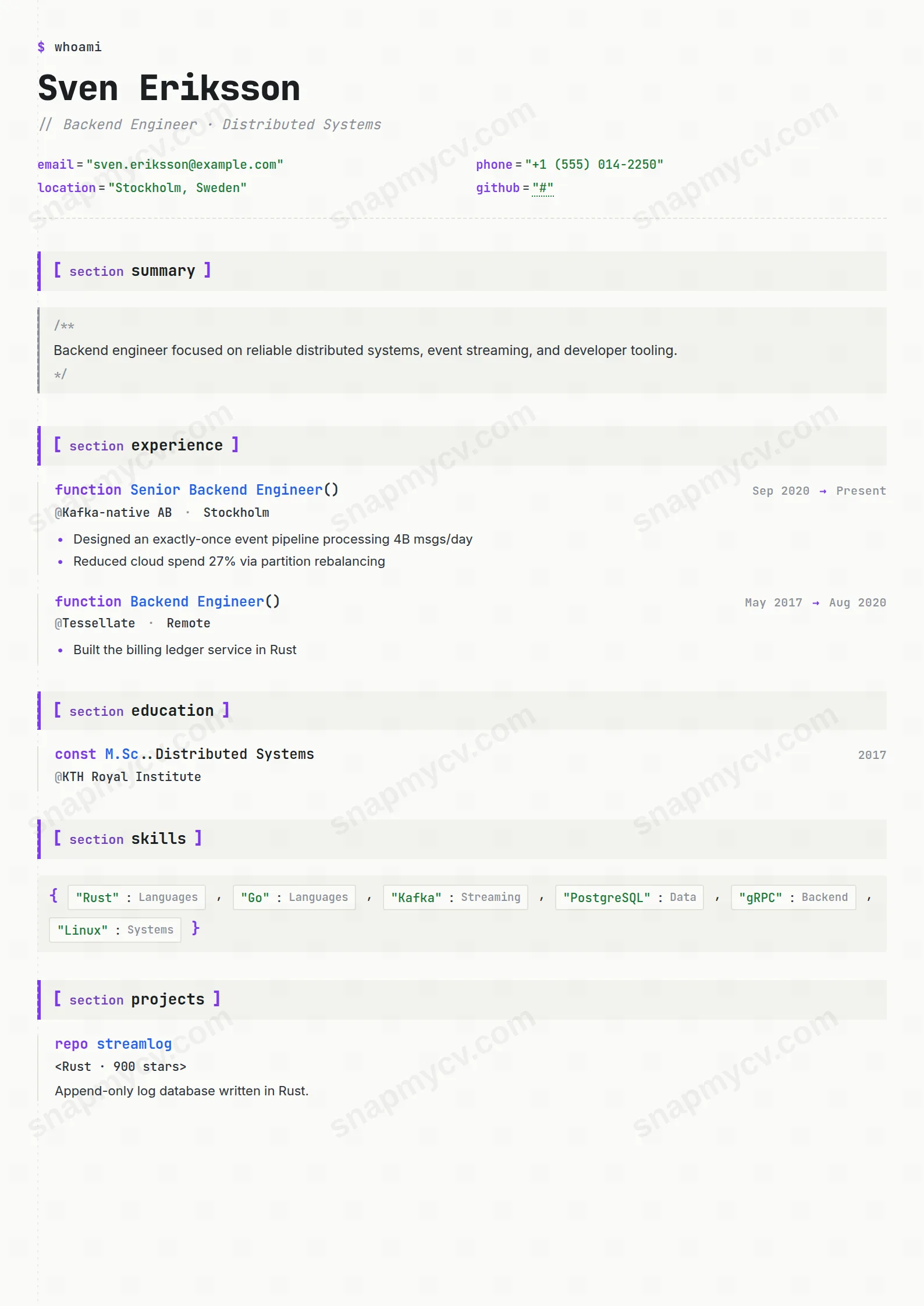
Monospace headings and code-syntax accents in a terminal-inspired frame. For developers whose aesthetic is the editor they never leave.
Best for: software engineers with a terminal-native identity. Free to fill in, restyle, download as a PDF, or publish at your own SnapMyCV link.
Applicant tracking systems: Visual only. Designed for human readers — heavy decoration, dark backgrounds or column layouts that often break ATS parsing.A template's styling never changes the advice that matters most — lead with achievements, quantify your impact, and tailor the content to each role.
New to writing a CV? Read our step-by-step CV guide and ATS tips, then come back and make this design your own.
Codex Mono commits to a single idea and executes it cleanly: your career rendered as a source file. It opens on a terminal prompt, $ whoami, with a blinking cursor, then sets your name in heavy JetBrains Mono so the very first glance reads as a code editor rather than a document. Contact details follow as syntax-highlighted key="value" pairs in string green (#1f7a3a), section titles arrive bracketed as [ section experience ] tagged with a purple keyword (#7c3aed), and a faint dashed gutter runs down the left like an editor's line margin. Each of these is a real syntax cue, not ornament, which is why the metaphor holds together instead of looking like a novelty skin.
The restraint is in the substrate. Everything sits single-column on warm off-white paper (#fbfbf9) with near-black ink (#1b1f23), and body copy quietly switches from the monospace to Inter so your sentences stay readable while the IDE styling stays a flourish. Roles are framed as function role(), degrees as const, side projects as repo, and skills as a {} object of badges, giving a consistent grammar that a technical reader parses instantly. Numbers render in amber (#b45309), so a well-quantified bullet lights up on the page the way a highlighted literal does in an editor.
This template is genuinely right for engineers who want their craft legible in the first two seconds: backend and full-stack developers, DevOps and platform engineers, data and ML engineers, and computer-science students whose strongest evidence is GitHub work. The repo framing for projects, with its <tech · stack> line, and the {} skills object reward a portfolio built on concrete tooling and live repositories, so the more your value lives in shipped code, the better this fits.
Be honest about where it works against you. If you are a designer, marketer, lawyer, finance or operations professional, or a manager whose story is people and outcomes rather than systems, the function role() and key="value" scaffolding will read as costume. It also suits builders over pure leaders: a staff engineer still writing code wears it well, but a VP of Engineering pitching strategy to a non-technical board is better served by something plainer. And if you are applying somewhere conservative that has never seen a terminal, the joke may land as noise.
Treat the monospace grid as dense by design and write to it. Keep role titles literal and let the function role() framing supply the flourish, so a line reading Senior Backend Engineer needs no extra styling from you. In the skills {} object, name real languages, frameworks and tools rather than soft traits, because badges of Go, Kubernetes and Postgres parse cleanly where "team player" looks out of place. Point repo entries at live URLs and a personal site so the green strings become genuine, clickable evidence, and lean on hard metrics in experience bullets since numbers render in amber and are the thing the layout visibly rewards.
The common mistake is overplaying the gag: cramming in fake variable names, ASCII art, or jokey job titles that fight the real content. The second mistake is length. This is a compact, single-column format, so aim for one page, three to five tight results-first bullets per role, and a skills object of maybe fifteen to twenty items rather than an exhaustive dump. Because the dashed gutter and code-block indent already carry the structure, resist adding your own dividers or dense paragraphs; short declarative lines keep the whole thing reading like clean, well-formatted code.
The single-column structure helps, but the code-like punctuation such as function role() and key="value", plus the green, purple and amber tokens, can trip stricter parsers that expect plain headings. Run the plain-text test first: copy the rendered CV into a blank document and confirm your roles, dates and skills survive as readable lines. If a role routes through a rigid ATS, keep this for direct and portfolio-facing sends and pair it with a plainer export.
Mostly yes, because the design leans on structure rather than colour to communicate. The bracketed [ section ] titles, dashed left gutter, JetBrains Mono weight and code-block indents all hold up in black and white, so hierarchy stays clear. You lose the semantic signal of string green contacts and amber numbers, which flatten to grey, but nothing becomes unreadable, so a greyscale office print is safe.


