
Social-card sections with gradient accents for content marketers.
Create a free account to customize and publish this design.
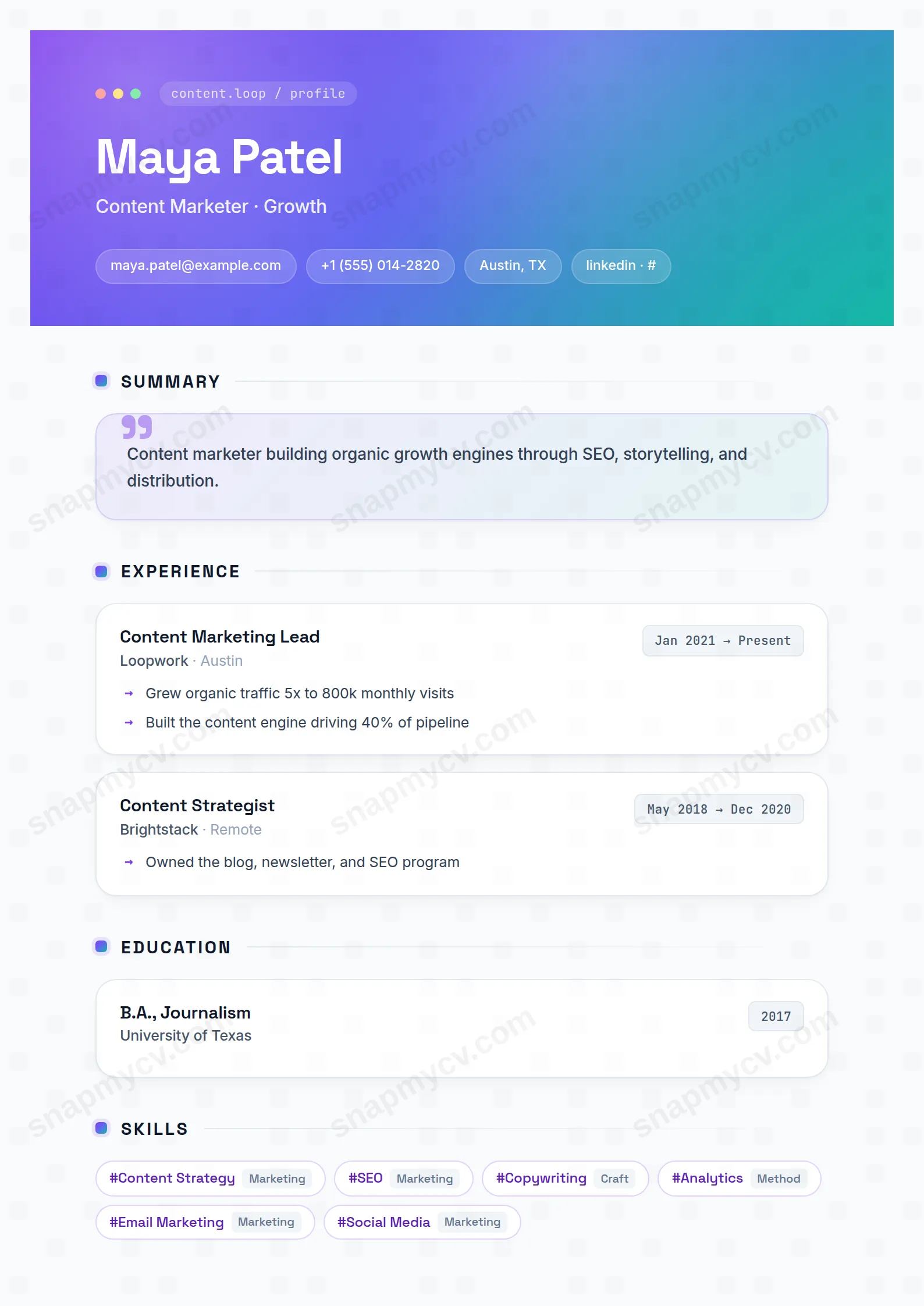
Sections styled as social cards with gradient accents — your CV formatted in the medium you work in. Campaigns, channels, and growth numbers each get their own card.
Best for: content marketers and social media managers. Free to fill in, restyle, download as a PDF, or publish at your own SnapMyCV link.
Applicant tracking systems: Light styling. Mostly parseable but uses sidebars, columns or visual elements that may confuse stricter ATS.A template's styling never changes the advice that matters most — lead with achievements, quantify your impact, and tailor the content to each role.
New to writing a CV? Read our step-by-step CV guide and ATS tips, then come back and make this design your own.
Content Loop is a deliberate piece of mimicry. It takes the interface language of the platforms content people work in all day and turns a CV into something that looks native to that world. The full-bleed header runs a three-stop gradient from violet #7c3aed through indigo #6366f1 into teal #14b8a6, then plants three traffic-light dots and a monospace 'content.loop / profile' handle in JetBrains Mono along the top, so the page reads as an app chrome before it reads as a resume. Your name lands large in Space Grotesk, the geometric-humanist typeface that then carries every heading, while contact details tuck into frosted, pill-shaped chips instead of a plain address block.
The body makes the same bet, quietly. Everything below the header is a single column of white cards floating on a soft slate-50 canvas, which keeps the eye moving down one clean track rather than hunting across columns. Roles become 'posts' stamped with a monospace date badge, skills collapse into a violet-outline hashtag cloud, and projects and certifications drop into a two-up grid banded with a thin gradient bar. Inter handles body copy and arrow bullets keep each card scannable. The colour and novelty live almost entirely in the header and the accents, so the actual content stays legible.
This template is genuinely built for one crowd: content marketers, social and community managers, copywriters, brand and growth folk, newsletter writers and creators. For them the feed styling is not decoration, it is proof you understand the medium, and the pull-quote summary plus post-style roles let you show voice as well as results. It also flatters people whose work is inherently visual or platform-native and who are applying somewhere that values that fluency.
Be honest about who should walk past it. If you are targeting law, finance, government, academia, medicine or any tradition-bound desk, the gradient header and hashtag cloud will read as unserious, and the app-chrome handle is a liability rather than a signal. It is also a poor fit for very dense, decade-deep career histories, because the single-column card feed rewards focus and punishes people who need to cram twelve roles onto one page.
Feed the structure the content it is designed for. Lead every role 'post' with a concrete outcome and push the numbers that matter into the arrow bullets: reach, retention, subscriber growth, engagement rate, pipeline. Keep role titles short so they sit cleanly on a single line in the Space Grotesk post head, and group your skills by category before they become the hashtag cloud, otherwise the violet pills sprawl into an unreadable mess. Treat the pull-quote summary as a hook of one or two sharp lines, not a paragraph of throat-clearing, because the oversized quotation mark magnifies whatever you put there.
The most common mistake with this layout is over-filling it. Because each item is a card, three vivid roles read far better than eight thin ones, and a tight two-up projects grid beats a wall of certifications. Aim for a summary of two to three lines, four to six bullets per recent role tapering for older ones, and skills grouped into a handful of clusters. Let the gradient header carry the personality so your wording can stay plain and confident, and resist adding decorative filler that competes with the design already doing that job.
The underlying markup is clean single-column HTML with standard section headings, which is the part ATS parsers actually read, so your roles, dates and bullets generally come through in order. The gradient, frosted chips and violet hashtag pills are visual styling and carry no text penalty, but the safest check is to copy the rendered CV into a plain-text document and confirm every skill and date still appears. If a role relies on a keyword that only lives inside a stylised pill, make sure it also sits in your body text.
It holds up better than most colour-forward designs because the layout, not the palette, does the structural work. The violet-to-teal header collapses into a mid-grey band, the traffic-light dots and gradient proficiency tags lose their hue, and the violet hashtag outlines turn pale, so some of the app-feed personality flattens. The white cards, monospace date badges, Space Grotesk headings and arrow bullets stay perfectly legible, so a greyscale print still functions as a clear CV, it just loses the wink that makes the colour version distinctive.


