
Narrative pull-quote layout pairing serif and sans for copywriters.
Create a free account to customize and publish this design.
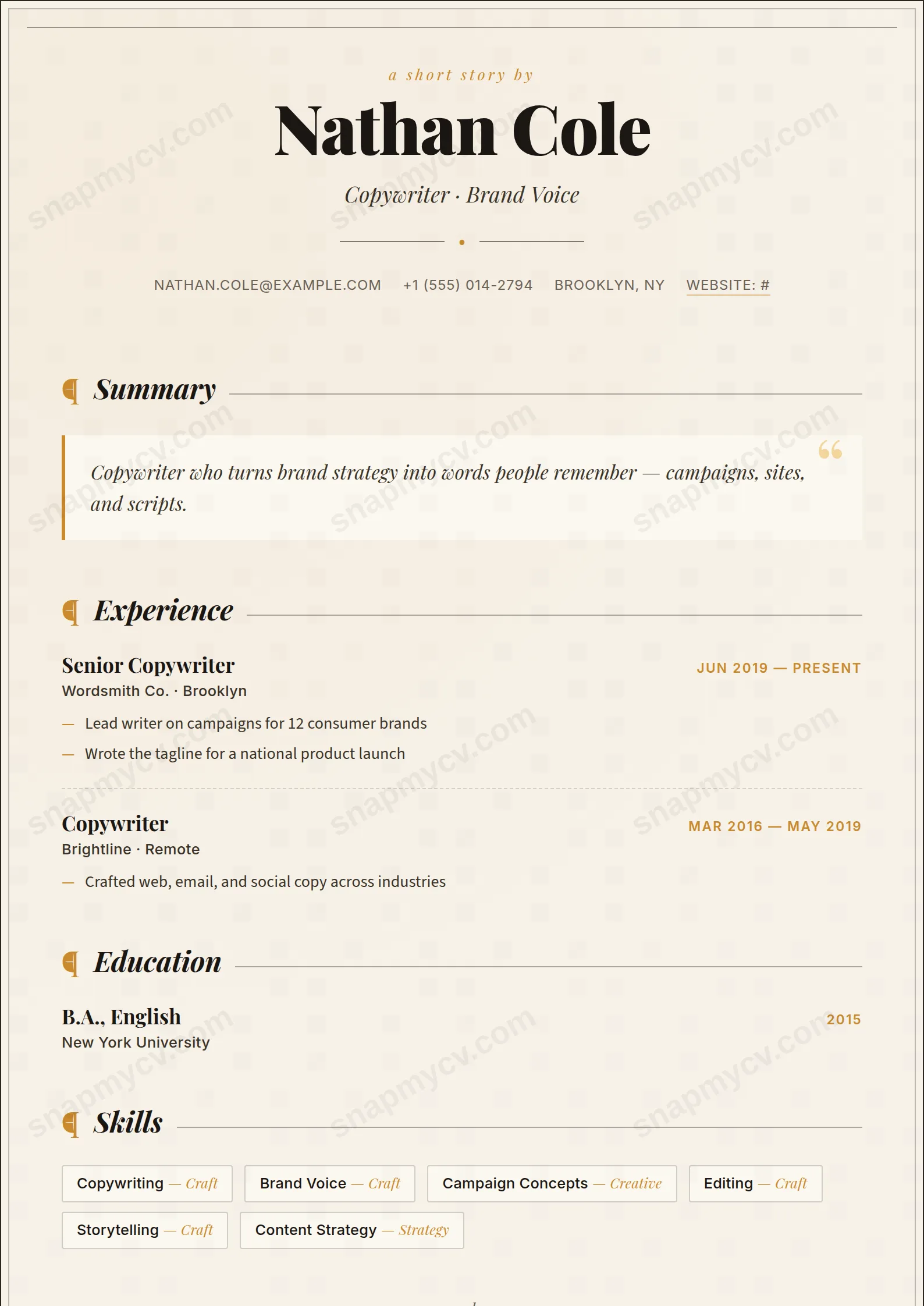
A narrative layout that pairs serif and sans and makes room for a pull-quote — because a copywriter's CV should prove the craft in its own body text.
Best for: copywriters and brand writers. Free to fill in, restyle, download as a PDF, or publish at your own SnapMyCV link.
Applicant tracking systems: ATS-friendly. Single-column, standard section headers, parses cleanly in most applicant tracking systems.A template's styling never changes the advice that matters most — lead with achievements, quantify your impact, and tailor the content to each role.
New to writing a CV? Read our step-by-step CV guide and ATS tips, then come back and make this design your own.
Copywriter borrows the grammar of a magazine spread and applies it to a career. The masthead sets your name in Playfair Display at 44pt in an almost-black ink (#1b1714), floated on a warm paper cream (#f7f2e9) that carries a faint amber and ink texture, so the page looks stock-printed rather than screen-flat. A byline reading "a short story by", an italic headline, a single amber dot suspended between two hairlines and uppercase contact details complete the head of the piece, and a thin inner border rules the whole page like the trimmed edge of a printed sheet.
The choices below the masthead are all about reading. The layout holds to one column because prose wants an uninterrupted measure, and each section is announced by an amber pilcrow and an italic serif title that trails off into a fine rule. The summary is promoted into a genuine pull-quote: a paper-soft panel with a three-pixel amber spine, an oversized quotation mark and an amber drop-cap on the first letter. Roles are separated by dashed rules, achievements hang off amber em-dash bullets, and a quiet "end" sign-off closes the story. Source Sans and Inter carry the body text, keeping it crisp and legible so the Playfair serif drama stays reserved for the headlines.
This template is unapologetically for people paid to shape sentences: copywriters, content and brand writers, editors, journalists, content strategists and creative leads. The editorial styling telegraphs an ear for voice, rhythm and restraint before a hiring reader reaches your first bullet, which is exactly the signal you want inside agencies, studios, publishers and brand teams.
Be honest about where it works against you. The Playfair headlines, amber accents and pull-quote flourish read as ornate to conservative intake in banking, law, government or large corporates, where a plainer template lands better. It also punishes thin writing: because the summary sits under a drop-cap at centre stage, a generic line of adjectives is exposed rather than hidden. If your material is a list of tools rather than a body of crafted work, a more neutral structure will flatter you more than this one.
Write the summary as a real opening line, the way you would open a feature, because the drop-cap and quotation mark put that first sentence under a spotlight. One or two sentences of voice beat four of filler here. Under experience, keep highlights to punchy, results-led sentences that sit cleanly on the amber em-dash bullets, and let the dashed rules between roles do the separating so you never need extra spacing or headers. Use the skills badges, languages and publications sections to prove range, and treat a bylines or clips list as a real asset since this design expects published work.
The common mistake is over-filling a layout that was built for white space. Long paragraph blocks flatten the pilcrow-and-rule rhythm and bury the pull-quote, so cut anything that does not earn its place on the page. Aim for a tight one-page or one-and-a-bit read: a short summary, three to five roles with three or four bullets each, and compact supporting sections. The "end" sign-off works best when the story actually ends there rather than spilling past it.
It parses better than most creative styles because it is a genuine single column of real text with conventional headings, which is the arrangement parsers handle most reliably. The risk is decorative, not structural: the pilcrows, drop-cap and amber em-dash bullets are styling, so run the plain-text test by copying the rendered CV into a blank document and confirming every role, date and bullet reads in a sensible order before submitting through a strict portal.
It survives well because the design never relies on colour to carry meaning. The amber pilcrows, dot, spine and drop-cap drop to mid grey, while the almost-black Playfair headlines against the cream keep a strong contrast, so the hierarchy stays intact on a black-and-white office printer. You lose the warmth of the paper texture but not the readability or the structure.


