
Professional corporate template with a bold blue accent scheme.
Create a free account to customize and publish this design.
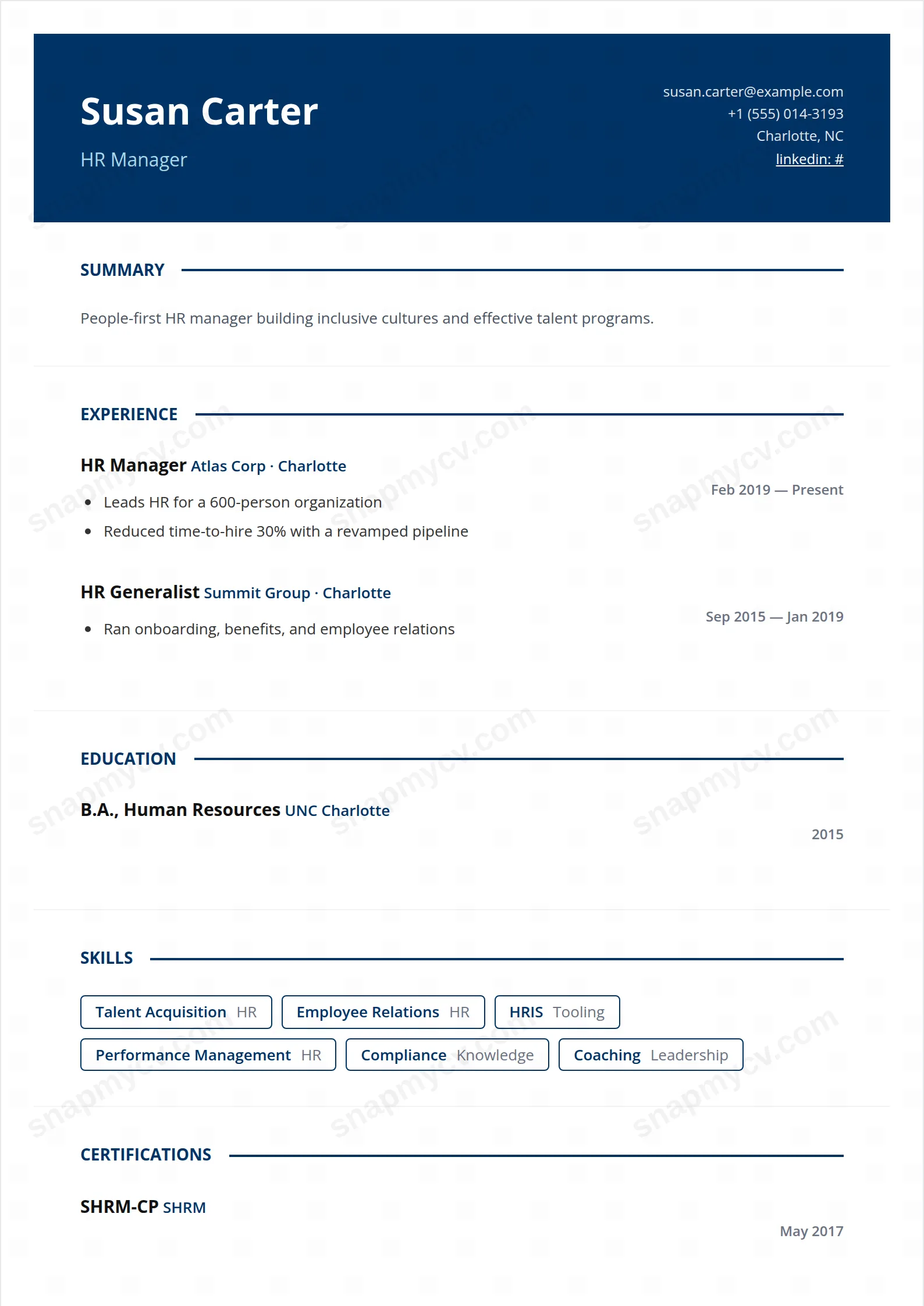
A bold blue accent system on dependable corporate structure. Recognizably professional in any industry, with enough color to avoid anonymity.
Best for: corporate roles across functions. Free to fill in, restyle, download as a PDF, or publish at your own SnapMyCV link.
Applicant tracking systems: Light styling. Mostly parseable but uses sidebars, columns or visual elements that may confuse stricter ATS.A template's styling never changes the advice that matters most — lead with achievements, quantify your impact, and tailor the content to each role.
New to writing a CV? Read our step-by-step CV guide and ATS tips, then come back and make this design your own.
Corporate Blue front-loads its authority. A solid #003366 navy band runs edge to edge across the top, and against it your name sits in bold 32px Open Sans with the headline picked out just below in a lighter #add8e6 blue. That two-tone treatment gives you an instant visual hierarchy before a single bullet is read: the eye lands on the name, drops to the role, then finds contact details set quietly in muted grey off to the right. Nothing competes, and the band carries weight without turning into a graphic-design statement.
Below the band the page turns deliberately plain, and that restraint is the point. It is a single column capped at 800px, so it reads top to bottom in one pass like a well-run agenda. Section titles are navy, uppercase and 700-weight, each closed off by a thin 2px rule that pulls the eye across the width. Roles are bold near-black, company names repeat the navy so your career line stays legible at a glance, and dates float right in grey. Skills are outlined navy badges rather than filled chips, which keeps the lower half airy instead of heavy.
This template speaks the visual language of established firms, so it is genuinely right for finance, banking, consulting, operations, project management and sales leadership, the roles where navy-and-white still reads as competence rather than flash. The single-column flow suits a linear, steady career story where each role builds on the last, and recruiters skimming a stack of PDFs get a clean reading order with no sidebar to decode.
It is the wrong choice if your field rewards visual personality. Designers, illustrators, brand and motion people, or anyone expected to show range, will find the disciplined navy palette and outlined badges too reserved to signal craft. Early-career applicants with one short role can also look thin here, because the generous single column exposes empty space rather than hiding it. If your value is portfolio-led, a template that carries imagery or a two-column split will serve you better.
Lead with a tight three or four line summary directly under the band, then let the experience block do the work, because its bold role, navy company line and right-aligned dates are engineered for a chronological narrative. Put your quantified wins in the bulleted highlights: revenue moved, teams led, budgets owned, projects shipped. The full-width column gives every line room to land, so specific numbers read cleanly rather than getting cramped. Aim for three to six highlights per recent role and taper older entries to one or two.
The most common mistake with this style is padding the outlined skill badges. Because they are unfilled navy outlines, a long grid of soft or generic terms looks noisy and dilutes the ones that matter, so keep them to genuine, named competencies. Respect the 2px section rules as real breaks and do not stack unrelated content under one heading. One page suits most mid-career profiles; two is fine for a long senior history, but trim rather than stretch so the calm, orderly rhythm holds all the way down.
The underlying structure is ATS-safe: a single column, conventional uppercase headings and a clear top-to-bottom reading order with no sidebar to scramble the sequence. The one thing to check is the coloured #003366 band and #add8e6 headline, since colour carries no meaning to a parser. Export the PDF and copy the text out to confirm your name, contacts and every section come through in the correct order.
It survives better than most colour-led designs because the layout leans on weight and structure, not hue. The #003366 band drops to a strong dark grey that still frames the name, and the 700-weight uppercase titles plus 2px rules keep the hierarchy intact. The one thing that softens is the #add8e6 headline, which pales to a light grey, so make sure your role title still reads against the band in a mono print.


