
Charcoal and champagne with embossed headers for in-house counsel.
Create a free account to customize and publish this design.
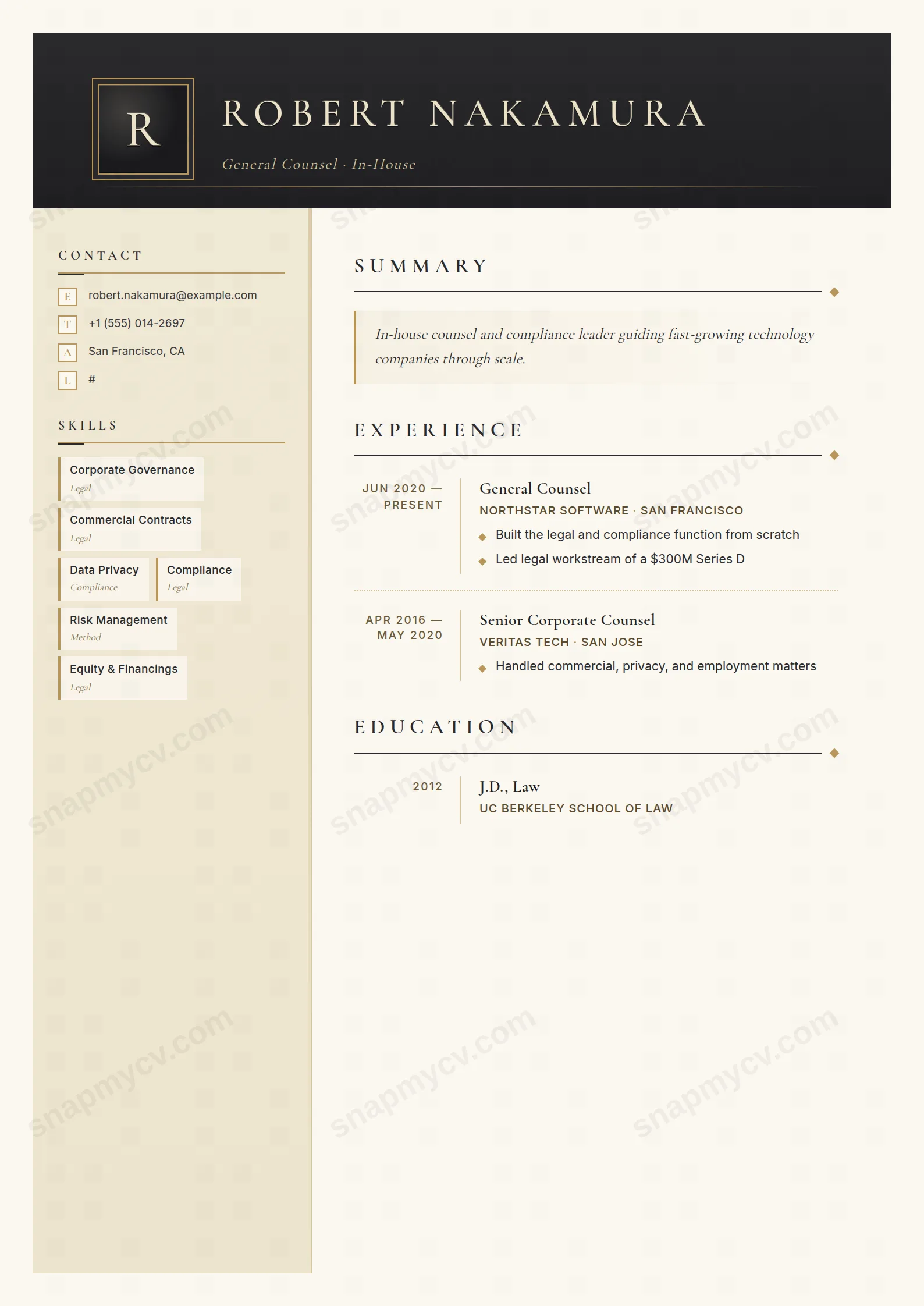
Charcoal and champagne with embossed headers: boardroom-adjacent rather than courtroom-dramatic. Built for careers measured in deals reviewed and risk averted.
Best for: in-house counsel and corporate legal teams. Free to fill in, restyle, download as a PDF, or publish at your own SnapMyCV link.
Applicant tracking systems: Light styling. Mostly parseable but uses sidebars, columns or visual elements that may confuse stricter ATS.A template's styling never changes the advice that matters most — lead with achievements, quantify your impact, and tailor the content to each role.
New to writing a CV? Read our step-by-step CV guide and ATS tips, then come back and make this design your own.
Corporate Counsel is built to read like letterhead from a corner office rather than a document off a job board. The masthead is a deep charcoal gradient from #2a2a2d to #1f1f22, carrying your name in spaced, uppercase Cormorant Garamond set in champagne #ece1c7 with a soft embossed text-shadow, so the type looks pressed into the page. A gold-bordered monogram tile stamps your initial like a wax seal, and a thin champagne-to-gold filament rules off the header. The body then settles onto warm ivory #fbf8f1 with charcoal text, a quiet, high-authority contrast that never shouts.
The structure is a two-column grid: a 240px sidebar washed in a soft champagne gradient, separated from the ivory main column by a single gold #b8975a hairline. Every deliberate choice reinforces restraint. Cormorant carries the display work in letter-spaced small caps, while Inter handles the supporting detail so the serif stays ceremonial and the gold accents stay disciplined rather than decorative. Skills sit in gold-edged cards, roles use a right-aligned date rail with gold diamond bullets, and the summary is italic Cormorant inside a champagne-tinted quote block. The whitespace is generous on purpose, letting seniority speak without ornament.
This template is right for in-house and corporate lawyers, general counsel, compliance and legal-operations leaders, company secretaries, and senior associates moving client-side. The formal serif masthead and embossed seal signal gravitas, and the sidebar's certifications and languages blocks are purpose-built for the bar admissions, jurisdictions, and qualifications a counsel CV is judged on. It is a register that rewards depth of career over novelty.
Be honest about the mismatches. A junior or entry-level candidate will leave the champagne sidebar looking sparse, because the cards and credential stacks are designed to be filled. Anyone in a fast-moving startup, creative, or product-tech role will find the ornate Cormorant and gold filament reads as stuffy rather than credible for that audience. And if you are applying almost entirely through aggressive one-column parsing portals, the two-column layout works against you. This design is for people who want to look established, not disruptive.
Lead the italic Cormorant summary with your remit and the matters you own, and keep it to three or four lines. It sits in a champagne quote block, so overfilling it breaks the elegance the whole page depends on. In the ivory main column, present roles in reverse-chronological order so the right-aligned date rail keeps a long career scannable, and make each gold diamond bullet outcome-led: deals closed, risk reduced, disputes resolved, value protected. Aim for three to five roles with tight bullets rather than a dense wall.
The 240px sidebar is narrow, so it punishes long labels. Group skills into clear categories and keep each entry to a word or two, or the gold-edged cards wrap awkwardly and lose their crispness. Reserve the certifications block for genuine credentials such as bar admissions and jurisdictions, and let languages run as the quiet stacked list it was designed for. The most common mistake with this style is diluting the gold accents by cramming everything in; the palette only reads as expensive when there is room around it.
The charcoal masthead stays strong in black and white because its authority comes from the dark-header-against-ivory contrast, not the colour itself. The gold #b8975a hairline, the champagne sidebar, and the gold-edged skill cards all flatten toward pale grey, so those accents largely disappear and the sidebar reads as a soft tint block. The document remains perfectly legible, but a greyscale print loses the warmth and the seal-like richness that define the design, so keep a colour PDF for anything that represents you seriously.
It is built for depth. The two-column grid offloads certifications, languages, and skills into the sidebar, which frees the ivory main column entirely for experience, and the right-aligned date rail keeps many roles scannable rather than cluttered. The trade-off runs the other way: a short early-career history leaves the champagne sidebar and credential stacks looking empty, so this layout flatters a fifteen-year counsel more than a first job.


