
Structured numbered-section syllabus layout for curriculum designers and administrators.
Create a free account to customize and publish this design.
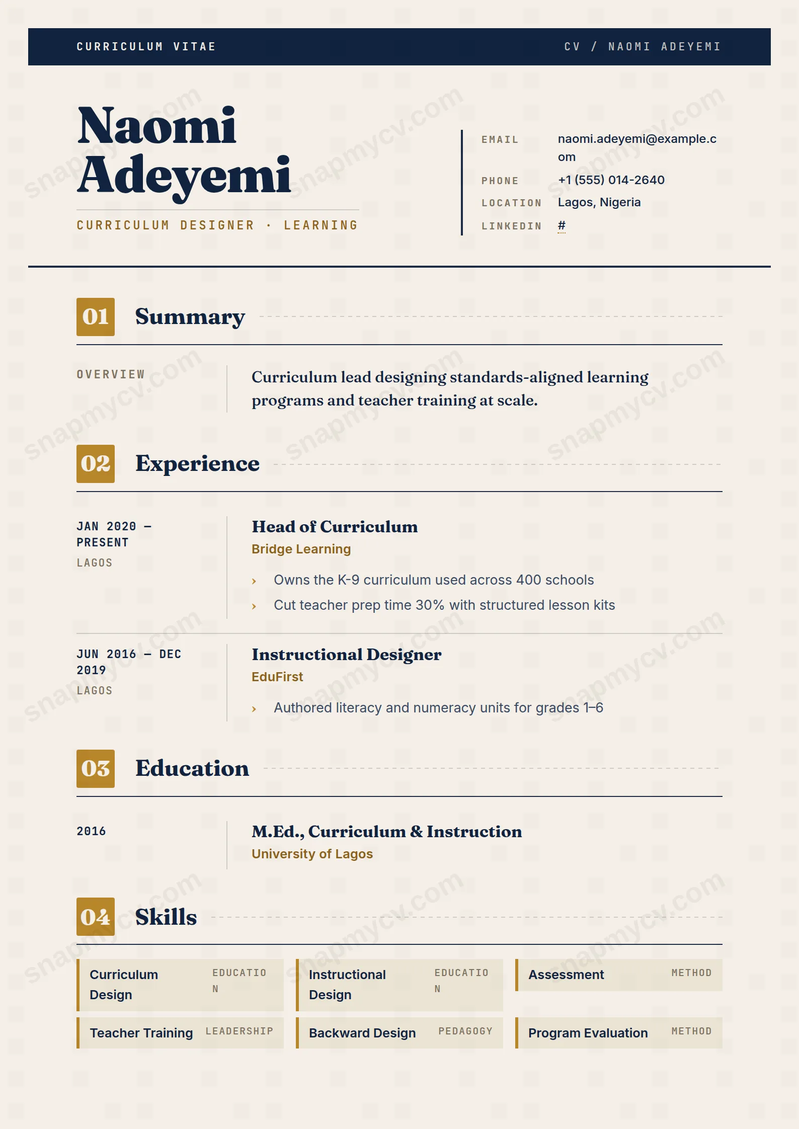
Numbered sections structured like a well-built syllabus, because that is the artifact this audience trusts most. Programs designed, outcomes measured, standards met — in order.
Best for: curriculum designers and instructional leads. Free to fill in, restyle, download as a PDF, or publish at your own SnapMyCV link.
Applicant tracking systems: Light styling. Mostly parseable but uses sidebars, columns or visual elements that may confuse stricter ATS.A template's styling never changes the advice that matters most — lead with achievements, quantify your impact, and tailor the content to each role.
New to writing a CV? Read our step-by-step CV guide and ATS tips, then come back and make this design your own.
The design starts from one idea: a CV that behaves like a well-built syllabus. A slim navy band (#11233f) crosses the top, carrying an uppercase JetBrains Mono label, 'Curriculum Vitae', beside a quiet document code, so the page announces itself the way a course pack does before the content begins. Your name then lands in heavy Fraunces serif at 38pt, with the role set below in a mono ochre tagline ruled off by a hairline. Contact details file into a keyed grid on the right, each label capitalised and spaced like a register entry rather than a run of text.
The palette is deliberately scholarly, not corporate. Warm paper (#f4efe6) softens the whole page, navy ink keeps it authoritative, and a single ochre accent (#b8862a) does all the pointing. Every section opens with an ochre square holding an auto-incrementing number, 01, 02, 03, a Fraunces title, and a dashed rule that trails off to the edge. Entries then split at a thin divider: dates and location in mono on the left, the detail on the right, with ochre chevron bullets marking each point. That two-column rhythm and the numbered modules give the eye a fixed grid to follow, so a dense career still scans in seconds.
This template is genuinely right for curriculum leads, heads of department, instructional designers, programme directors and senior educators, anyone whose job is organising knowledge for others. The numbered, module-style structure quietly signals that you think in units, outcomes and sequence, which is precisely the impression an academic or training-leadership panel is looking to form. The Fraunces and JetBrains Mono pairing also reads as considered and literate rather than templated.
Be honest about who should skip it. If you are firing off high-volume applications through strict corporate ATS portals, the two-column entries and coloured header add parsing risk you may not want. If your field prizes minimalism, finance, law, hard engineering, the warm paper and ochre chevrons can feel too characterful. And early-career applicants with thin history will find the numbered modules exposing, because each empty-looking unit draws attention to how little sits inside it. This design rewards people who have enough substance to fill several well-shaped sections.
Treat every section as a unit you are designing. Put dates and location in the left mono column and keep the format identical throughout, because that rail is narrow and any inconsistency shows immediately. Reserve the ochre chevron bullets on the right for outcome-led lines: name the cohort, the change and the measure, so each point carries evidence rather than a duty. The skills grid, where items drop into paper-deep tiles with an ochre left border, is for frameworks and tools you actually lead on, not a keyword dump that dilutes the strong ones.
The most common mistake with this style is overfilling. Because sections auto-number, adding too many makes the 01, 02, 03 sequence stretch and the dashed rules feel repetitive, so aim for four to six well-earned modules rather than ten thin ones. Keep the top summary tight, two or three lines under the mono tagline, and let languages and certifications sit as short, breathing blocks. Since the whole layout leans on that navy-paper-ochre restraint, resist crowding: the design looks its best when whitespace frames each unit.
The headings are conventional and the underlying markup runs top to bottom, which most parsers handle. But this is a designed layout with two-column entries, a navy header band and a multi-column skills grid, so before submitting through a strict tracking system, download the PDF and run the plain-text test: paste everything into a blank document and confirm it reads in a sensible order with nothing dropped. The auto-incrementing 01, 02, 03 markers are decorative, so they should not confuse a parser, but keep a simpler single-column copy for the strictest portals.
It survives better than most coloured templates because the design leans on contrast, not hue. The navy ink stays near-black, the #f4efe6 paper drops to a soft grey, and the ochre accents, the numbered squares, chevrons and skill-tile borders, read as a mid-tone that still separates from the background. You lose the scholarly warmth, but the module structure and hierarchy remain fully legible on a black-and-white office printer.


