
Dark terminal aesthetic with neon green accents for security engineers.
Create a free account to customize and publish this design.
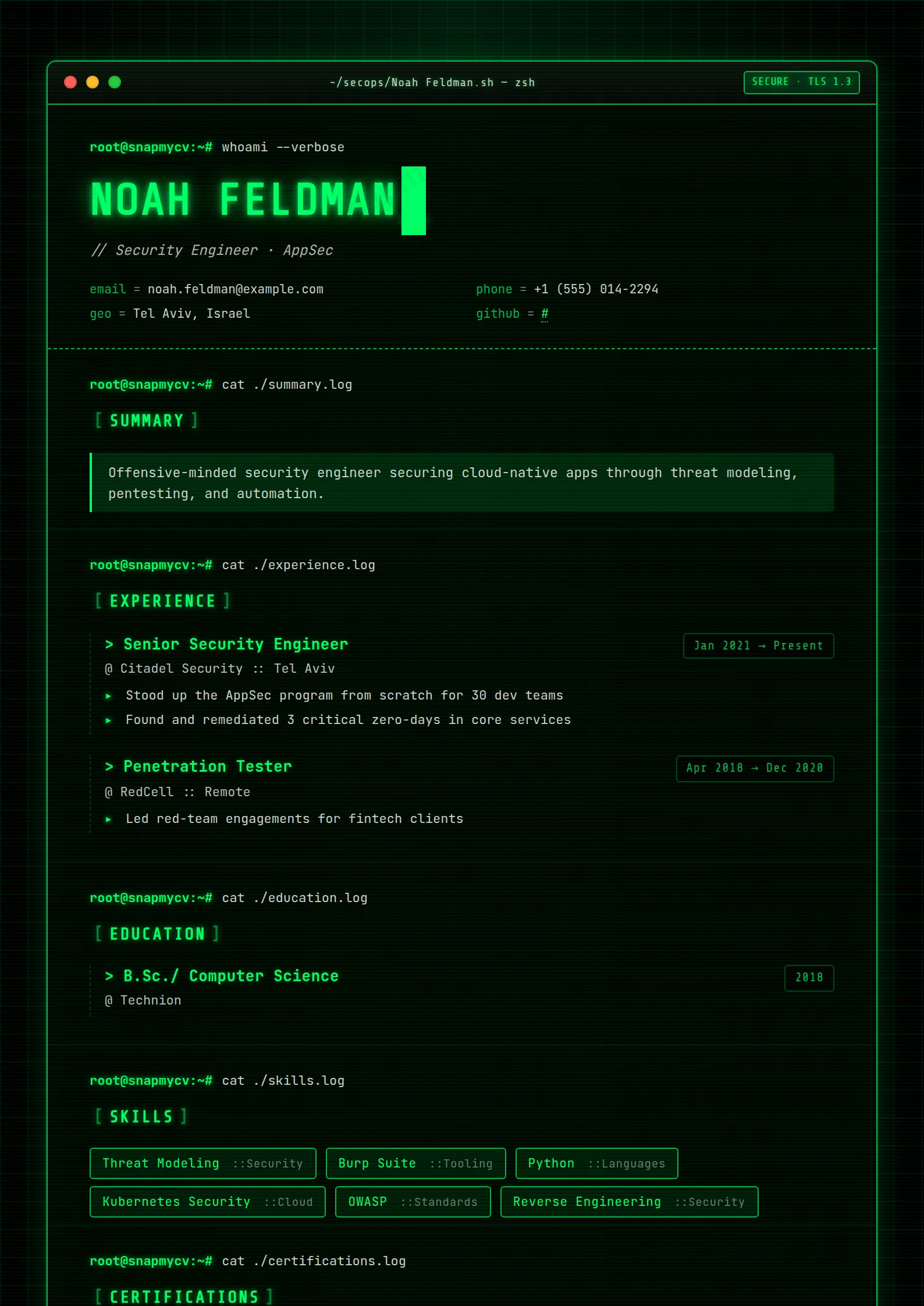
A dark terminal aesthetic with neon-green accents that reads like a clean shell session. CVEs, certifications, and incident work formatted for technical reviewers who live in this palette.
Best for: security engineers and penetration testers. Free to fill in, restyle, download as a PDF, or publish at your own SnapMyCV link.
Applicant tracking systems: Visual only. Designed for human readers — heavy decoration, dark backgrounds or column layouts that often break ATS parsing.A template's styling never changes the advice that matters most — lead with achievements, quantify your impact, and tailor the content to each role.
New to writing a CV? Read our step-by-step CV guide and ATS tips, then come back and make this design your own.
Cyber Sec commits fully to a single metaphor: your career rendered as a terminal session. The document sits in a rounded panel with red, amber and green traffic-light dots, a title bar reading ~/secops/yourname.sh and a glowing SECURE - TLS 1.3 pill, all on a pure black #000000 canvas dusted with a faint green grid and screen-blend scanlines. Every section opens with a root@snapmycv:~# prompt piping a command such as cat ./experience.log, and the page closes on exit 0 beside a blinking cursor. Nothing here is decorative accident. The single column, the console framing and the sign-off all say the same thing before a line of copy is read: this person lives in the command line.
Typography and colour do the rest of the work. Everything is monospace, with Share Tech Mono carrying the headline, section titles and date chips while JetBrains Mono handles body and lists, so the whole page keeps a fixed-width, machine-set rhythm. The palette is unapologetically phosphor: neon #00ff66 for your name, headings and links, a dimmer #00b34a for keys and borders, and a soft grey-green #c9d1c9 for body copy. The name glows in uppercase behind a triple-layered text-shadow, skills harden into bordered badges, list items lead with a neon arrow, and the summary sits in a tinted, left-bordered callout. Loud and deliberate, it reads like a live console rather than a resume.
This template is aimed squarely at security practitioners: penetration testers, red and blue teamers, SOC analysts, security engineers, malware researchers and CTF regulars who want the work signalled instantly. The SECURE - TLS 1.3 chrome, the ~/secops path and the command-line framing all speak fluent infosec, and the same terminal fluency flatters DevOps, SRE and backend engineers who genuinely live in the shell. If the neon-on-black console matches how you actually work, it lands.
Be honest about where it will hurt you. Conservative finance, government, legal and non-technical hiring panels tend to read heavy styling as noise, and a black-on-neon terminal can feel like costume rather than credential in those rooms. If your target reviewer is an HR generalist or an executive committee rather than a fellow engineer, a quieter single-column layout will travel further and argue less.
Let the chrome shout so your wording does not. Keep headlines and role lines short, one crisp phrase each, so the neon glow carries the emphasis and the fixed-width type stays clean. Put your metrics in the body: CVEs found, dwell time cut, incidents contained, phishing click-rates reduced. The skills area is the natural home for tooling such as Burp, Nmap, Splunk and Wireshark, where each entry hardens into a bordered badge and takes an optional ::category tag; group by discipline so the badges scan rather than sprawl. Route your strongest evidence through highlight bullets, since those render with the arrow marker and read like command output.
The common mistakes are all about density. Long paragraphs collapse the terminal illusion and drown the phosphor contrast, so lean on the left-bordered summary callout for two or three lines at most and keep experience to tight bullets. Resist stuffing every badge you have ever touched; a wall of neon pills flattens the hierarchy the glow is meant to create. The dark theme is print-aware, so the black background and green glow survive PDF export, but confirm your longest lines do not wrap awkwardly inside the fixed monospace grid before you send it.
The structure helps more than the styling hurts: it is single column with standard section names, which parsers handle well. But the decorative prompts like cat ./experience.log, the arrow bullets and the black-on-neon palette are built for human eyes, not machines. Download the PDF, paste it into a blank document, and confirm your roles, dates and skills come through as clean plain text before applying anywhere automated.
It is print-aware, so the #000000 background and #00ff66 glow are preserved in the PDF rather than dropped to white. In greyscale, though, neon green on black converts to light-grey text on near-black, which stays legible but loses the vivid contrast that makes the design work. This template is at its best on screen and in colour print; assume a mono office printer will mute it considerably.


