
Sleek dark-themed template for a modern, tech-forward look.
Create a free account to customize and publish this design.
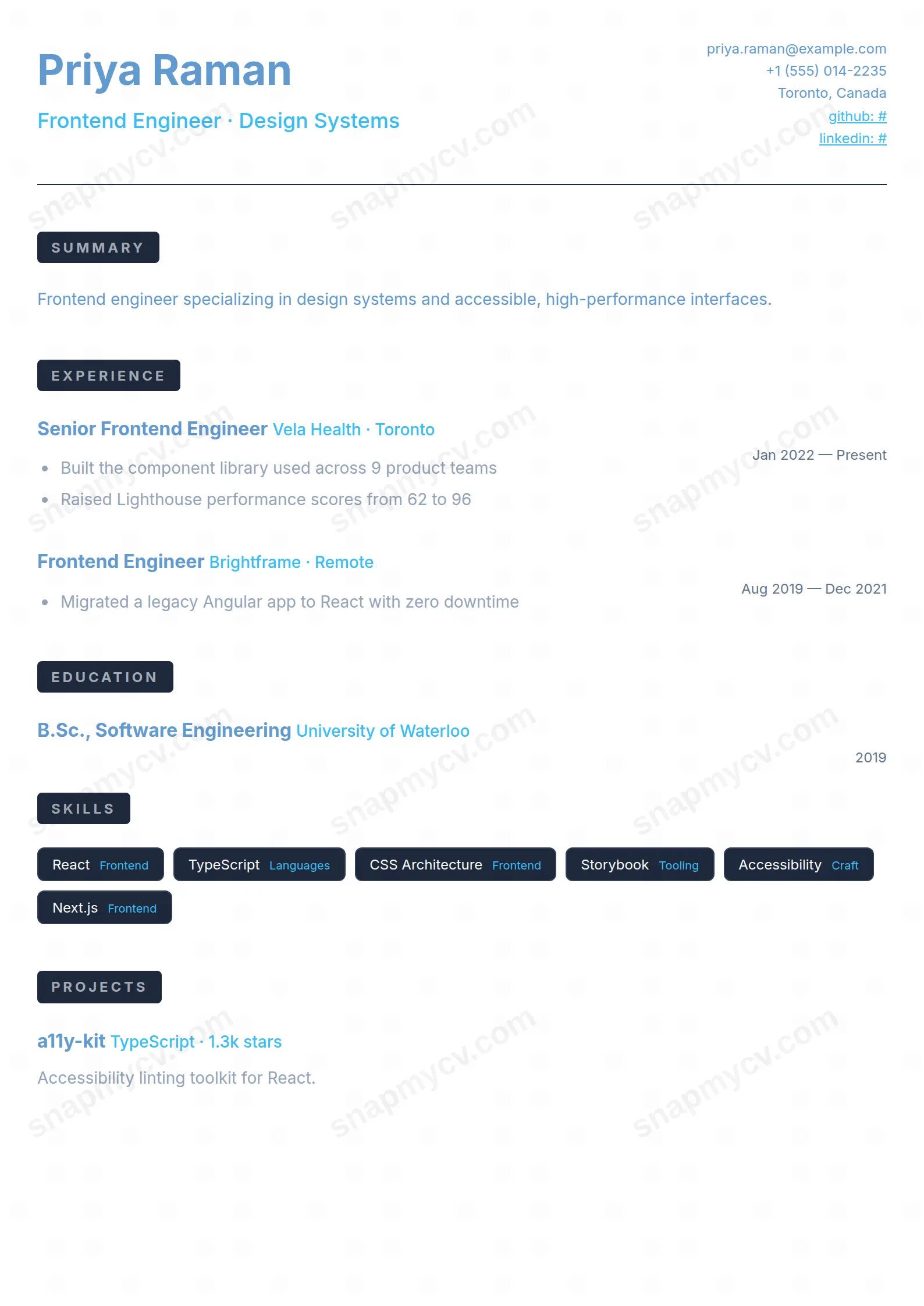
A sleek dark theme for screens-first applications: portfolio links, side projects, and stacks presented the way your tools actually look.
Best for: developers and digital-native applicants. Free to fill in, restyle, download as a PDF, or publish at your own SnapMyCV link.
Applicant tracking systems: Visual only. Designed for human readers — heavy decoration, dark backgrounds or column layouts that often break ATS parsing.A template's styling never changes the advice that matters most — lead with achievements, quantify your impact, and tailor the content to each role.
New to writing a CV? Read our step-by-step CV guide and ATS tips, then come back and make this design your own.
Dark Mode is not a light CV with the colours flipped. It is drawn from the start on a deep slate-navy field (#0f172a) with soft off-white body text, the way a code editor or terminal actually looks, so the eye lands on content rather than on a harsh white rectangle. The typeface is Inter throughout: your name is set large and near-white at 36px, and a single sky-blue (#38bdf8) does all the accent work beneath it, carrying the headline, company names, live links and the small category tags on each skill. Restricting the palette to one blue against one dark ground is the whole discipline of the design; add a second bright colour and the signal collapses.
Hierarchy is built from contrast and space instead of heavy rules. Section titles are tiny uppercase labels with wide letter-spacing, muted in slate and nested inside rounded pill backgrounds, so they read as quiet signposts rather than shouting dividers. Skills sit in bordered badges, a single thin divider closes the header, and contact details stack neatly to the right of your name. Because the layout leans on generous whitespace to separate blocks, a dense technical history stays legible instead of turning into a wall of glowing text.
This template earns its look on people who build and ship software: front-end and full-stack engineers, data and dev-ops practitioners, product designers, and anyone applying to startup or product-led teams where a confident dark aesthetic reads as fluency rather than gimmick. It carries summary, experience, education, skills, projects, certifications, languages, awards, publications, volunteering and hobbies, so a long technical career has somewhere to sit. The sky-blue accent flatters GitHub links and clickable project URLs, which is exactly the evidence these roles want to see.
Be honest about where it works against you. If you are applying into law, banking, government, academia or any conservative field that expects a printed white page, the midnight background will read as trying too hard, and some recruiters simply dislike dark documents on screen. It is also a poor fit for a sparse one-role resume, where the wide dark expanse looks empty rather than considered. If your instinct is to preserve the dark theme through to PDF, this template is for you, since it does exactly that; if you need a safe, ink-on-white default, choose a lighter template instead.
Everything runs in one linear column, so order is your main lever: put the summary right under the header, then experience, then the sections that prove your craft, projects and skills, before the supporting material. Lead each experience bullet with an outcome, because the accent colour is already doing the visual signposting and long grey paragraphs will drown it. Give every skill a short category label so the blue sub-tags stay meaningful, and attach real URLs to projects and certifications since the template makes them clickable, which is half the point of a developer CV.
The common mistake is overfilling. On this dark ground, three tight bullets per role read as senior, while eight wrapped lines turn the badges and pills into noise and kill the whitespace the design depends on. Keep the summary to two or three sentences, trim skills to the badges you would actually defend in an interview, and resist adding a second accent colour to any section. The headings scale down and the column collapses cleanly on a narrow phone screen, so aim for a taut one to two pages rather than trying to fill the canvas edge to edge.
It survives. The template carries explicit colour-adjust print rules, so the #0f172a background and the #38bdf8 accents are baked into the exported PDF rather than dropping to white. That is deliberate, since the whole identity of Dark Mode is the midnight canvas, and it would look broken as plain black text on white.
The structure is ATS-safe: one column, a single linear reading order, conventional headings and real selectable text rather than images. The only risk is cosmetic, because some older tracking systems strip colour and can mishandle very dark backgrounds when they re-render a preview. Before you apply, copy all the text out of the PDF and confirm every heading, role and date still appears in order.


