
Data-viz inspired template with skill bars and sparklines for data scientists.
Create a free account to customize and publish this design.
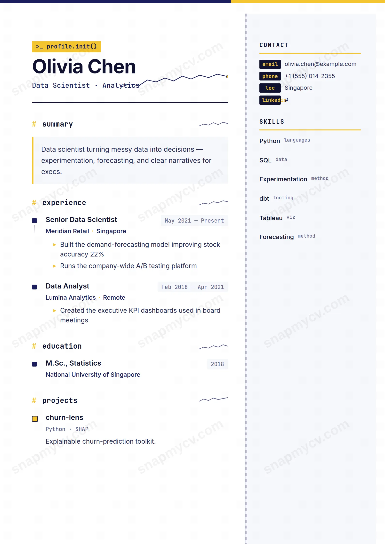
Skill bars, sparklines, and a layout that practices the data storytelling it preaches. Your analytical range is visualized, not just listed.
Best for: data analysts and analytics engineers. Free to fill in, restyle, download as a PDF, or publish at your own SnapMyCV link.
Applicant tracking systems: Light styling. Mostly parseable but uses sidebars, columns or visual elements that may confuse stricter ATS.A template's styling never changes the advice that matters most — lead with achievements, quantify your impact, and tailor the content to each role.
New to writing a CV? Read our step-by-step CV guide and ATS tips, then come back and make this design your own.
The design starts from a simple premise: an analyst's resume should look like the artefacts an analyst actually ships. That is why the page is capped by a navy-to-gold bar running #1a1f5c into #f4c531, and why the header opens with a JetBrains Mono terminal line, ">_ profile.init()", with a small sparkline nudging upward beside your name. Section titles are lowercase and led by a gold hash, each closing with its own miniature sparkline, so scanning the page feels like reading a dashboard rather than a letter. Nothing here is decoration for its own sake; the visual language signals the discipline before a single bullet is read.
The typographic split does the heavy lifting. Inter carries the prose so paragraphs stay legible, while every metric, date and label is set in JetBrains Mono, which lines figures up on a consistent monospaced grid and makes numbers feel like data. Gold is rationed strictly to accents, the hashes, the sparklines, the bar fills, so the pale #f7f8fc sidebar and dotted navy rule keep the whole thing calm instead of loud. The result is a layout with clear hierarchy: your name and trendline up top, a scannable spine of sections, and quantified detail rendered in a font that says these numbers were measured.
This template is genuinely right for people whose work is judged by figures: data analysts, data scientists, BI and analytics engineers, and product or growth analysts. The horizontal bar-chart skills block and the quantified timeline both reward a history full of measurable outcomes, so if your value shows up as latency cut, revenue lifted or models shipped, the design amplifies it. It also flatters adjacent quant roles, financial and marketing analysts, anyone who lives in dashboards and expects a resume to speak their dialect.
Be honest about who should look elsewhere. If your impact is narrative rather than numeric, senior design, policy, law, academia, most writing-led roles, the mono figures and sparklines will sit empty and read as gimmick. The terminal prompt and code-styled header can feel out of place in conservative, non-technical fields. And because it is a two-column, colour-and-chart layout, anyone applying primarily through brittle applicant tracking systems should weigh the ATS trade-off before committing to it.
Feed the layout the content it was shaped for. The main column runs your experience as a connected timeline of square markers, so lead every highlight with a number and its consequence, "cut query latency 40%" or "drove a 2.3x lift", and let the gold accents feel earned. Keep the 270px right sidebar tight: skill names must be short because each one sits on a single horizontal bar row, so "SQL" and "dbt" work where a long phrase wraps and breaks the rhythm. Contact details belong in the mono key-value chips, and the language bars should reflect real proficiency since, unlike the skill bars, they map to your stated level.
The common mistakes are predictable. People pad the timeline with duty-list bullets that carry no metric, which leaves the sparklines and monospaced figures looking like styling with nothing to style. Others cram the sidebar until bars wrap onto two lines and the chart grid collapses. Aim for four to six roles on the timeline, six to ten skills in the bar block, and bullets kept to one tight line each so the JetBrains Mono numbers stay aligned. Restraint is what makes this dashboard read as credible rather than busy.
It holds up better than most colour-heavy templates because gold is used only for small accents, the hashes, sparklines and bar fills, rather than for text or large fields. In greyscale the navy header reads as dark grey and the gold bars drop to a light tone, so contrast survives, though the skill bars lose some of their punch. The Inter body copy and JetBrains Mono figures stay fully legible because they are set in near-black, not colour.
It is tuned for a focused one to two page CV, not an exhaustive career dump. The main-column timeline sits best with four to six roles of tight, single-line bullets, while the 270px sidebar wants roughly six to ten short skills plus a few languages and contact chips before the bar grid feels crowded. Overfill either side and the monospaced alignment and sparklines lose the clean, dashboard-like rhythm that is the whole point of the design.


