
Classical Garamond serif with burgundy accents for lawyers.
Create a free account to customize and publish this design.
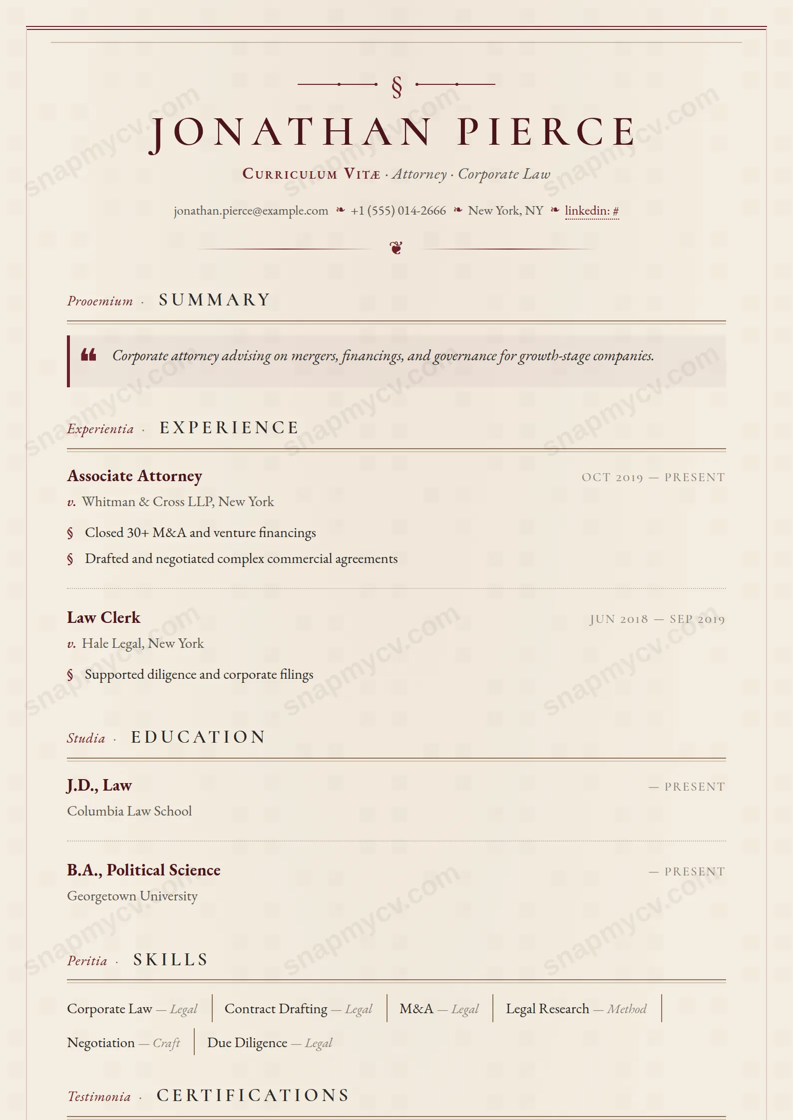
Classical Garamond-style serifs and burgundy accents in a layout that would not look out of place engraved. Tradition, rendered crisply enough for a PDF parser.
Best for: attorneys and legal professionals in formal practices. Free to fill in, restyle, download as a PDF, or publish at your own SnapMyCV link.
Applicant tracking systems: ATS-friendly. Single-column, standard section headers, parses cleanly in most applicant tracking systems.A template's styling never changes the advice that matters most — lead with achievements, quantify your impact, and tailor the content to each role.
New to writing a CV? Read our step-by-step CV guide and ATS tips, then come back and make this design your own.
Esquire is engineered as a single-column document with the cadence of chambers stationery. It rests on a warm parchment ground (#f4ede0) bracketed by double burgundy rules at head and foot, and the header is centred rather than left-aligned so the eye lands first on a section-sign monogram and hairline flourishes. The name is set in Cormorant SC small-caps with a wide 0.18em track in deep burgundy (#4a141c), sitting above an italic Curriculum Vitae tag. That opening sequence does deliberate work: it signals seniority and formality before a single line of content is read.
The typography, not colour, carries the authority. Body copy is EB Garamond at 11.5pt over a roomy 1.55 line-height, which slows the reader and lends every sentence weight. Each section title pairs an italic Latin label with a small-caps English heading underlined by a sandstone rule (#8a6f54), so structure feels engraved rather than boxed. Burgundy (#6b1f2a) is rationed with intent: the summary drop-cap and left border, the section-sign bullets in achievement lists, the italic v. and conferred by cues before employers and issuers, and the dotted underlines on links. The restraint is the design. Nothing shouts, and that is precisely how it reads as expensive.
Esquire is right for careers where lineage and discretion signal trust: solicitors, barristers, in-house counsel, paralegals, notaries, and articled clerks, and it extends comfortably to academics, accountants, diplomats, and senior consultants who prefer gravitas to gloss. The Latin labels, section-sign bullets, and cum laude GPA badging speak the native register of these fields, and the two-column language grid suits the genuinely multilingual candidate. If your work rewards a documentary, understated presentation, this template flatters it.
Be honest about who should walk past it. Designers, product and growth marketers, startup operators, and anyone in a visual or fast-moving field will find the parchment ground and serif formality reads as stiff or dated against their peers. Junior candidates with thin histories are exposed too, because the text-first layout offers no colour blocks or sidebar to fill space. If your instinct is to demonstrate range, energy, or contemporary polish, Esquire will actively work against you.
Because the layout is unforgiving of padding, it rewards precise drafting over volume. Lead each role with a single crisp title and a one-line summary, then let the section-sign highlights carry hard outcomes: matters led, judgments won, deal values, publications cited. Keep the headline to one clean line and let the italic Latin labels supply the ornament, so you are never tempted to decorate with adjectives. The summary sits under the drop-cap and left border, so treat it as your opening statement: three or four sentences of substance, no more.
The common mistake is over-filling. The parchment ground, sandstone dividers, and 1.55 line-height look their best with disciplined white space, and cramming bullets collapses that calm into clutter. Aim for four to six achievement lines per senior role and fewer as you go back in time. Populate education, certifications, languages, awards, and publications where they genuinely apply, since this template is built to hold that fuller professional record, but leave sparse sections out rather than padding them. Confirm your name, dates, and headings read cleanly top to bottom, and let the restraint carry the seniority.
Mostly no. It is a true single-column layout with real-text English headings in the correct reading order, which is what applicant tracking systems parse best. The italic Latin labels sit beside each English heading, and the section-sign and pilcrow marks are CSS flourishes rather than content, so they should not pollute your parsed text. To be safe, copy the rendered PDF into a blank document and confirm your roles, dates, and headings survive before submitting through a portal.
Yes, and better than most coloured templates. The design leans on typography and hairline rules rather than colour to build hierarchy, so in greyscale the deep burgundy name and headings simply become dark grey against a light parchment tone that reads as off-white. The double top-and-bottom rules and sandstone underlines still frame the page clearly. It was made for the printed, documentary feel, so a monochrome copy loses very little of its intended authority.


