
Personal-essay first-person opening for founders and entrepreneurs.
Create a free account to customize and publish this design.
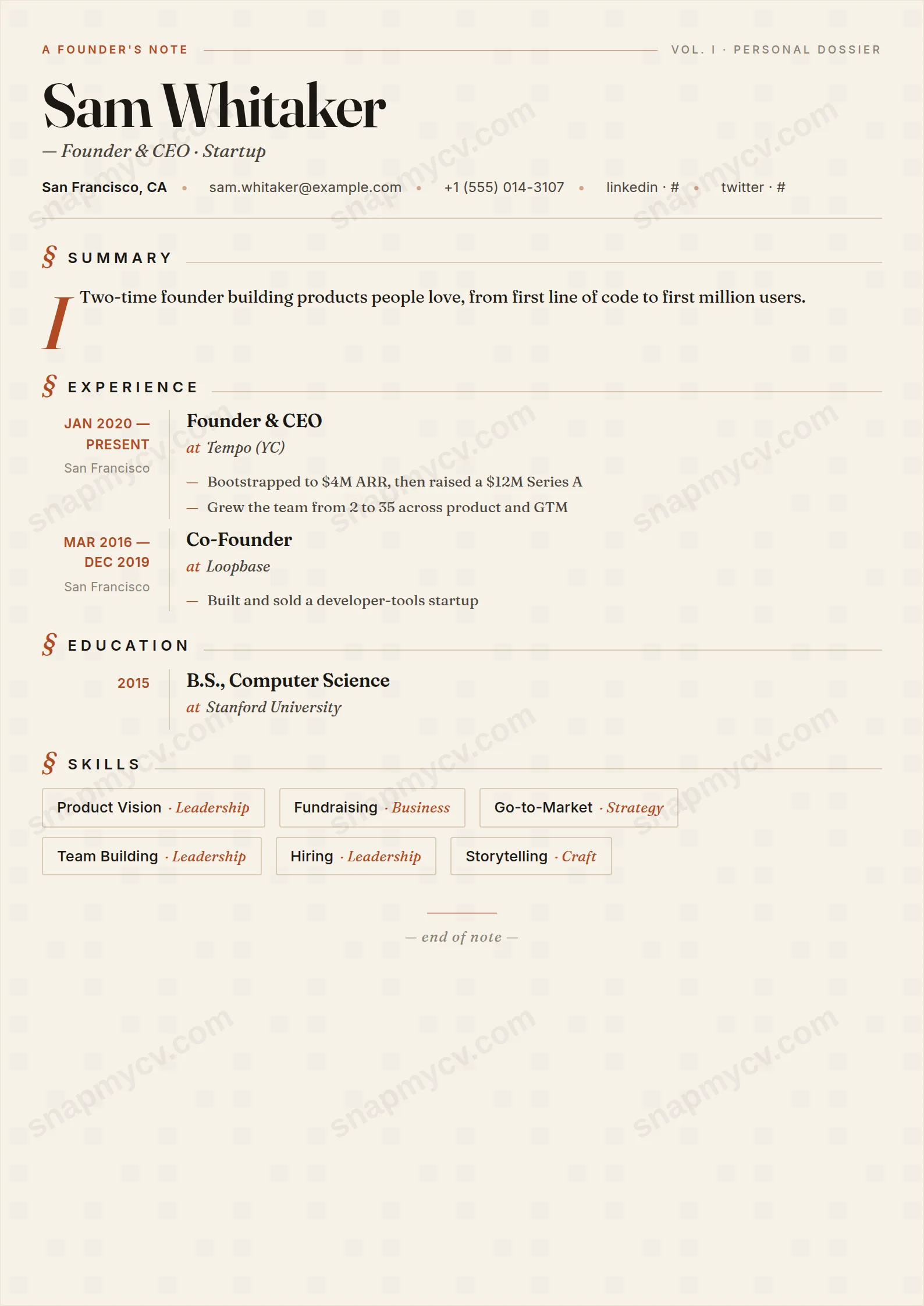
Opens with a first-person essay block instead of a bullet list — the way founders actually introduce themselves. Ventures, exits, and metrics follow in a clean structure that still parses as a CV.
Best for: founders, entrepreneurs, and startup operators. Free to fill in, restyle, download as a PDF, or publish at your own SnapMyCV link.
Applicant tracking systems: ATS-friendly. Single-column, standard section headers, parses cleanly in most applicant tracking systems.A template's styling never changes the advice that matters most — lead with achievements, quantify your impact, and tailor the content to each role.
New to writing a CV? Read our step-by-step CV guide and ATS tips, then come back and make this design your own.
Founder Note starts from a simple premise: some careers are better argued than tabulated. The cream paper background (#f7f1e8) replaces the usual clinical white, softening the contrast so the page feels printed rather than generated, and the single terracotta accent (#b04a23) marks headings and dividers without ever shouting. There is no sidebar, no two-column grid, no skills pills competing for attention. The layout runs as one considered editorial column, which is what lets the summary and narrative breathe.
Every choice here serves voice. The editorial typography and generous line spacing slow the reader down, so a paragraph that explains the bet you made or the company you started actually gets read instead of skimmed. Hierarchy comes from type weight and the warm accent rather than boxes or shading, keeping the eye moving top to bottom in one clean pass. The restraint is deliberate: one accent, one background, one column, so the personality lives in your words, not in decoration.
This is the right template when your judgement is part of the pitch: founders, freelancers, creative leads, consultants, and anyone publishing a personal brand at their own shareable SnapMyCV link. The warm cream-and-terracotta palette and letter-like column reward a strong point of view and a story that connects the dots between roles. On screen it reads as a personal landing page, which is exactly where this style earns its keep.
Be honest about where it struggles. If your value is a long, dense list of technologies, certifications, or parallel workstreams, the single narrative column will feel cramped and the warmth will read as underselling. Engineers, analysts, and academics who need a scannable skills block or a two-column layout are better served elsewhere. Founder Note is a poor fit for anyone whose achievements are best shown as a grid rather than a story.
Lead with a summary that takes a position. This layout hands the opening paragraph real space, so use two or three sentences of genuine point of view, then immediately ground it in concrete outcomes: revenue, users, launches, funding, the problem you actually solved. The most common mistake with this style is letting the editorial tone drift into adjectives with no evidence behind them. The cream page invites a personal register, but every claim still needs a number or a named result close by.
Because there is no sidebar to absorb overflow, keep the single column disciplined. Aim for three to five roles, each with a short framing line and two or three tight achievement bullets under standard headings, so the terracotta section markers stay evenly spaced down the page. Resist padding it out to fill the warmth: white space is part of the design, and a crowded column erases the calm that makes Founder Note work. Save the extended narrative for the summary and your most recent role, and let older entries run lean.
Yes. Under the editorial styling the structure is completely conventional: standard section headings and plain achievement bullets in one linear column, which is the easiest shape for a parser to read. The warmth lives in the cream background and terracotta accent, not in anything that trips up ATS.
It holds up well because the design never relies on colour to carry meaning. The terracotta (#b04a23) headings drop to a solid dark grey and the cream (#f7f1e8) reads as near-white, so hierarchy still comes through from type weight and spacing. You lose the warmth on a black-and-white printer, but nothing becomes unreadable.


