
Education-first with fresh purple accent for recent graduates.
Create a free account to customize and publish this design.
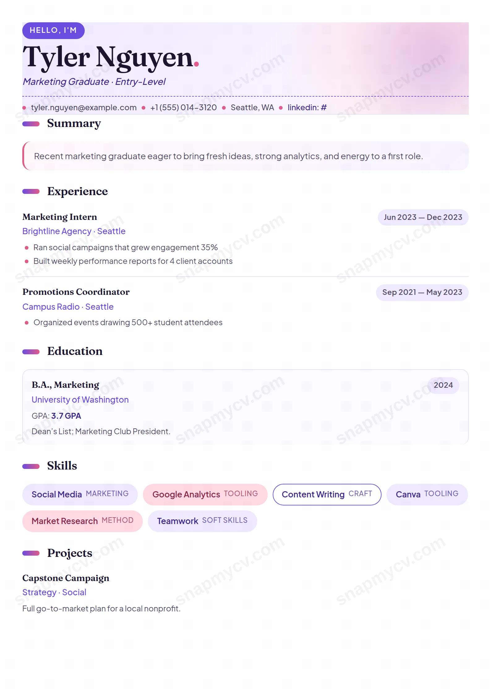
Education comes first, projects and coursework get real estate, and a fresh purple accent keeps the page young without losing professionalism. A graduate CV that doesn't try to look like a ten-year veteran's.
Best for: recent graduates and first-job applicants. Free to fill in, restyle, download as a PDF, or publish at your own SnapMyCV link.
Applicant tracking systems: ATS-friendly. Single-column, standard section headers, parses cleanly in most applicant tracking systems.A template's styling never changes the advice that matters most — lead with achievements, quantify your impact, and tailor the content to each role.
New to writing a CV? Read our step-by-step CV guide and ATS tips, then come back and make this design your own.
Fresh Grad pairs Fraunces, a high-contrast serif set at 42pt for the name and 17pt for section titles, with Plus Jakarta Sans for the body at 11pt. The serif lends a first CV a little gravity that a flat sans would not, while the Jakarta body keeps dense education and project detail comfortable to read. Small flourishes reinforce the tone: a pink-deep (#E25C8A) full stop is appended after the name, and the header is a soft lavender (#EFE9FF) to white gradient with a pink radial glow in one corner and a blurred lavender burst behind it, warm rather than corporate.
The palette is deliberately restrained where it matters. Deep lavender (#6C4CE0) and indigo (#3F2A8C) carry links, sub-lines, and the little gradient marks beside each section title, while pale tints fill the panels so nothing shouts over the words. The strongest signal is structural, not chromatic: the Education section head sits inside its own lavender panel with a 4px left border, and every degree becomes a bordered card. The eye lands on qualifications first, which is the whole thesis of the layout, lead with what a new graduate actually has.
Reach for Fresh Grad if this is one of your first CVs. It fits final-year students, recent graduates, school leavers, and career changers chasing graduate schemes, internships, or entry-level roles in tech, design, marketing, and general commercial fields. The education-first hierarchy and the room given to projects reward people whose evidence is coursework and side work rather than a decade of jobs.
Be honest about where it does not belong. If you carry ten years of experience, the education-led ordering works against you, and the playful pink accents plus the flower-marked hobby pills read as junior. Conservative sectors such as corporate law, investment banking, or senior public-sector roles expect something quieter, so the decorative header and serif flourish become a mismatch rather than a selling point.
Everything stacks in one 794px column, so order is your main lever. Keep the uppercase eyebrow pill to a role or field of two or three words, give the italic headline a real direction instead of adjectives, and hold the summary to two or three sentences, since it sits in a tinted panel with a pink-deep left border that pulls the eye. Put education directly below as intended, and write each degree card with a grade, relevant modules, and a line of context so the card earns its border.
Treat a strong final-year project like a job entry and use the bulleted list, where each point gets a pink dot, to show outcomes rather than duties. Skills render as wrapping pills that alternate lavender, pink, and outlined white on their own, so aim for ten to eighteen concrete tools rather than one long undifferentiated string; the small tag inside a pill suits a level such as intermediate. Languages fall into a two-column grid and hobbies into dashed pills, and both are meant to stay short. The common mistake is padding thin experience to fill the page. The entry cards and hairline dividers already make a modest history look deliberate, so keep it tight.
The colours are mostly light tints, so in greyscale the lavender panels and pink skill pills drop to pale grey and the page stays perfectly legible. The hierarchy survives without hue because the Fraunces section titles, the gradient section marks, and the bordered education cards carry the structure on their own. The corner glow and header burst are so faint that they may barely print, which does no harm.
Not really. The pink accents, the flower glyph on the hobby pills, and the serif flourish read as fresh and creative, which lands well for graduate schemes in tech, design, and marketing but looks informal for corporate law, investment banking, or senior government roles. If your target is a traditional firm, a plainer template will match their expectations better.


