
Modern frosted glass aesthetic with layered translucency effects.
Create a free account to customize and publish this design.
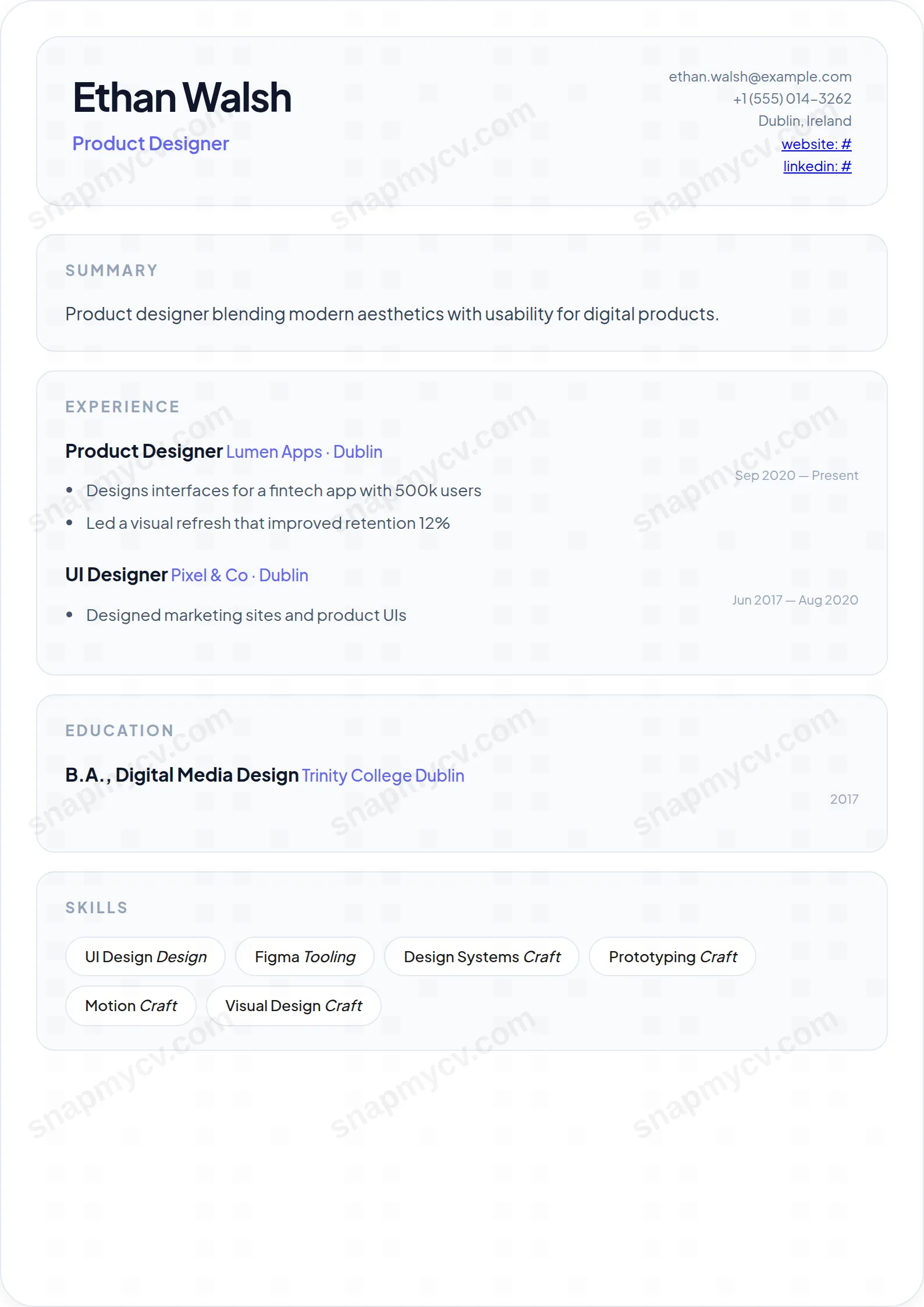
Frosted-glass layers and soft translucency give a current, product-design feel. A CV that looks like it shipped from a 2026 design system.
Best for: product designers and tech-forward applicants. Free to fill in, restyle, download as a PDF, or publish at your own SnapMyCV link.
Applicant tracking systems: Visual only. Designed for human readers — heavy decoration, dark backgrounds or column layouts that often break ATS parsing.A template's styling never changes the advice that matters most — lead with achievements, quantify your impact, and tailor the content to each role.
New to writing a CV? Read our step-by-step CV guide and ATS tips, then come back and make this design your own.
Glassmorphism is built around one committed idea: a translucent white card floating on a fixed diagonal gradient that runs from soft periwinkle (#e0e7ff) into pale lilac (#fae8ff). The card is backdrop-blurred and wrapped in a faint 30px-rounded border, and every section sits inside its own frosted sub-panel rather than on hard rules, so the page reads as layered surfaces of glass instead of stacked boxes. Plus Jakarta Sans, a geometric humanist sans, holds it all together with clean, slightly rounded letterforms that suit the soft edges.
The hierarchy is deliberately quiet so the material can do the talking. Your name sits at 34px in near-black slate (#0f172a) with tight letter-spacing, while a single indigo accent (#6366f1) threads through the headline, job titles, and company lines to guide the eye without shouting. Section labels are small, wide-tracked uppercase greys, skills render as rounded pill badges with a feather-light shadow, and contact details tuck into the top-right of the header. The result is one airy column, not a busy grid, where whitespace is a structural element rather than an afterthought.
This template is aimed squarely at people whose taste is part of their value: UI and UX designers, product designers, front-end and creative developers, brand and motion specialists, and anyone pitching into a studio, agency, or product startup. The frosted-glass surface and indigo accent read as current and considered without tipping into gimmick, which is exactly the signal that lands well with design-led hiring teams and portfolio-adjacent roles. If your work is visual, it flatters you.
Be honest about where it does not belong. Law, finance, government, academia, and other conservative fields tend to read decorative colour and translucency as noise, and a plainer single-column template will travel further there. It also rewards restraint over volume: if you have fifteen years across a dozen roles and want to list every one at length, the airy panels will fight you. This is a template for a focused, curated story, not an exhaustive dossier.
Treat whitespace as a feature you must protect. Keep your summary to two or three sharp lines so the frosted header panel stays light, and let the highlight bullets under each role carry the weight, framing outcomes rather than duties. Because the indigo accent already handles emphasis on titles and companies, resist adding bold, italics, or extra colour of your own; every layer you pile on erodes the calm the design depends on. Curate your skills tightly so the pill badges sit in one or two clean rows instead of wrapping into a dense wall, which is the single most common way this layout gets ugly.
Aim for three to five roles with a handful of bullets each, and lead every bullet with a strong verb since the eye scans the left edge of the single column first. The other frequent mistake is overstuffing the header: the top-right contact block is small by design, so list the essentials and skip long addresses or duplicate links. When you export, the template drops the blur and gradient for solid white panels with light grey dividers, so keep content that reads well in that quieter print state too.
The underlying markup is clean single-column HTML with conventional headings, which is what parsers actually read, so the blur and gradient themselves do not travel into the ATS. The visual effects are pure styling and get ignored during text extraction. Before submitting, copy the rendered text into a plain document and confirm your name, roles, dates, and pill-badge skills all appear in a sensible order.
For print and PDF the template already swaps the lavender gradient for solid white panels with light grey dividers, so a greyscale print stays clean rather than muddy. The indigo accent on titles and companies darkens to a legible grey that still reads as emphasis against the slate body text. Contrast remains comfortable, so nothing important disappears when colour is removed.


