
Executive-level template designed for international professionals.
Create a free account to customize and publish this design.
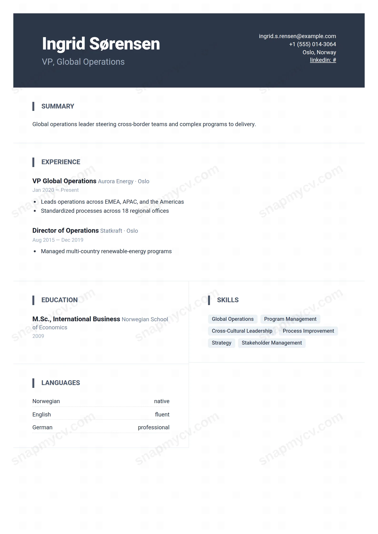
Executive framing with room for multi-country experience, languages, and cross-cultural scope. Built for careers that need a map more than a timeline.
Best for: international executives and global program leaders. Free to fill in, restyle, download as a PDF, or publish at your own SnapMyCV link.
Applicant tracking systems: Light styling. Mostly parseable but uses sidebars, columns or visual elements that may confuse stricter ATS.A template's styling never changes the advice that matters most — lead with achievements, quantify your impact, and tailor the content to each role.
New to writing a CV? Read our step-by-step CV guide and ATS tips, then come back and make this design your own.
Global Leader stakes everything on its opening move: a full-width charcoal band in deep slate (#2d3748) that behaves like a boardroom nameplate. Your name sits large at 36px in Heebo's heaviest weight, the headline drops beneath it in a muted blue-grey (#a0aec0), and contact details align hard to the right of the same band. The choice is deliberate. By loading identity into a dark, high-contrast block, the design makes the reader register who you are before they hunt for how to reach you, and the right-aligned contact keeps that band balanced rather than top-heavy.
Below the masthead the page turns crisp and white, and the hierarchy softens on purpose. Summary and experience run the full 900px width for air, then secondary material folds into a two-column compact grid split by hairline rules. Section titles are small uppercase labels in #4a5568 marked with a four-pixel left bar, skills sit in soft grey pill badges (#edf2f7), and languages line up in a dotted-rule ledger. Heebo, a clean geometric sans, holds every line consistent, so the document reads modern and disciplined rather than ornamental.
This template is built for senior operators with a genuine international footprint: country managers, regional directors, general managers, and executives whose mandates span markets. The dark banner projects seniority, and the grid beneath it absorbs the breadth such profiles carry, education, certifications, awards, languages, and publications, without ever feeling stuffed. If your value is scale and reach across regions, the layout was designed around exactly your shape of career.
It is the wrong pick if you are early in your career or applying for a hands-on creative role. A graduate or junior candidate will leave the wide experience column looking sparse and the secondary grid half-empty, which the design amplifies rather than hides. Designers, artists, and portfolio-led applicants will also find the restrained slate-and-grey palette too corporate to represent their work. This is an executive document, and it looks under-fed when the career behind it is not.
Treat the full-width experience block as your stage for scale of impact. Lead each senior role with tight bullet highlights that name P&L, headcount, regions, and outcomes, because that 900px column is where the reader expects magnitude, not a paragraph of duties. Keep the headline to a single sharp line so it holds its own against the bold 36px name above it; a two-line headline crowds the masthead and weakens the whole opening. The most common mistake here is writing the summary like a personal statement. Make it three or four lines of positioning, then let the experience carry the evidence.
Use the two-column grid strictly for proof points, and populate the languages ledger in full, since for a global leader fluency is part of the credential, not a footnote. Skills belong in the pill badges as short noun phrases, roughly eight to fourteen, not full sentences that break the badge shape. Distribute content evenly so neither grid column ends far shorter than the other, and keep uppercase section labels reserved for real sections rather than inventing filler headings to balance the page.
It holds up well. The #2d3748 slate reads as a solid dark grey block and the muted #a0aec0 headline stays legible against it, so the nameplate effect survives a black-and-white printer. The soft #edf2f7 skill pills flatten to a barely-there grey, which is fine because they still read as discrete tags rather than blending into the page.
Yes, that is its strength. The full-width experience column suits several senior roles with layered bullets, and the two-column compact grid is specifically there to carry education, certifications, awards, languages, and publications without crowding. If anything the risk runs the other way: a short career leaves the wide column and the grid looking thin, since the layout is tuned for breadth.


