
Vibrant gradient accents with a fluid, modern layout.
Create a free account to customize and publish this design.
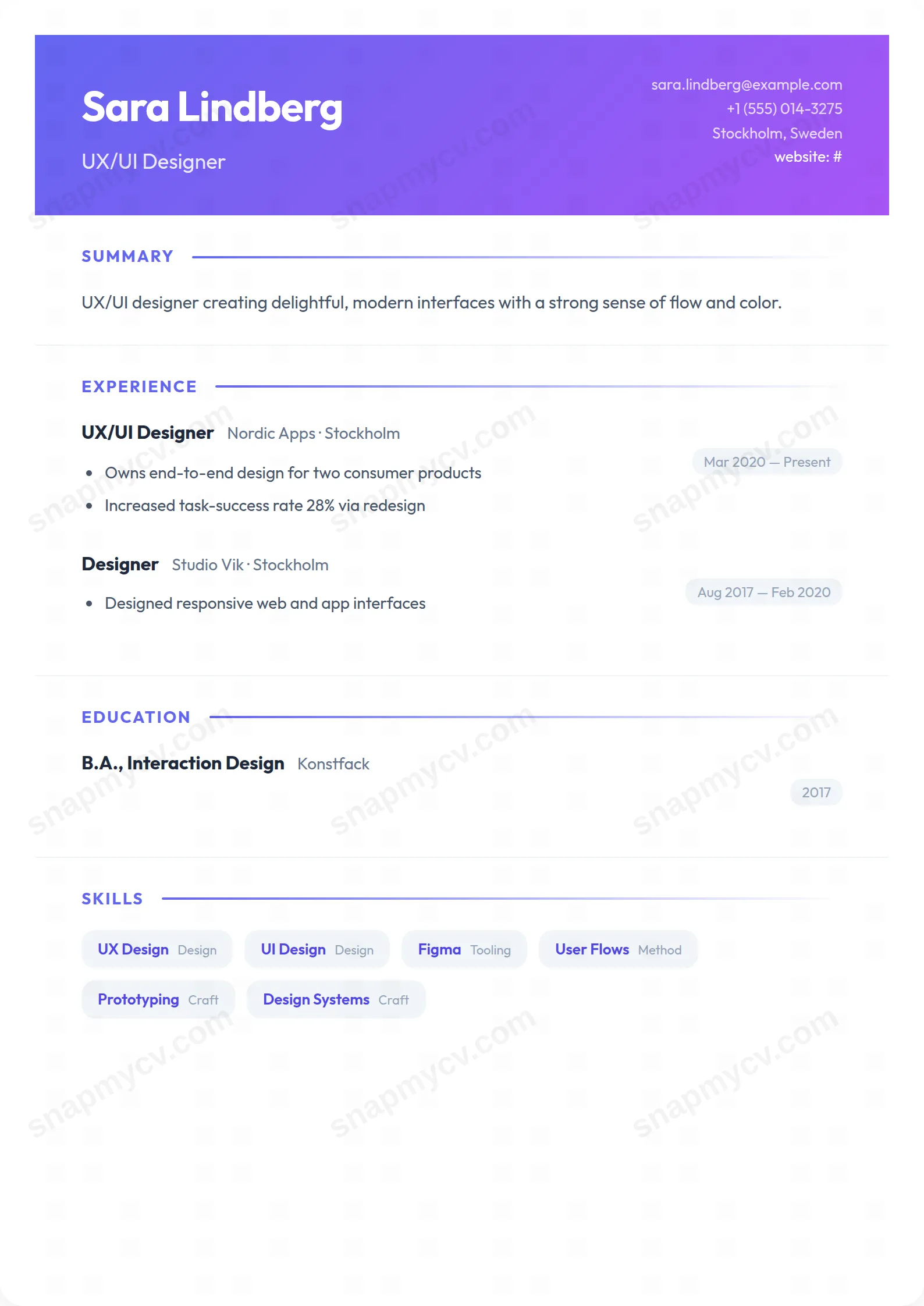
Fluid gradient accents over a modern structure — contemporary without tipping into novelty. Color does the differentiating; the grid does the convincing.
Best for: modern roles in tech, media, and marketing. Free to fill in, restyle, download as a PDF, or publish at your own SnapMyCV link.
Applicant tracking systems: Visual only. Designed for human readers — heavy decoration, dark backgrounds or column layouts that often break ATS parsing.A template's styling never changes the advice that matters most — lead with achievements, quantify your impact, and tailor the content to each role.
New to writing a CV? Read our step-by-step CV guide and ATS tips, then come back and make this design your own.
Gradient Flow makes one decisive move and commits to it. The header is a 135-degree wash from indigo (#6366f1) into violet (#a855f7), a full-bleed colour block that carries your name in 36px Outfit with a lighter headline beneath and contact details tucked to the right. That diagonal sweep is doing the hierarchy work, so the type underneath can stay calm. Nothing competes with the banner, which is exactly why the banner reads as confident rather than loud. The entire CV then sits inside an 800px white card with 20px rounded corners and a soft drop shadow, a choice that reframes the page as a product surface instead of a paper document.
The supporting details are deliberately quiet so the header can be bold. Section titles are small uppercase indigo labels closed off by a gradient rule that fades to nothing, echoing the header without repeating it. Dates ride inside pale grey pills, skills become rounded indigo badges on light slate, and hobbies pick up a warm red (#ef4444) that keeps the palette from feeling monochrome. Everything is set in the geometric Outfit typeface across weights 300 to 700, so contrast comes from weight and colour rather than from competing fonts. The whitespace is generous by design, letting each section breathe inside the card.
Gradient Flow is built for people whose field rewards visual confidence: product managers, designers, marketers, front-end engineers and startup generalists. The gradient banner and badge styling quietly signal that you have taste and care about surface, while the disciplined single column keeps the substance in plain view. It carries summary, experience, education, skills, projects, certifications, languages, awards, publications, volunteering, hobbies and custom sections, so a dense modern career fits without the card feeling crowded.
Be honest about where it works against you. If you are applying to law firms, banks, government bodies, academia or any tradition-bound institution, the violet gradient and rounded badges will read as too playful for the room, and a restrained serif layout serves you better there. The same is true for very senior executive profiles where understatement signals seniority. Choose Gradient Flow when the colour is an asset to your story, not a distraction from it.
Treat the header as premium space. Your name and a short, specific headline are all it should carry, because a long title wraps awkwardly against the diagonal band and dilutes the impact. Keep contact details lean on the right so they stay legible over the lighter end of the wash. In the single column below, lead every role with outcome-driven highlight bullets rather than duty lists, since the small uppercase indigo section labels and grey date pills already give the page its structure. Let the layout style the page and write plainly underneath it.
The most common mistake with this template is over-decorating a design that is already expressive. Resist stuffing the skills row: twelve sharp indigo badges land harder than thirty vague ones, and an overloaded badge block quickly looks like noise against the calm sections. Keep your summary to three or four lines so it does not swamp the space beneath the banner, and use the languages tiles and red-accented hobbies as light closing notes, not major sections. Aim for a full but unhurried single page or two, letting the generous whitespace inside the card do its job.
The indigo-to-violet header collapses into a mid-grey band and the indigo section labels and skill badges become subtle grey tones, so the layout stays readable but loses the colour contrast that defines it. The rounded card, uppercase labels, date pills and single-column rhythm all survive, so nothing becomes illegible. If you know the CV will be photocopied or printed mono, just know it will look considerably more muted than on screen.
The underlying markup is a clean single column with conventional headings, which parses more reliably than most colour-forward designs. The gradient banner and rounded badges are purely visual and sit on top of ordinary text, so before submitting through an applicant tracking system, run the plain-text test: paste the rendered CV into a blank document and confirm your name, roles, dates and skills all appear in a sensible order.


