
Financial Times inspired salmon-tinted layout for investment analysts.
Create a free account to customize and publish this design.
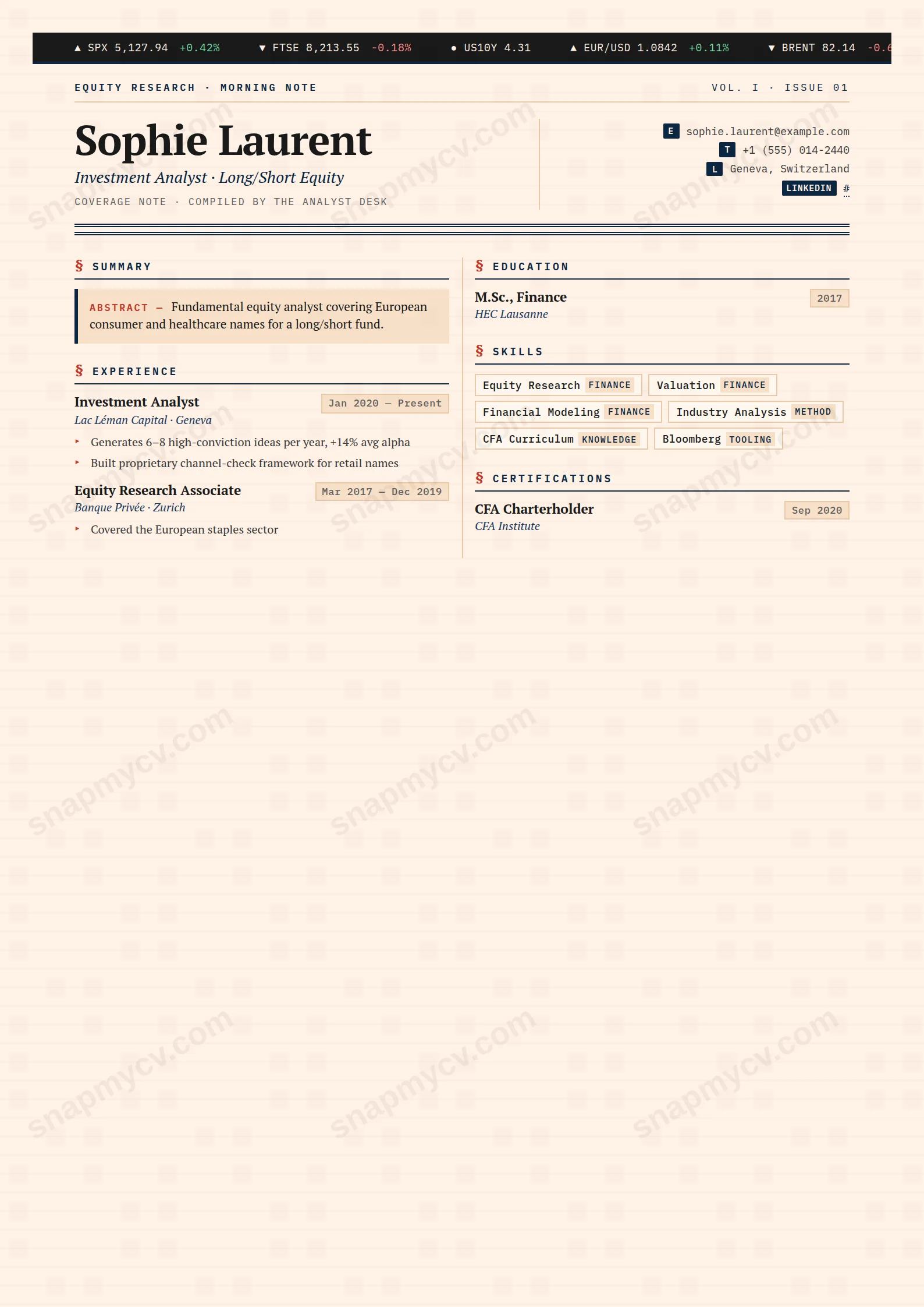
A salmon-tinted layout that tips its hat to the Financial Times. Dense, literate, and numbers-forward — for readers who notice the reference and approve.
Best for: investment professionals and fund analysts. Free to fill in, restyle, download as a PDF, or publish at your own SnapMyCV link.
Applicant tracking systems: Light styling. Mostly parseable but uses sidebars, columns or visual elements that may confuse stricter ATS.A template's styling never changes the advice that matters most — lead with achievements, quantify your impact, and tailor the content to each role.
New to writing a CV? Read our step-by-step CV guide and ATS tips, then come back and make this design your own.
The design commits fully to the visual grammar of a sell-side research note rather than borrowing a few cues. Everything sits on Financial Times salmon paper (#fff1e5) with a faint newsprint baseline grid, so the page carries the texture of a printed markets note before a single word is read. A live-feel ticker bar in IBM Plex Mono runs across the top under a masthead reading EQUITY RESEARCH MORNING NOTE, and your name is set in a 36px PT Serif headline beside an italic strapline, cut off from the body by a double navy rule in #0a2540. That pairing of a mono ticker against a serif headline is the whole thesis: machine-read data on top, considered editorial voice below.
The choices underneath reinforce the same discipline. Content breaks into two newspaper columns divided by a hairline rule, section titles are spaced mono caps flagged with a red section mark, and your summary is boxed as an ABSTRACT with a navy spine so it reads as the note's opening call. Dates, skills and the ticker borrow the red-down and green-up colours of a trading screen, and a For information purposes only footer closes it. The density is deliberate. Whitespace is rationed the way column inches are, which signals that every line was meant to earn its place.
Hedge Note is genuinely right for people who live inside financial markets: equity research analysts, hedge fund and asset-management candidates, IB associates, traders, quants and economists. If your work is judged on attributable, quantified calls, the format flatters you, because the abstract box and mono date tags mirror how the industry already presents conviction and tenure. A reader from that world decodes the ticker, the salmon paper and the red-down green-up palette instantly and reads them as fluency.
It is the wrong choice for nearly everyone outside that niche. Designers, marketers, teachers, healthcare and most creative or generalist roles will look like they are wearing a costume, and a recruiter unfamiliar with research notes may read the density and the For information purposes only footer as a gimmick rather than a signal. Early-career candidates with thin quantified track records should also avoid it, because the two-column grid exposes short experience sections and the abstract box has nothing to frame. If you cannot fill it with numbers, pick something quieter.
Write your experience highlights as crisp, attributable claims with numbers attached, the way you would defend a price target, because the two-column grid and PT Serif body reward short factual lines and punish long paragraphs. Keep the ABSTRACT box to two or three sentences of real signal; it is the note's headline call and loses force the moment it turns into a generic summary. Use the mono date tags to make tenure legible at a glance, and treat the skills section as coverage areas and tools rather than a soft-skill list, since the spaced mono caps look wrong wrapping vague adjectives.
The common mistake is fighting the density: people pad prose to fill space, which collapses the newspaper columns into a wall of grey and defeats the rationed whitespace the design depends on. Let the ticker bar and the footer stay as flavour and never try to load them with substance, because they read as chrome, not content. Aim for a tight one-page note. Three to five roles, a handful of quantified bullets each, and a lean skills block will balance the two columns cleanly, whereas an overstuffed second column drifts off the baseline grid and the whole markets-note illusion breaks.
The headings are conventional and the underlying text is clean, but the two-column grid and coloured salmon paper are stylistic risks a parser can misread, sometimes interleaving the left and right columns. Before submitting through an ATS, copy the rendered CV into a plain-text editor and confirm every role, date and bullet still reads in a sensible order. If a specific portal warns against multi-column files, use a single-column template for that application instead.
The layout holds up because the structure carries the meaning: the double navy rule, the boxed abstract with its spine, the hairline column divider and the spaced mono section marks all stay legible in black and white. What you lose is the trading-screen coding, since the red-down and green-up cues and the #fff1e5 salmon background flatten to similar greys. The design still reads as a research note in greyscale, just without the colour signalling that makes it feel live.


