
Warm and inviting template tailored for hospitality industry roles.
Create a free account to customize and publish this design.
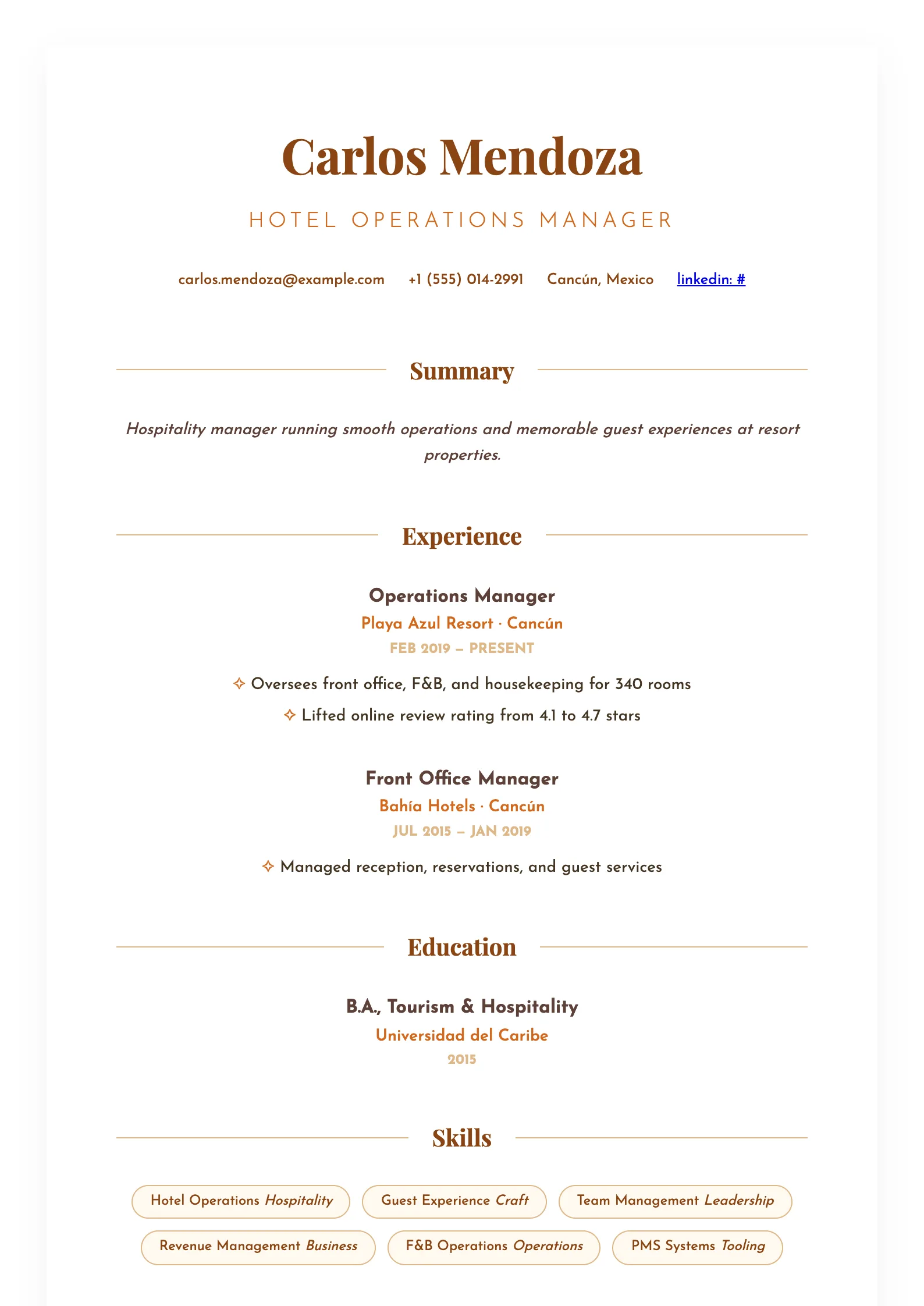
Warm tones and an inviting layout that mirror the service standard you're selling. Front-of-house polish, applied to paper.
Best for: hospitality and service industry roles. Free to fill in, restyle, download as a PDF, or publish at your own SnapMyCV link.
Applicant tracking systems: Light styling. Mostly parseable but uses sidebars, columns or visual elements that may confuse stricter ATS.A template's styling never changes the advice that matters most — lead with achievements, quantify your impact, and tailor the content to each role.
New to writing a CV? Read our step-by-step CV guide and ATS tips, then come back and make this design your own.
Every choice here borrows from the printed menu, the one artefact hospitality candidates handle daily. The page is a soft cream (#fffaf0) rather than clinical white, your name is set large in Playfair Display, a high-contrast serif, in saddle-brown (#8b4513), and the tagline beneath runs as spaced uppercase capitals in warm chocolate (#d2691e). Each section title is bracketed by two thin burlywood rules, the exact treatment a menu uses to separate starters from mains, so the eye moves down the page in tidy, appetising bands.
The body face is Josefin Sans, a geometric sans with tall, open letters that keeps the styled page from tipping into fuss. Restraint carries the rest: the summary is italicised to read like a spoken welcome, achievement bullets are marked with a small chocolate ✧ instead of a hard dot, and skills sit in rounded pill badges outlined in burlywood. The whole thing is a single centred column with generous whitespace, so nothing competes with your service record and the warmth reads as deliberate hospitality, not decoration for its own sake.
This is built for people whose value is measured in guest satisfaction: hotel concierge and front-desk teams, restaurant and bar staff, cabin and cruise crew, events and guest-experience coordinators, and food-and-beverage or venue managers. The cream palette and warm browns telegraph approachability, the single trait these roles hire for, so the design is doing part of the pitch before a word is read.
Avoid it if you are chasing a corporate, finance, legal, or technical role, where the cream page and ✧ bullets read as too casual against expectations of a plain, data-dense CV. It also strains under heavy volume: the centred single column and menu-style rules look best with disciplined entries, so a fifteen-year career crammed in full will lose the calm spacing that makes it work.
Because everything is centre-aligned in one column, front-load outcomes managers scan for: covers served per shift, review or satisfaction scores, upsell figures, and standards upheld. Keep the uppercase tagline to a few words so the spaced capitals never wrap and lose their elegance, write the italic summary as two or three warm sentences, and reserve the ✧ highlight bullets for two or three concrete wins per role rather than a long list. Let the burlywood skill pills carry service tools, POS systems, languages, and certifications, since short labels sit best inside the rounded badges.
The common mistake is treating this like a dense corporate CV and overfilling it. Long paragraph blocks defeat the centred layout, which relies on whitespace between the menu rules to breathe. Trim each role to its most guest-facing wins, keep pill labels to one or two words, and let the languages row stay a single clean line. Aim for one page: the design rewards a curated service story, not an exhaustive one.
Underneath the styling it is a single column in straight reading order with standard section names like Experience, Skills and Education, which most applicant tracking systems follow cleanly. The risk is cosmetic: the pill badges and ✧ bullets are visual flourishes, so before applying to a large chain, export the PDF, copy the text out, and confirm every entry still reads top to bottom in the right order.
It holds up better than most coloured templates because the design leans on contrast, not hue. The saddle-brown name and chocolate headline drop to strong dark greys against the near-white cream, so the menu-style hierarchy stays legible when a hotel prints your CV in mono. The burlywood section rules and pill outlines fade to faint light-grey lines, which softens the effect but keeps every heading and skill readable.


