
Gold-leaf elegance on cream stationery for hospitality professionals.
Create a free account to customize and publish this design.
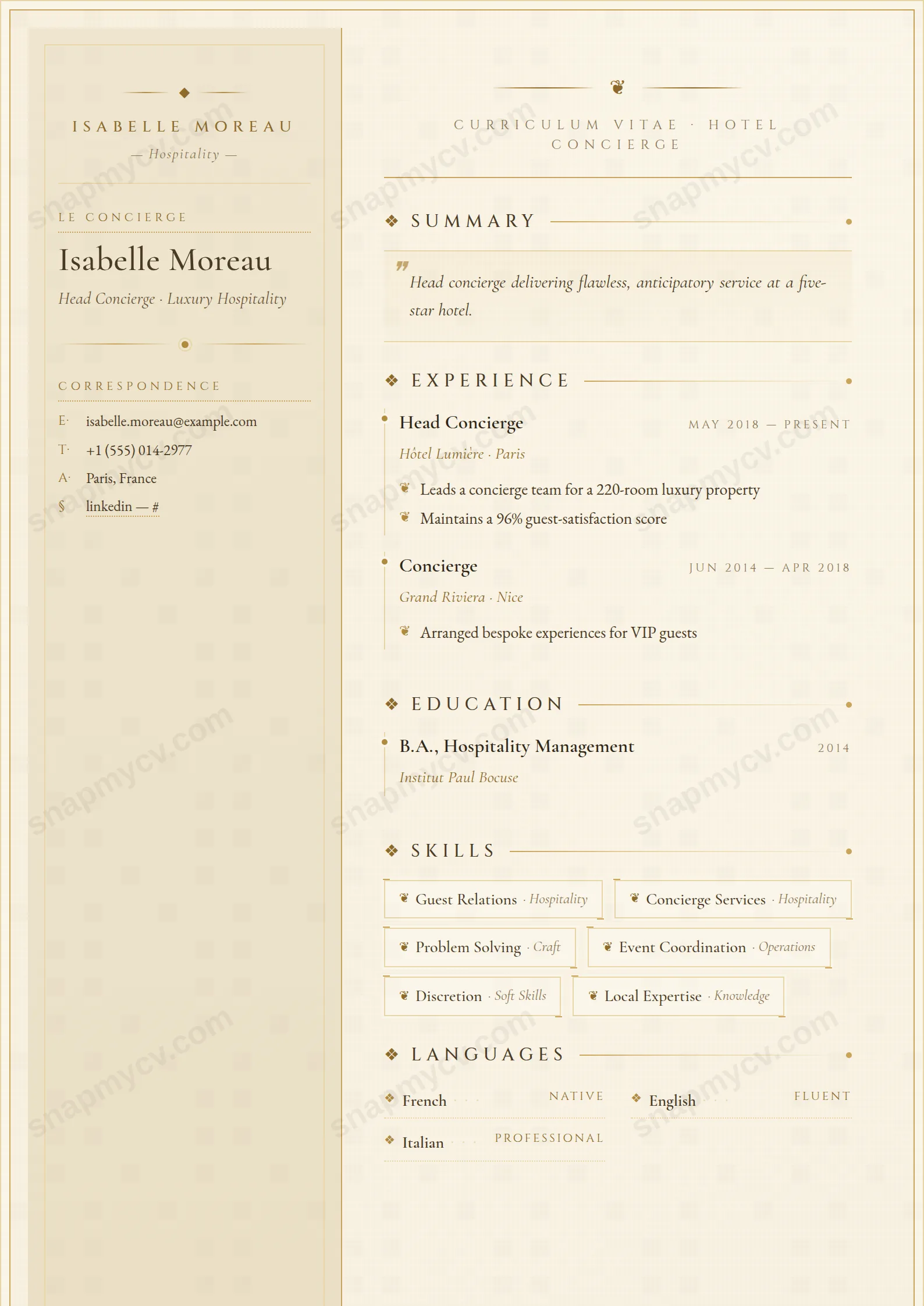
Gold-leaf accents on cream stationery, set with restraint. The page itself performs the hospitality standard you're claiming — composed, warm, and detail-perfect.
Best for: hotel, concierge, and luxury hospitality professionals. Free to fill in, restyle, download as a PDF, or publish at your own SnapMyCV link.
Applicant tracking systems: Light styling. Mostly parseable but uses sidebars, columns or visual elements that may confuse stricter ATS.A template's styling never changes the advice that matters most — lead with achievements, quantify your impact, and tailor the content to each role.
New to writing a CV? Read our step-by-step CV guide and ATS tips, then come back and make this design your own.
Hotel Concierge is built to read like the headed notepaper of a grand hotel rather than a document. Everything rests on a warm cream-to-ivory wash that lifts from #f7f0e0 to #fbf6e9, framed by a triple inset border that closes on a single hairline of gilt, with a faint paper grain printed over the top so the page feels stocked rather than printed. Gold is rationed on purpose. The #b08940-to-#c9a35a range appears only on hairline rules, bead dividers and small fleur ornaments, never as a fill, so the sheet stays quiet and the metal reads as detail rather than decoration.
The layout splits into a 270px left sidebar in deeper cream, carrying the crest, name and contact block, and a wider right column that holds the narrative. Typography does the register-setting. Cinzel sets the small-caps eyebrows, section titles and dates in wide engraved letter-spacing, while EB Garamond and Cormorant Garamond handle the readable serif body and the italic flourishes. The profile sits in a tinted block opened by gilt drop-cap quotation marks, skills arrive as bracketed badges, languages sit in a two-column proficiency grid, and each role is pinned by a gold bullet on a faint left rule. French cues, the 'Le Concierge' label and the 'au service de l'hote' footer, seal the hospitality character.
This template is cut for hospitality professionals whose work is judged on polish and discretion: concierges, guest relations and front office managers, head butlers, reservations leads, guest services and VIP hosts in luxury hotels, resorts, private members' clubs and fine dining. The gilt frame and French labelling signal exactly the register those rooms expect, where presentation is itself part of the service. It also carries well for a maitre d'hotel, a spa or estate manager, or a private household staffer moving between high-end postings.
Be honest about where it does not belong. If you are applying for a software, finance, engineering or academic role, or submitting into a corporate portal that wants sober single-column plainness, the ornament will feel costumed and work against you. The two-column serif construction is decorative by design, so anyone who needs a stark ATS-first sheet or who has ten dense roles to cram in should choose something plainer. Hotel Concierge rewards a curated, well-spaced story, not a full dossier.
Treat the 270px sidebar as your service card and nothing more: crest or monogram, name in Cinzel, then a tight contact stack and the two-column language grid. That grid is a genuine asset in this field, so fill it honestly with real proficiency labels rather than padding it with a token phrase. Skills belong in the bracketed badges, so keep each to one or two words. Long strings break the badge shape and are the most common way people spoil this layout. Reserve the tinted profile block for a short italic introduction of two or three sentences that actually sounds like a person greeting a guest, since the drop-cap quotes frame it as a spoken welcome.
In the right column, let each role breathe against its gold bullet and faint left rule, and lead the highlights with measurable service wins: occupancy lifts, guest satisfaction and review scores, VIP arrangements handled, events run, languages deployed on shift. The gold detailing and generous cream margins look their best with four to six roles and trimmed bullet points rather than a wall of text, so aim for a single confident page. Keep Cinzel section titles to the conventional set, since the engraved small-caps get hard to read in long custom headings. When the whitespace is respected, the hairline rules and fleur ornaments do the persuading for you.
The body is real selectable text, not an image, and the section titles use the conventional Experience, Education, Skills and Languages labels, which helps. Because it is a two-column coloured design, run the plain-text test before you submit: copy the whole page into a blank document and confirm the sidebar and main column still fall into a sensible reading order. If an employer insists on a strictly ATS-parsed file, a single-column template is the safer bet for that specific application.
It holds up better than most gold designs because the metal is used only on thin rules, bead dividers and small ornaments rather than as large fills, so in greyscale those details drop to light grey lines and the layout still reads cleanly. The cream ground turns to a soft off-white and the serif text stays crisp and legible. You lose the warmth of the gilt, but nothing structural collapses, which matters given how often front-office CVs get photocopied on the pass.


