
Project-portfolio focus with sticker-style tags for interns.
Create a free account to customize and publish this design.
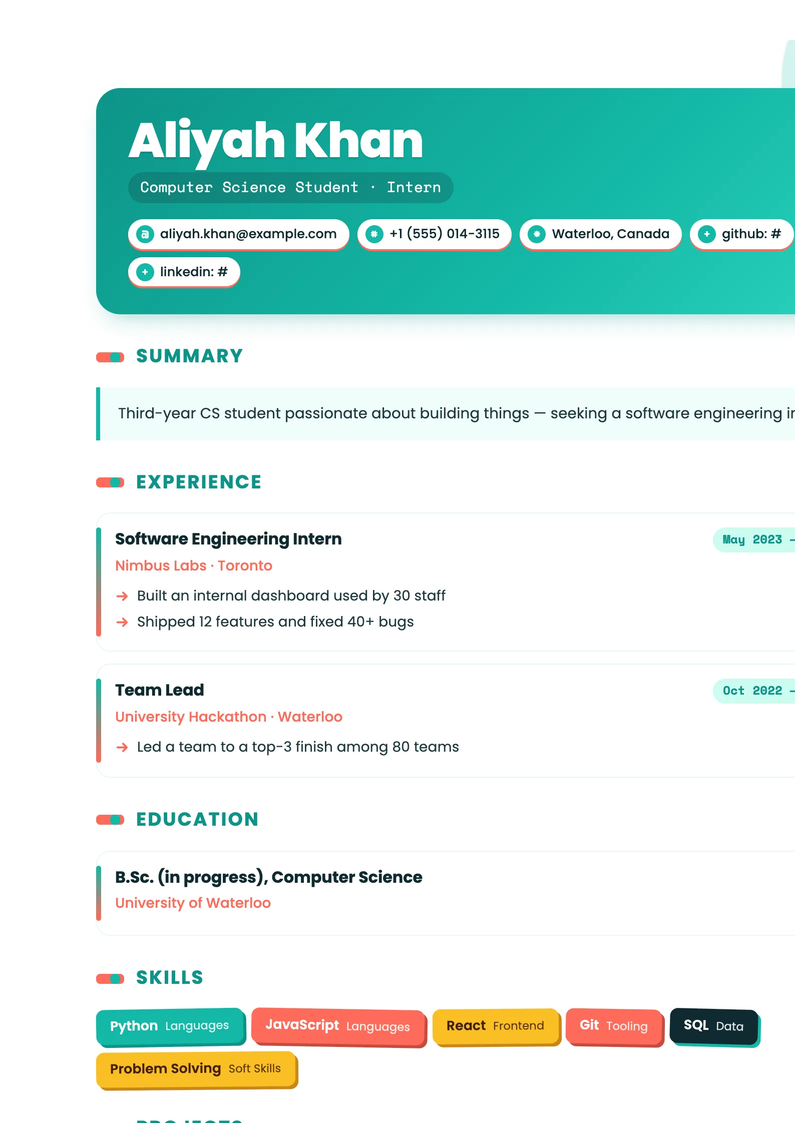
Built for CVs that are short on years and long on potential: projects take the spotlight, sticker-style tags add personality, and education sits close behind. Nothing here apologizes for being early-career.
Best for: interns and students applying for their first roles. Free to fill in, restyle, download as a PDF, or publish at your own SnapMyCV link.
Applicant tracking systems: ATS-friendly. Single-column, standard section headers, parses cleanly in most applicant tracking systems.A template's styling never changes the advice that matters most — lead with achievements, quantify your impact, and tailor the content to each role.
New to writing a CV? Read our step-by-step CV guide and ATS tips, then come back and make this design your own.
Intern Energy opens with a rounded card that pours a teal gradient from #0d9488 into #14b8a6 and out to #2dd4bf, capped with three burst dots in coral, butter-yellow and white. That header is doing deliberate work. Your name sits in heavy 36pt Poppins for warmth and presence, while the headline drops into a Space Mono pill just beneath it. The pairing is the whole idea: a friendly geometric sans carries the personality, and the monospace pill lends a flicker of technical credibility so the page reads as capable, not just cheerful.
The colour logic repeats all the way down a single column. Contact details become white pills lifted on a coral drop-shadow, skills tilt on a slight angle and cycle through teal, coral, amber and ink like peel-off stickers, and arrow bullets nudge every achievement forward instead of sitting flat. Soft teal and coral circles bleed off the page corners, the summary rests in a mint #f0fdfa panel with a teal left border, and each role is a rounded card spined with a teal-to-coral gradient. The restraint is in the structure: one clean column keeps all that energy legible.
This is a template for students, interns, recent graduates and early-career applicants chasing a first role, placement, internship or part-time job, and it lands hardest in creative studios, startups, campus teams and junior tech where visible personality is a plus rather than a liability. The sticker skills and coral accents signal energy and initiative, exactly the read a fresher wants.
Be honest about where it works against you. In a conservative bank, a law firm or a formal government application, the tilt, the burst dots and the saturated teal will read as unserious, and the playful surface can undercut a senior CV where gravitas matters more than warmth. If you already have ten years of experience to weigh, a quieter layout serves you better. Judge the audience before the aesthetic.
Because you are probably light on formal experience, feed the sections that flatter beginners. The tilted sticker skills grid, the project cards with their Space Mono tech chips, plus volunteering, awards and languages all pull real weight here, so treat them as headline content rather than filler. Write a short, warm summary for the mint panel first, two or three sentences that set your tone, then let the teal-to-coral cards below carry the specifics. Open every arrow bullet with an action verb and keep each card tight; the layout rewards a few sharp lines over dense paragraphs.
The common mistakes are all about volume. Dumping twenty skills turns the sticker grid into confetti and kills its charm, so cap it near eight to twelve of your strongest. Keep contact pills to the essentials the coral shadow can breathe around, and resist stretching a thin work history to fill the column, because empty rounded cards look emptier than plain text would. One page, a handful of well-chosen entries, and the design does the rest.
The layout does not rely on colour alone to separate sections, so a greyscale print stays readable: the rounded cards, the mint summary panel and the pill shapes all keep their edges as tonal blocks. You will lose the teal-to-coral spine and the sticker colour-cycling, which flatten to similar greys, so the skills grid reads as plain tilted tags. Name, roles and dates survive cleanly because they lean on the heavy Poppins weight and the card structure, not the hues.
The markup underneath uses conventional, clearly labelled sections, which most ATS parsers handle fine, and the visual tilt is styling that does not change the reading order of the text itself. Still, this is a heavily decorated design with pills, chips and stickers, so before a strict portal submission, copy the rendered CV into a blank document and confirm your name, skills and dates land in a sensible sequence. If they do, the sticker styling is cosmetic and safe.


