
Chalkboard-inspired warmth with friendly serif for K-12 teachers.
Create a free account to customize and publish this design.
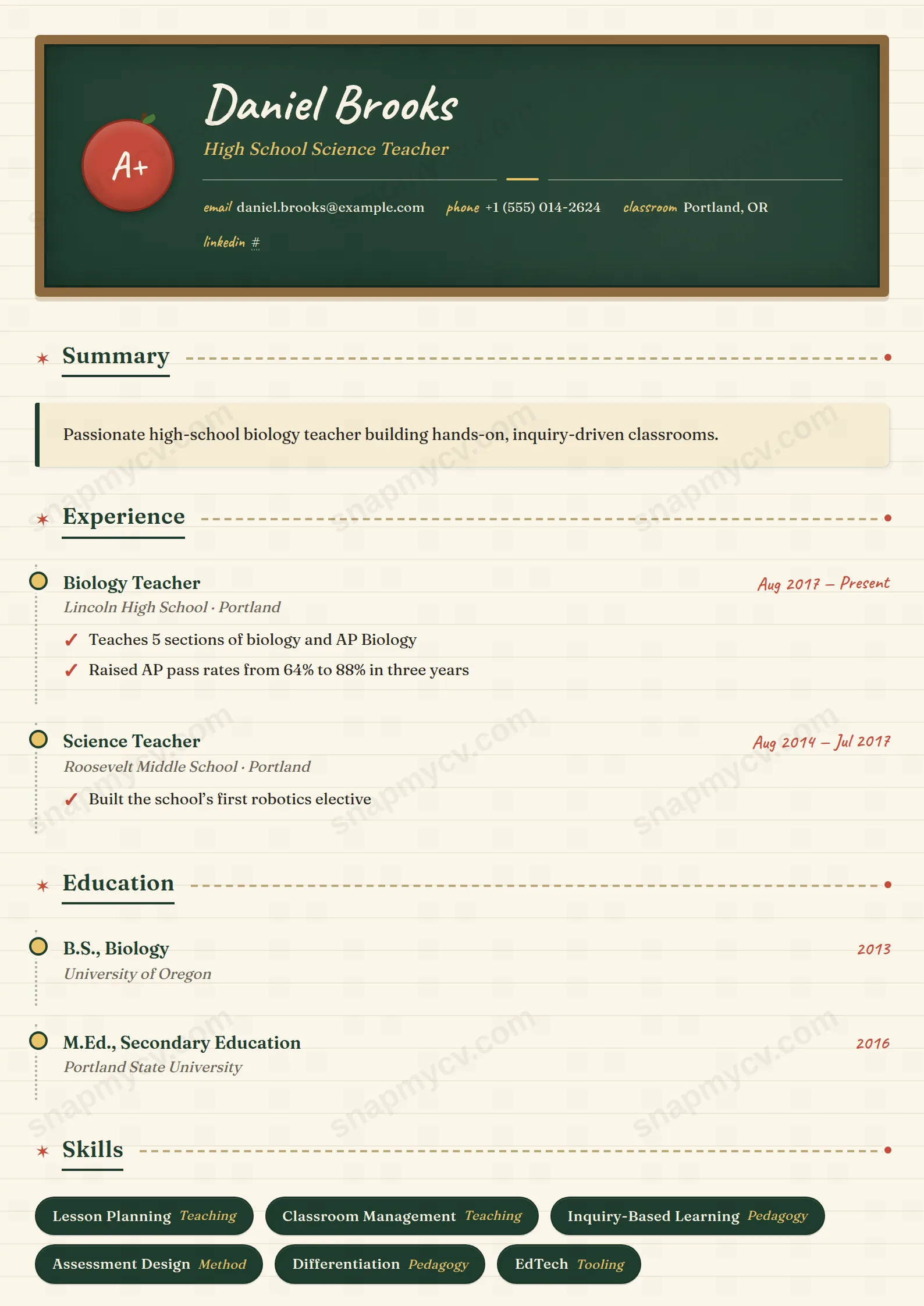
Chalkboard-inspired warmth and a friendly serif make a teaching CV that feels like a good classroom: organized, welcoming, and quietly rigorous underneath.
Best for: K-12 teachers and school staff. Free to fill in, restyle, download as a PDF, or publish at your own SnapMyCV link.
Applicant tracking systems: ATS-friendly. Single-column, standard section headers, parses cleanly in most applicant tracking systems.A template's styling never changes the advice that matters most — lead with achievements, quantify your impact, and tailor the content to each role.
New to writing a CV? Read our step-by-step CV guide and ATS tips, then come back and make this design your own.
Every choice in K-12 Educator argues that a teacher's CV should feel like the room they run. The header is a wood-framed chalkboard banner in deep board-green (#1f3d2e) with your name brushed in Caveat, a genuine handwriting face, and an apple-red A+ stamp tilted into the corner for a note of earned play. That banner sits on a warm cream page (#fbf6e9) faintly ruled like notebook paper, so the document signals approachability before a single word is read. The restraint is real: apple red and pencil yellow are the only accents, and they never spill past markers, ticks, and the underline dot.
The body abandons the two-column resume grid for a single top-to-bottom column set in Fraunces, a soft modern serif that keeps long paragraphs comfortable at reading size. Section titles are underlined like a heading chalked on a board, then trailed by a dashed rule capped with an apple-red dot, a small motif that paces the eye down the page. Experience and education hang off a dotted timeline pinned with pencil-yellow markers, achievements carry hand-drawn tick marks instead of bullets, skills sit in rounded chalk badges, and languages line up in a dashed gradebook. The theme is committed rather than decorated on top.
This is a template for people whose job is caring for students: K-12 classroom teachers, teaching assistants, early-years and primary staff, substitute and supply teachers, coaches, and school librarians applying to schools and districts where warmth reads as competence. The friendly, human personality does real work here, because a hiring principal is screening for temperament as much as credentials, and the chalkboard banner communicates both at a glance.
Be honest about where it does not belong. The Caveat handwriting, apple-red stamp, and notebook rules will feel unserious to a corporate recruiter, a law firm, a bank, or a conservative government panel, and anyone in finance, consulting, or senior administration should choose something plainer. It also suits a single focused role, not a sprawling twenty-year career across sectors, since the decorative timeline and single column reward a tight, story-led CV over a dense one.
Open with a short summary in the sticky-note card, three or four lines at most, then let the tick-marked highlights carry the evidence: test-score gains, curricula you built, a classroom-management approach, family engagement wins. Keep each highlight to a single crisp line, because the hand-drawn tick marks and Caveat accents lose legibility the moment a bullet wraps to two or three lines. Put grade levels and subjects into the experience subtitles that hang on the dotted timeline, load the chalk badges with certifications, platforms, and pedagogies rather than soft adjectives, and reserve the dashed gradebook for languages, where it is a genuine quick win for bilingual or ESL roles.
The common mistakes are all about density. People paste corporate-length paragraphs into a layout built for breathing room, cram fifteen skill badges until the chalk row looks cluttered, or run so many timeline entries that the pencil-yellow markers stop feeling special. Aim for three to five roles, six to ten badges, and highlights that read like a well-kept board rather than a wall of text. The cream page and generous whitespace are load-bearing, so leaving space is part of using this template well.
Mostly, but with a caveat. The deep board-green (#1f3d2e) banner drops to a dark grey that keeps your name legible in reverse, and the Fraunces body and dotted timeline read cleanly in black and white. The apple-red A+ stamp, red underline dots, and pencil-yellow markers lose their contrast and flatten into similar greys, so the schoolhouse personality that makes this template distinctive is strongest in colour and noticeably muted on a mono office printer.
It is built for a focused CV, comfortably one page and up to a tight two. Three to five roles on the dotted timeline, each with a handful of single-line tick-marked highlights, is the sweet spot. Push past that and the decorative markers, chalk badges, and notebook-ruled whitespace start fighting the content, so a fifteen-role career history or dense academic record is better served by a plainer, denser layout.


