
Bold all-caps headers with bar-chart accents for trial lawyers.
Create a free account to customize and publish this design.
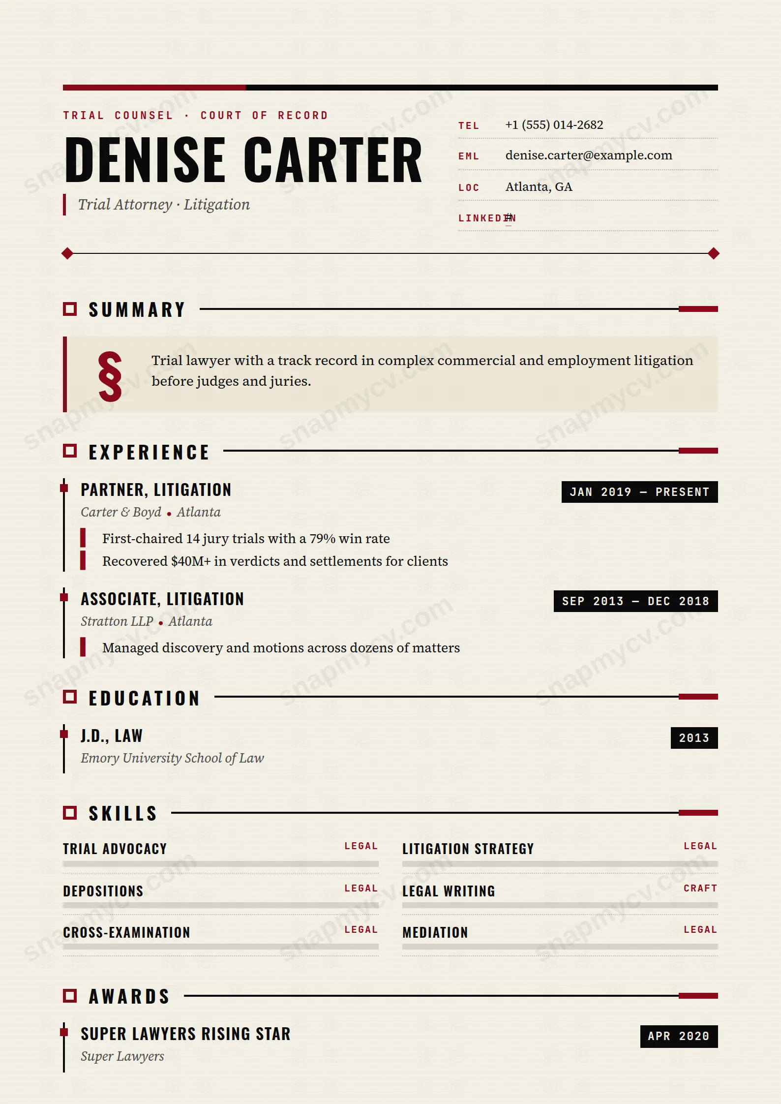
All-caps headers land like opening statements, with bar-chart accents for case outcomes. Assertive without being loud — the page argues your record cleanly.
Best for: trial lawyers and litigators. Free to fill in, restyle, download as a PDF, or publish at your own SnapMyCV link.
Applicant tracking systems: ATS-friendly. Single-column, standard section headers, parses cleanly in most applicant tracking systems.A template's styling never changes the advice that matters most — lead with achievements, quantify your impact, and tailor the content to each role.
New to writing a CV? Read our step-by-step CV guide and ATS tips, then come back and make this design your own.
Litigator is engineered to read like a document entered into the record. The page sits on a warm paper cream (#f4f0e6) carrying a faint printed grain, then argues its case in ink black (#0a0a0a) against a single rationed accent of blood red (#8b0a1a). A heavy black header bar, capped with a red segment, opens the file; your name lands enormous in condensed Oswald capitals, while an italic Source Serif 4 line is pinned behind a red rule like the heading of a charge sheet. The pairing is deliberate. Oswald supplies the tall, compressed authority of signage and case captions, and Source Serif 4 lends the literate, argued tone of a written brief.
Nothing here is ornament for its own sake. Section titles run in spaced Oswald caps beside a small notched marker, trailed by a ruled line that bleeds off in red. The summary is framed as a legal clause, led by a towering paragraph-mark (§) drop cap. Dates sit in inverted black chips set in JetBrains Mono, experience hangs off a vertical timeline rule ticked in red, skills render as part-black, part-red bar charts, and hobbies become bordered monospace tags. It is single-column and unmistakably adversarial, with whitespace used sparingly so the eye is pushed down the timeline rather than allowed to wander.
This is a bespoke instrument for people who argue before a court of record: litigators, barristers, advocates, prosecutors and trial counsel. The eyebrow already reads 'Trial Counsel,' and the gavel-marked highlights are built to carry verdicts, settlements and reported judgments. It extends cleanly to neighbouring adversarial fields, arbitration, regulatory enforcement, white-collar investigations and any high-stakes practice that rewards presence over polite restraint.
Be honest about where it fights you. If you work in-house transactional law, private client, tax or academia, the blood-red bar charts and courtroom theatre will read as louder than your work, and a calmer serif template will serve you better. It is equally a poor fit for anyone outside law who simply wants a bold look, because the vocabulary is so specifically forensic that the eyebrow, the § clause and the gavel markers feel like costume rather than credential.
Give the design real outcomes to frame. Lead each role's highlights with the verdict, the forum and the number, so the red timeline ticks and the black date chips are marking wins rather than decorating filler. Because dates live in narrow JetBrains Mono chips, keep them to clean year ranges and avoid long parenthetical notes that would break the chip. Hold your headline to one sharp line of practice area, since it sits in italic beside the masthead and wraps badly if you crowd it. The § clause summary wants three or four tight sentences, argued like an opening, not a paragraph of duties.
The commonest mistake is fighting the palette. The blood red is potent precisely because it is confined to markers, rules, ticks and the header cap, so do not reach for more colour and do not pad the skills into a wall of bars, since eight to ten weighted competencies read as considered while twenty read as noise. Feed the single column in priority order, experience first and deep, education and skills kept lean, and let the ink and cream carry the long stretches so the accent still lands when it appears.
Mostly yes, because the design leans on the black-to-cream contrast for its structure, so the header bar, Oswald headings, date chips and timeline rule all stay legible in monochrome. The blood red flattens to a mid-grey, which means the red ticks and the part-red skill bars lose some of their punch and the header's red cap becomes near-invisible. Nothing critical is encoded in colour alone, so a greyscale print still reads as a clean, single-column document.
It is happiest with a focused senior narrative rather than a decade-by-decade list. Four to six roles hung off the vertical rule, each with two or three outcome-led highlights, keeps the red ticks meaningful and the page breathing. Push past that and the timeline compresses, the § summary and skill bars get squeezed, and the deliberate whitespace that gives the layout its courtroom composure starts to disappear.


