
Editorial magazine-spread layout with drop caps for creative directors.
Create a free account to customize and publish this design.
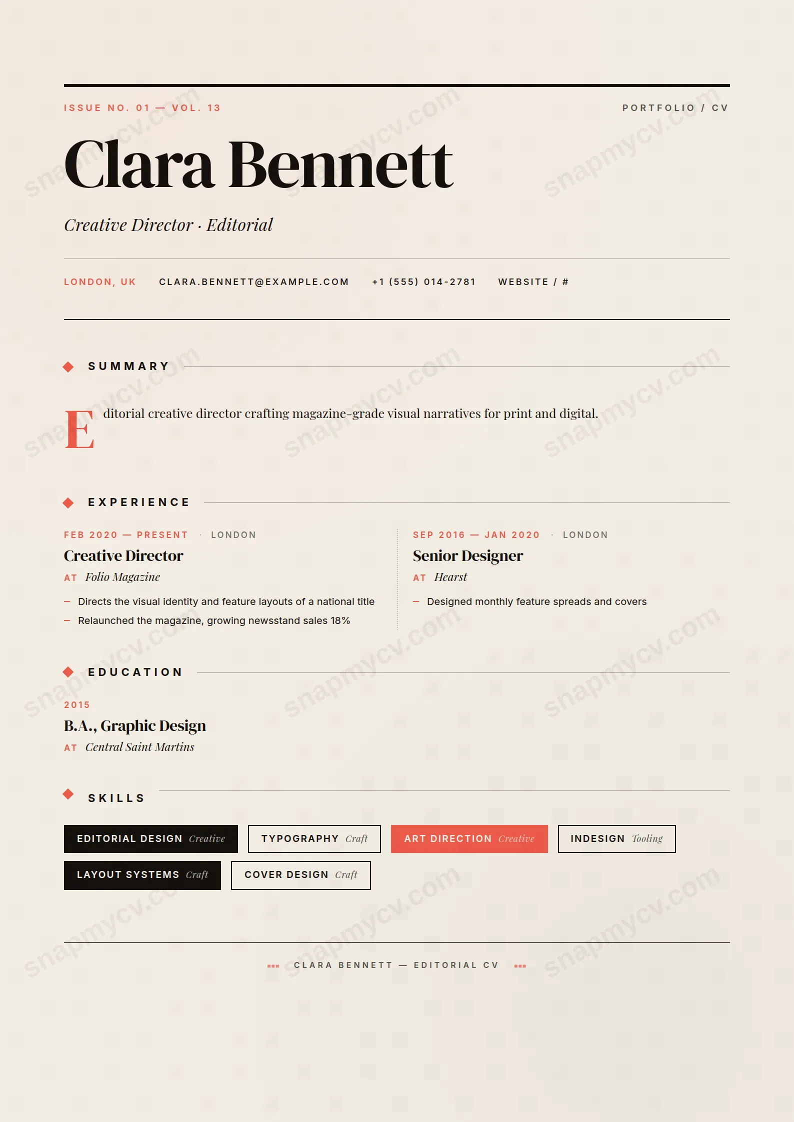
Drop caps, editorial columns, and spread-style pacing borrowed from print. For careers that deserve to be read like a feature, not scanned like a form.
Best for: editors, journalists, and creative directors. Free to fill in, restyle, download as a PDF, or publish at your own SnapMyCV link.
Applicant tracking systems: Visual only. Designed for human readers — heavy decoration, dark backgrounds or column layouts that often break ATS parsing.A template's styling never changes the advice that matters most — lead with achievements, quantify your impact, and tailor the content to each role.
New to writing a CV? Read our step-by-step CV guide and ATS tips, then come back and make this design your own.
Magazine Spread borrows the grammar of a print title on purpose. The name is set in DM Serif Display and blown up to cover-headline scale, boxed by two heavy ink rules (#15110d) that form a masthead, with a spaced-out uppercase Inter folio reading Portfolio / CV and an issue line running alongside. Underneath, the headline arrives as an italic Playfair Display deck, so it behaves like a cover line rather than a job title. The whole page rests on warm paper (#f3ede3) warmed further by faint coral and ink wash gradients, which is what stops the serif weight from feeling funereal. Discipline is the point: a single coral (#ec5a4a) does every piece of punctuation, the issue number, the diamond section markers, the coral date stamps and the drop cap, so the colour reads as an editorial signature instead of decoration.
The body deliberately abandons the CV form and adopts feature-article structure. Your summary flows into two justified columns split by a hairline rule and led by an oversized coral drop cap, the oldest trick in magazine typesetting for pulling a reader in. Experience, education and projects drop into a two-column grid divided by a dotted rule, each entry stamping dates in coral small caps, the role in serif and the employer in italic, a three-tier hierarchy that lets the eye scan without bold shouting. Skills become bordered chips, some reversed out in ink or coral, languages sit on a dotted two-column ledger, and a centred colophon signs the page off like the masthead of a real issue.
This template is built for people whose work is partly visual and who are judged on taste: creative and art directors, editors, brand and content designers, copywriters, photographers and stylists. The masthead rewards a confident name and one sharp headline, and the folio framing signals that a portfolio sits behind the page, which makes it a strong fit for studio applications and portfolio-led roles. It is expressive by design, so it works best where an unusual, well-set document is read as evidence of craft rather than a risk.
Be honest about where it does not belong. The coral accent, the reversed ink chips and the dual two-column grids make this the wrong choice for conservative corporate, legal, finance or public-sector applications, and for any pipeline that leans on automated parsing. If your headline is a plain job title, or your history is dense and needs a single scannable column, the masthead and drop cap will feel like costume rather than fit. Choose it only when the design is part of the message.
Write to the structure rather than fighting it. Treat the deck as a cover line: one taut phrase that captures your discipline, not Senior Designer at Company. Keep the summary to roughly two crisp paragraphs so the two justified columns balance under the drop cap, because a thin summary leaves one column stranded and an overlong one buries the drop cap. In the experience grid, front-load each entry with achievement-led highlights kept short, since the columns are narrow and long sentences wrap into visual mush; two to four punchy lines per role sits best. Load the skills chips with tools and named disciplines rather than soft adjectives, so the reversed ink and coral chips carry real information.
The common mistakes are all about density. People pour a corporate-length summary into the drop-cap columns, list ten roles that overflow the grid, or write skills as full sentences that break the chip shapes. Aim for a one-page issue: a tight summary, three to five well-edited roles, a focused skills row and a short languages ledger on the dotted two-column rule. Let the italic hobbies or interests line add a single human note near the colophon. The layout is at its best when every section is edited down to what a magazine editor would actually run.
The template uses real selectable text and conventional section headings, which parsers handle, but the justified two-column summary, the two-column entry grid and the coloured chips are exactly the structures automated readers can reorder or drop. Before applying through a job board, copy the rendered PDF into a blank document and check that your roles, dates and skills come out in a sensible sequence. For heavily automated pipelines, submit a single-column template instead and keep this one for direct applications and portfolios.
It survives better than most colour designs because the hierarchy is carried by type, not hue: DM Serif Display for the name, serif roles over italic employers, and small-caps dates all still separate in black and white. The coral (#ec5a4a) accents, the diamond markers, date stamps and drop cap, drop to a mid grey, so they read as tone rather than colour, and the reversed ink chips stay legible. You lose the warm paper and coral signature, but the masthead and grid structure remain intact on a laser printer.


