
Pyramid Principle layout with headline-driven structure for strategy consultants.
Create a free account to customize and publish this design.
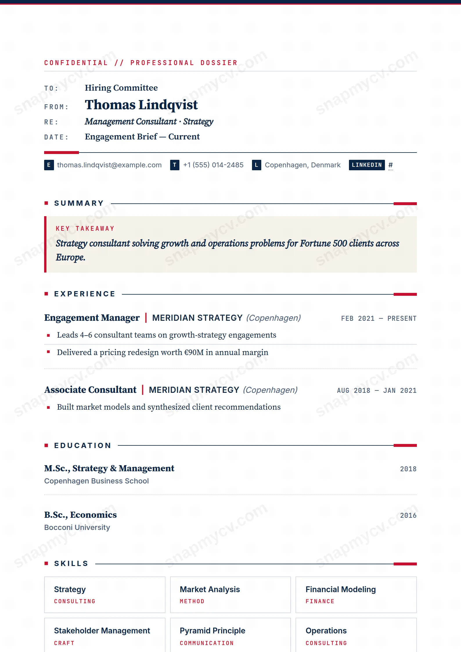
Structured on the Pyramid Principle: headline conclusions first, supporting detail beneath, no suspense. The CV equivalent of a well-run steering-committee memo.
Best for: management consultants and strategy professionals. Free to fill in, restyle, download as a PDF, or publish at your own SnapMyCV link.
Applicant tracking systems: ATS-friendly. Single-column, standard section headers, parses cleanly in most applicant tracking systems.A template's styling never changes the advice that matters most — lead with achievements, quantify your impact, and tailor the content to each role.
New to writing a CV? Read our step-by-step CV guide and ATS tips, then come back and make this design your own.
McKinsey Memo commits fully to one idea: your CV should read like an internal strategy deliverable, not a job flyer. The page opens with a deep navy #0B2545 bar and a slim red #c8102e rule, then a monospaced CONFIDENTIAL // PROFESSIONAL DOSSIER classification line in JetBrains Mono. That framing does real work, priming a recruiter to skim the document the way they skim a briefing note. The header itself is a literal memo block with TO, FROM, RE and DATE labels, and your name set large in Source Serif Pro so the serif warmth offsets the clinical mono labels around it.
The rest of the palette stays deliberately narrow. Navy carries the headings, red is rationed to accent rules and the square bullet markers, and warm cream #f6f2ea is held back for just two things: the Key Takeaway callout box and the hobby chips. That restraint is the point. Your summary becomes a red-ruled italic callout, experience renders as engagements with MECE-style square bullets, and skills lock into a three-column capability matrix tagged with monospaced category labels. A closing footer signs off END OF MEMO, STRUCTURED VIA PYRAMID PRINCIPLE, so the metaphor holds from first rule to last.
This template is squarely for management consultants, strategy and operations professionals, MBB and Big Four candidates, corporate strategy hires, and anyone whose day job is pitching outcomes. The memo scaffolding rewards work that already breaks down into problem, approach and result, which is why it flatters analysts and engagement managers, product and biz-ops people, and finance or transformation roles.
Be honest about who should walk away. If your value is visual, a designer, illustrator, brand or motion portfolio, the monospaced labels and CONFIDENTIAL dossier framing will read as costume rather than fit. The same goes for early-career applicants with thin experience: the memo header and pyramid-principle sign-off set an expectation of senior, outcome-led substance, and a sparse page under that framing looks emptier than it would in a plainer layout. Choose this when your bullets can carry quantified findings, not when styling is doing the persuading.
Treat the header labels literally. RE is your positioning line, so make it a role and a claim rather than a job title, and keep it to a single tight phrase since the mono type shows every extra word. Then spend real effort on the Key Takeaway callout, the cream red-ruled box near the top: state your value in one or two lines, lead with the outcome, and resist listing responsibilities there. Experience bullets should read like findings with quantified impact first and context second, and the italic situation line under each role is for engagement context, the client, the mandate, the stakes, never a duties list.
The three-column skills matrix is where people most often stumble. Its monospaced category tags are meant to group capabilities into deliberate buckets, so name the categories thoughtfully rather than dumping a flat keyword list that leaves ragged, half-empty columns. Keep the whole document to a scannable single column: four to six bullets per recent role, fewer as you go back, and hobby chips used sparingly so the cream accent stays a highlight instead of noise. The failure mode here is over-filling; the memo look depends on whitespace, and a page crammed edge to edge breaks the calm authority the format is trying to project.
Yes, because colour is doing hierarchy work, not carrying meaning. In greyscale the navy #0B2545 headings drop to near-black and the red #c8102e rules and square bullets flatten to mid-grey, but the memo structure, labels and callout borders still separate cleanly. The one thing to watch is the cream #f6f2ea Key Takeaway box, which nearly vanishes on white, so the callout reads more by its ruled border than its fill when printed without colour.
The document is a single column of real, selectable text with conventional headings, which most applicant tracking systems parse without trouble. The TO/FROM/RE labels, the CONFIDENTIAL line and the coloured rules are styling on top of ordinary text, and the three-column matrix is still text rather than an image. Because callout boxes and grids can occasionally reorder on extraction, do the plain-text test before applying: export, copy the text back out, and confirm the RE line, takeaway and skills land in a sensible reading order.


