
Blueprint-grid background with ruler dividers for mechanical engineers.
Create a free account to customize and publish this design.
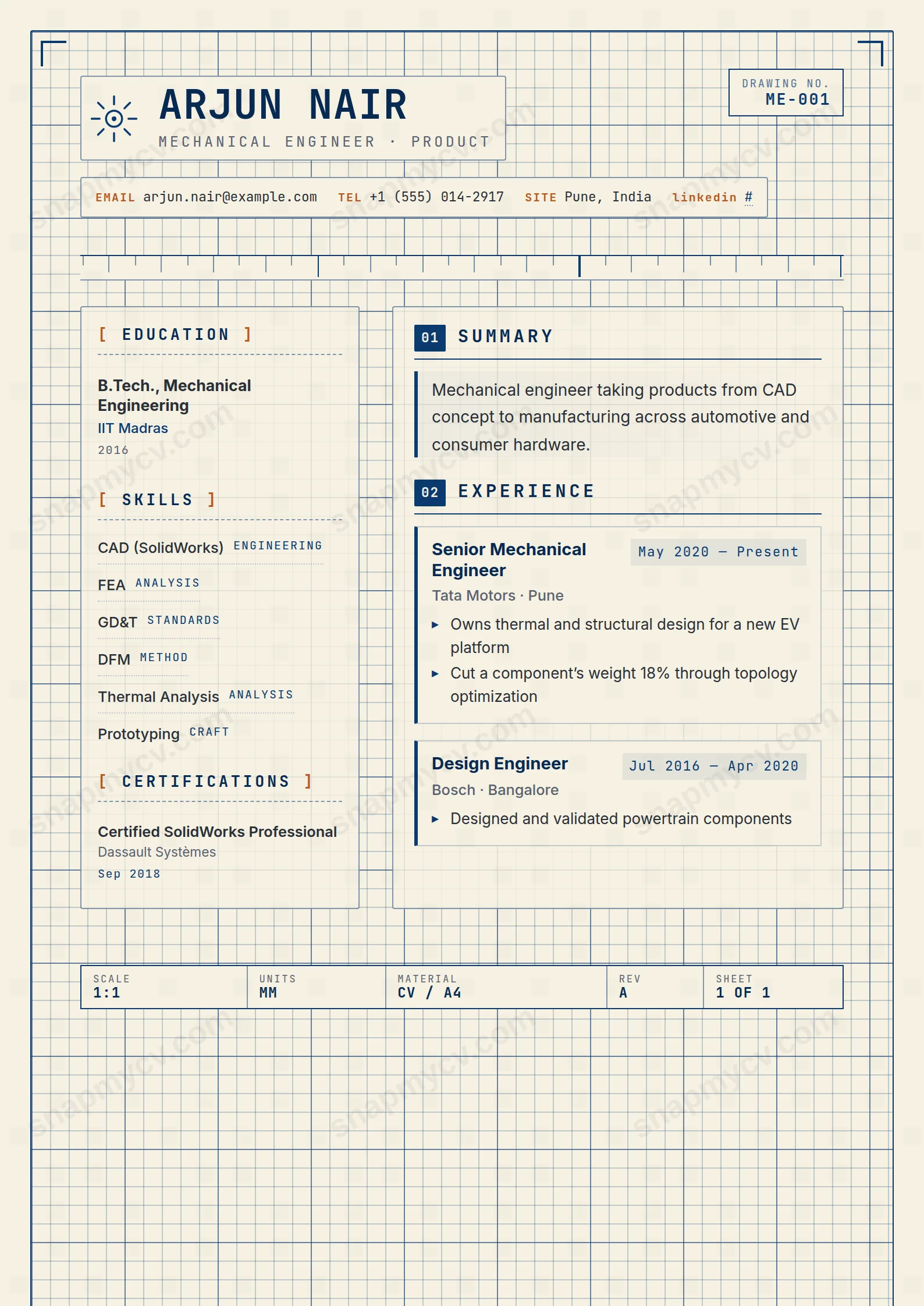
A faint blueprint grid sits behind ruler-straight dividers, and the content slots into it with machine-shop precision. CAD packages, tolerances, and project specs all have a place.
Best for: mechanical and manufacturing engineers. Free to fill in, restyle, download as a PDF, or publish at your own SnapMyCV link.
Applicant tracking systems: Visual only. Designed for human readers — heavy decoration, dark backgrounds or column layouts that often break ATS parsing.A template's styling never changes the advice that matters most — lead with achievements, quantify your impact, and tailor the content to each role.
New to writing a CV? Read our step-by-step CV guide and ATS tips, then come back and make this design your own.
Mechanical Engineer commits fully to the conceit of a drafting sheet, and the discipline of that idea is what saves it from gimmickry. A blueprint-blue (#0b3a6f) border frames the whole A4, a faint 16px grid with heavier 80px rules sits behind the content, and drafting tick-marks anchor each corner. The title block along the foot carries SCALE 1:1, UNITS MM, MATERIAL CV / A4, REV A and SHEET 1 OF 1, with a stamped DRAWING NO. ME-001 and a line-drawn gear in the masthead. These are not decoration for its own sake. They set up a visual grammar that tells a reader, in half a second, that the person behind the CV works in tolerances and part numbers.
The colour and type choices keep that grammar readable rather than noisy. Everything prints on a warm paper tone (#f6f1e3) instead of stark white, so the graphite body text in Inter feels closer to a printed spec than a screen. JetBrains Mono carries all the technical furniture: the uppercase name, the labelled EMAIL / TEL / SITE contact rows, the dates and the numbered headings. Main sections run 01 through 07 inside solid blue chips, sidebar headings sit in rust-coloured square brackets, and a single rust accent (#b85a1f) plus a blue left-rule on every entry does the hierarchy work that a lesser design would try to solve with more colour.
This template is genuinely right for mechanical, manufacturing, design and maintenance engineers, along with draughtspeople, CAD specialists and recent engineering graduates who want a document that mirrors the artefacts they produce. If your day involves GD&T callouts, FEA runs, tolerance stacks or maintenance logs, the drafting motifs read as fluency, not costume.
It is the wrong choice for anyone outside that world. A UX designer, a marketer, a nurse or a finance analyst will look like they borrowed someone else's title block, and the blueprint framing will read as a costume rather than a signal. It also suits people who have concrete, measurable work to show. If your experience is thin or highly narrative, the numbered sections and mono labels will expose the gaps rather than flatter them.
The layout splits into a 240px sidebar and a wider main column, and filling each correctly is what makes the sheet work. Skills, languages, certifications, education and hobbies belong in the sidebar. Summary, experience, projects, awards, publications and volunteering go in the main column. Tag every skill with a category such as FEA, CAD or GD&T so the mono labels carry real technical weight, and put chartered status or safety tickets under certifications where a hiring engineer expects them. Keep the summary tight, because it renders in a highlighted quote block beside a blue rule and any bloat there shows immediately.
Use the ▸ bullet under each role for measured outcomes: tolerances held, cycle times cut, scrap rate or cost reduced. Numbers are the whole point of this style. The most common mistake is over-stuffing the grid until the 16px background lines and corner ticks stop being legible, so leave whitespace and let three or four sharp bullets per role do the work of ten vague ones. Aim for five to eight categorised skills and a two or three sentence summary rather than filling every cell.
The section headings are standard and the text is real selectable type rather than an image, which helps. But this is a two-column, grid-and-colour design, so before applying, copy the rendered CV into a blank document and confirm the 240px sidebar and the main column read in a sensible order. If an employer insists on a strictly single-column file, use a plainer template for that particular submission.
It holds up better than most coloured templates because the design leans on structure, not hue. The #0b3a6f border, the numbered blue chips and the rust (#b85a1f) accents all drop to distinct grey values, and the mono labels, tick-marks and title block still carry the drafting identity. The warm #f6f1e3 paper tone reads as a light grey when printed in black and white, so the page stays legible rather than washing out.


