
Clean and precise layout for medical and academic CVs.
Create a free account to customize and publish this design.
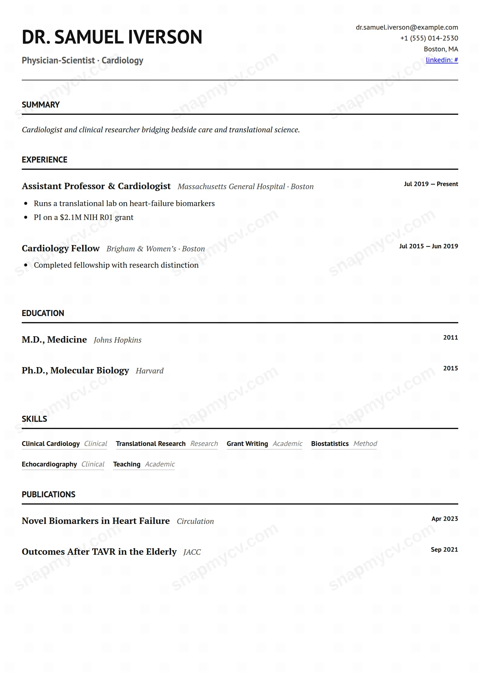
Clean, precise sectioning for the long-form needs of medicine and academia: publications, rotations, grants, and affiliations without clutter.
Best for: medical professionals and academics. Free to fill in, restyle, download as a PDF, or publish at your own SnapMyCV link.
Applicant tracking systems: ATS-friendly. Single-column, standard section headers, parses cleanly in most applicant tracking systems.A template's styling never changes the advice that matters most — lead with achievements, quantify your impact, and tailor the content to each role.
New to writing a CV? Read our step-by-step CV guide and ATS tips, then come back and make this design your own.
Medical Academic is a single column set in PT Serif on plain white, with the body in near-black #111 so it reads like a page torn from a journal rather than a designed CV. The contrast is doing quiet structural work: PT Sans takes over for the uppercase name, the section titles, the dates and the skill tags, so the eye can tell a heading from a sentence without any colour, box or rule getting in the way. A single hairline separates the header, where the name and headline sit left while contact details align right, from the body below.
Every decision here removes competition for the words. There is no sidebar, no accent colour and no icon set, only a 2px black underline beneath each section title and a justified italic summary to open. The publications block is treated as a first-class section with the same rhythm as experience and education, which is the whole point: the layout assumes your bibliography, grants and certifications are the substance, and it stays out of their way so a long, dense record still reads cleanly.
This is built for people whose worth is measured in publications, grants, board certifications, awards and teaching: registrars, research fellows, postdocs, consultants and faculty applicants across medicine and academia. The dedicated publications, certifications and awards sections mean a citation list or a stack of credentials sits where a committee expects it, instead of being crushed into a generic skills line. Its restraint reads as seriousness in a room that distrusts decoration.
It is the wrong choice for a designer, marketer or startup operator who needs a one-page hit of personality, and it is honestly overkill for an early-career applicant with no papers to list, where the empty publications section would only advertise the gap. If your field rewards visual flair or a compact two-column snapshot, the all-serif, monochrome density of this template will read as austere rather than authoritative.
Lead with the justified italic summary as three or four factual lines, not a mission statement, then let the sections stack in the order a committee reads: experience, education, publications, then certifications and awards. Write experience highlights as tight, outcome-led statements, and commit to one citation style for every publication so the column keeps its rhythm, because the moment your citations vary in punctuation and order the monochrome page shows the inconsistency immediately. The PT Sans dates and uppercase titles are your only signposts, so keep entry titles short enough that they do not wrap awkwardly against the right-aligned dates.
The commonest mistake is treating this like a one-pager and cramming, when the design is engineered for length: print rules keep individual entries whole across page breaks, so a bibliography that runs several pages stays clean. Let it breathe. Use full, spelled-out section headings rather than clever labels, keep the skill tags to genuine competencies rather than a keyword dump, and trust the whitespace and the hairline rule to do the formatting instead of adding bold or colour the template deliberately withholds.
It parses well for a styled CV because it is a true single column with conventional spelled-out headings like Experience, Education and Publications, and it uses no sidebar or colour blocks that split reading order. The PT Serif body is standard text, not an image, so scanners read it in the expected top-to-bottom sequence. Still, no styled template is guaranteed, so copy the exported PDF text into a blank document and confirm nothing lands out of order before applying.
Yes, that is exactly the record it is built for. Publications, certifications and awards each get their own first-class section with room for titles, publishers, issuers and dates, and print rules stop individual entries from splitting across a page break, so a bibliography spanning several pages stays readable end to end. The monochrome single column keeps a dense academic CV legible where a two-column or coloured layout would fracture it.


