
LaTeX-style academic layout with Computer Modern feel for ML and AI researchers.
Create a free account to customize and publish this design.
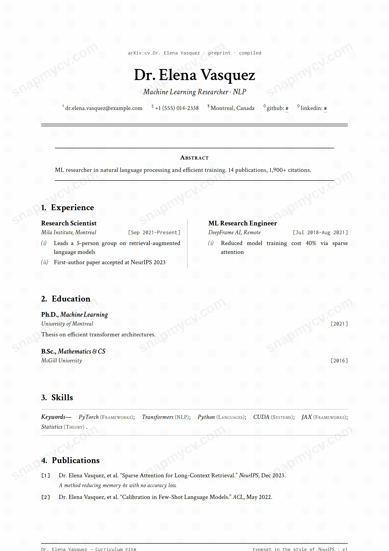
A LaTeX-flavored academic layout with a Computer Modern feel, built for publication lists, benchmarks, and citations. Looks reviewed before it's read.
Best for: ML researchers and applied scientists. Free to fill in, restyle, download as a PDF, or publish at your own SnapMyCV link.
Applicant tracking systems: ATS-friendly. Single-column, standard section headers, parses cleanly in most applicant tracking systems.A template's styling never changes the advice that matters most — lead with achievements, quantify your impact, and tailor the content to each role.
New to writing a CV? Read our step-by-step CV guide and ATS tips, then come back and make this design your own.
The whole layout is an act of typographic mimicry: it reproduces the title block of a machine-learning paper so faithfully that a reviewer recognises the format before they read a word. Your name is centred at 26pt in Crimson Text, a serif with the same bookish contrast you see in a typeset journal, and an italic headline sits under it like a paper's subtitle. Contact details hang off superscript daggers the way author affiliations do beneath a title, and a monospaced Inconsolata eyebrow, stamped with a compiled date, imitates the submission line arXiv prints down the spine of a PDF. A double horizontal rule seals the header exactly where a real preprint hands off to its body.
Every downstream choice extends that fiction rather than decorating it. Sections carry running numbers (1., 2., 3.), the summary is recast as a justified small-caps Abstract fenced by hairline rules, and skills dissolve into an italic, semicolon-separated Keywords line. The palette is deliberately monastic: near-black #0a0a0a ink on soft #fefefe paper, grey only for structural accents, closing on a NeurIPS-style footer. Nothing here is styled for attention. The restraint is the signal, because in this field ornament reads as noise and austerity reads as credibility.
This template is genuinely right for people whose working life already runs on LaTeX: PhD candidates, postdocs, research scientists and applied ML or statistics engineers who need a publication record to sit at the centre of the page rather than in a footnote. The bracketed reference entries for publications, awards and certifications ([1], [A1], [C1]) are a native idiom to any hiring committee or admissions panel, and the numbered sections quietly signal that you speak the format. If your value is measured in papers, methods and results, the design carries that weight without apology.
Be honest about who should walk away. If you have no papers, preprints or workshop entries, the Publications machinery sits idle and the whole conceit looks borrowed. Designers, marketers, sales and most corporate applicants will find the dense justified serif and academic ceremony actively working against them, and recruiters outside research often read the arXiv styling as eccentric rather than fluent. Industry ML roles that want a punchy one-pager may also find the reference formality slows a fast skim. This is a specialist instrument, not a general resume.
Feed each structural feature the content it was designed for. Write the summary as a real abstract, three or four sentences of contribution and result rather than a mission-statement slogan, because the small-caps hairline framing exposes anything vague. Load the Keywords line with genuine technical terms (reinforcement learning; distributed training; variational inference) and let it stand in for a skills grid. Experience and projects flow into two serif columns split by a faint vertical rule, so keep bullets tight and method-led; a bullet that wraps across many lines fractures the column rhythm and the justified text opens ugly rivers of white space. Put publications, awards and certifications where the bracketed numbering rewards them, and let that section grow as your record does.
The recurring mistakes are all mistakes of excess. People pad the abstract, dump a soft-skills list into Keywords, or run experience to two crowded pages when the dense body already reads long. Trim ruthlessly: one disciplined page beats two. Avoid decorative reordering that fights the numbered sections, and do not try to force non-academic content, portfolios or brand logos into a frame built for citations. The layout is at its best when the sections are short, the claims are concrete, and every line earns the paper it sits on.
The headings are conventional and the reading order is logical, which helps, but this is a partly two-column design with justified serif text and bracketed reference numbering, and column layouts are where automated parsers most often scramble order. Before you apply, run the plain-text test: copy the rendered CV into a blank document and confirm every role, date and publication survives in sensible sequence. For heavily automated portals, keep a single-column plain version to submit alongside it.
Extremely well, because it is essentially monochrome already. The #0a0a0a ink on #fefefe paper carries no colour that greyscale printing could flatten, and the grey structural accents, hairline rules and reference brackets were chosen to read on plain paper. It is one of the few templates that looks identical whether printed in colour or black and white, which suits the conference-handout and committee-photocopy reality of academic hiring.


