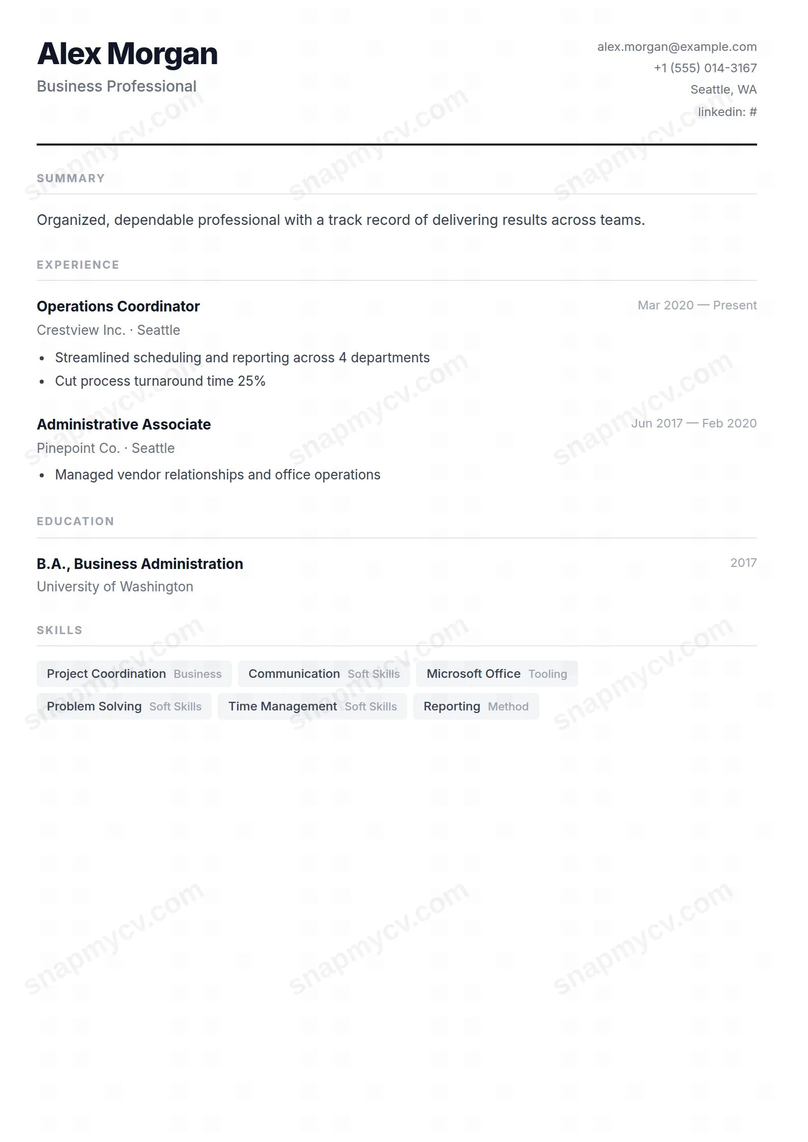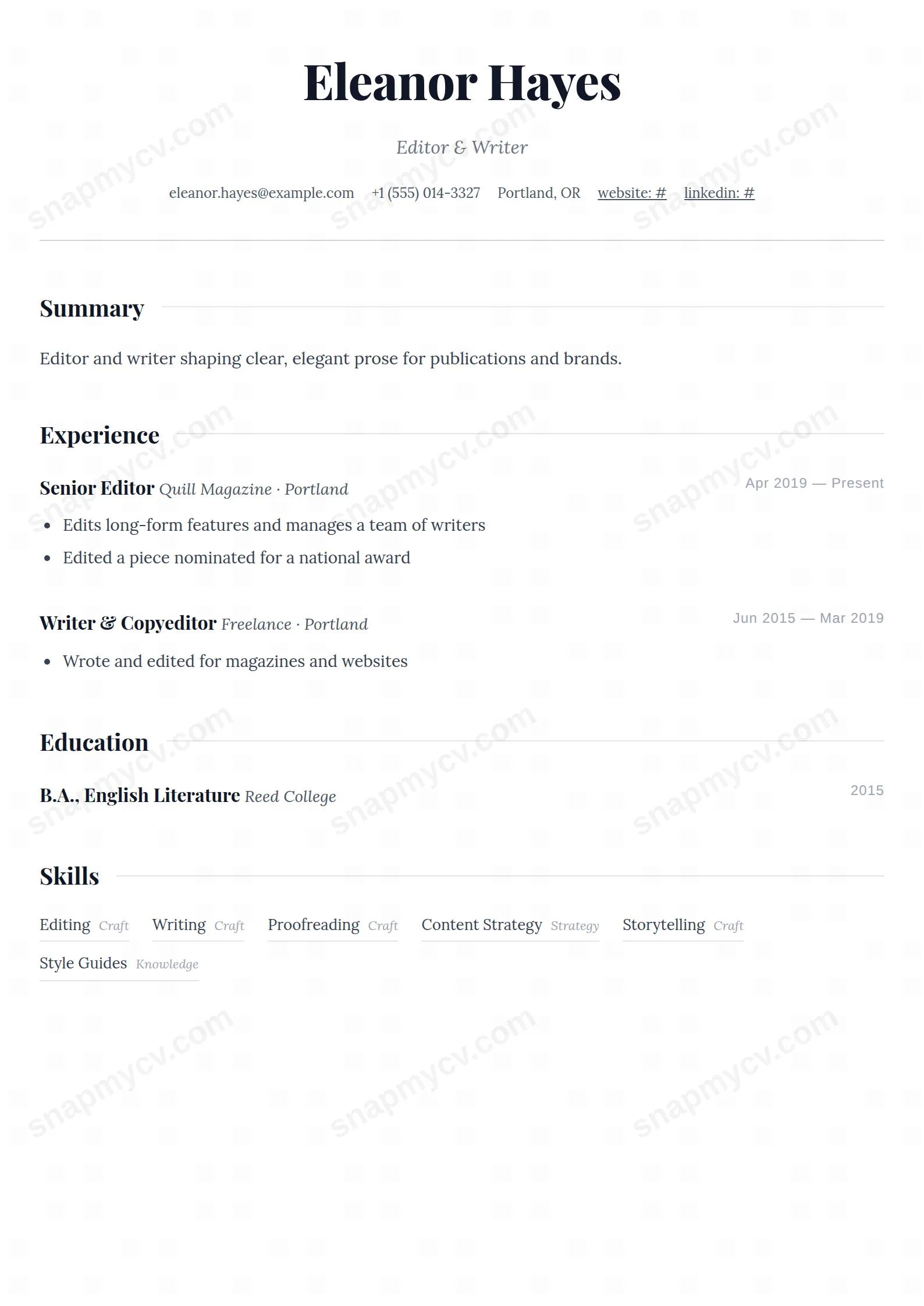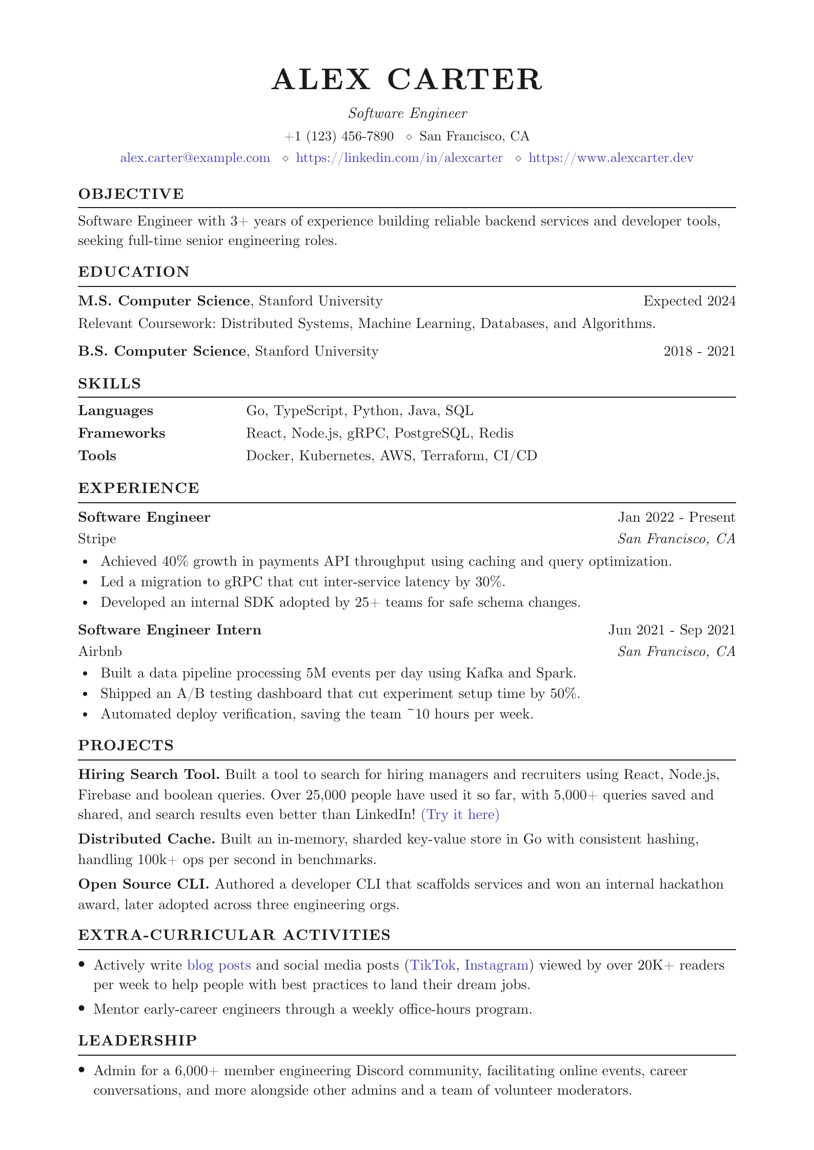
iOS/Android inspired template with rounded chips for mobile developers.
Create a free account to customize and publish this design.
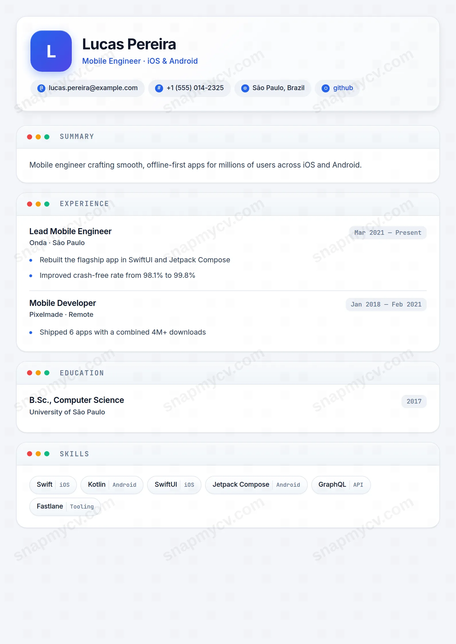
Rounded chips and app-store cleanliness borrowed from the platforms you ship to. A mobile developer's CV that feels native on the first scroll.
Best for: iOS, Android, and cross-platform mobile developers. Free to fill in, restyle, download as a PDF, or publish at your own SnapMyCV link.
Applicant tracking systems: Light styling. Mostly parseable but uses sidebars, columns or visual elements that may confuse stricter ATS.A template's styling never changes the advice that matters most — lead with achievements, quantify your impact, and tailor the content to each role.
New to writing a CV? Read our step-by-step CV guide and ATS tips, then come back and make this design your own.
The design starts from one deliberate metaphor: the phone home screen. Your name sits in Inter beside a rounded app icon that carries your initial in an electric-blue gradient running from #2563eb into indigo, with the headline picked out in a deeper #1d4ed8. Contact details are not a grey run-on line but soft pill chips, each fronted by a small circular glyph badge, so the top of the CV reads like a launch screen rather than a letterhead. That choice does real work. It signals, before a word is read, that you build for screens.
Below the header the page becomes a single-column stack of white app-cards floating on a cool grey #f4f6f9 canvas, each with gentle shadows and generous 18px rounded corners. Every card wears a macOS-style title bar with red, amber and green traffic-light dots, and its heading is set in uppercase JetBrains Mono. That monospaced accent is the spine of the whole system: it reappears on date stamps, skill tags, tech chips and language levels, so numbers and keywords line up with a precise, build-versioned rhythm while Inter keeps the body text warm and readable. The contrast between friendly rounded cards and clinical monospace labels is what gives the template its product-team personality.
Mobile Minimal is genuinely right for people whose work lives on a screen: mobile and front-end engineers, product managers, UX and UI designers, growth marketers and indie makers. The card-per-section rhythm and monospace tech chips flatter a stack-heavy story, and the app-icon header quietly proves you understand the aesthetic of the products you would be hired to build. If your best evidence is shipped features and the technologies behind them, this layout puts that language front and centre.
Be honest with yourself if you sit outside that world. The traffic-light dots, gradient icon and playful chips read as costume, not credential, in law, banking, medicine, academia or senior government roles, where a reviewer expects restraint. It is also a poor fit if your career is long and text-dense: the cards want brevity, and a decade of detailed bullet points will bloat them past the clean single-screen feel the design is chasing. Choose it to look like a maker, not to archive a CV.
Treat each card as a screen with a job to do rather than a container to fill. Keep experience entries tight, a few sharp bullets per role, so the card stays glanceable and its JetBrains Mono date stamp reads at once. Push your strongest material into Projects, where technologies render as monospace chips and live links belong: this is the section the template is optimised to show off, so name real stacks and shipped work here rather than burying them in prose. Skills appear as badges with an optional category note, so group them deliberately by theme instead of dumping one long alphabetical row.
The common mistake is fighting the structure: cramming paragraphs into cards, repeating the same skill across chips, tags and body text, or writing headlines that spill past a line and break the icon-and-name balance. Let whitespace between cards breathe, aim for a header plus four to six cards that a reader can thumb through like an app, and remember the monospace accents only look intentional when the content under them is short. In print the shadows drop away cleanly, so a quick contrast check keeps the blue header and grey canvas legible on paper.
The dots and gradient icon are decorative CSS, not text, so a parser simply ignores them and reads the single-column stack of headings and body content top to bottom. The bigger thing to check is the pill chips and monospace tags: before submitting to a strict system, paste the rendered CV into a blank document and confirm every role, date and skill still appears in a sensible order as plain text.
It survives better than most coloured templates because the design leans on structure, not just hue. The #2563eb-to-indigo gradient and #1d4ed8 headline flatten to legible dark greys, the #f4f6f9 canvas stays a pale backdrop against white cards, and the card shadows drop away cleanly on paper so nothing muddies. The monospace labels carry the hierarchy on their own, so a greyscale print still parses clearly.