
Bold two-column layout with sidebar for experienced professionals.
Create a free account to customize and publish this design.
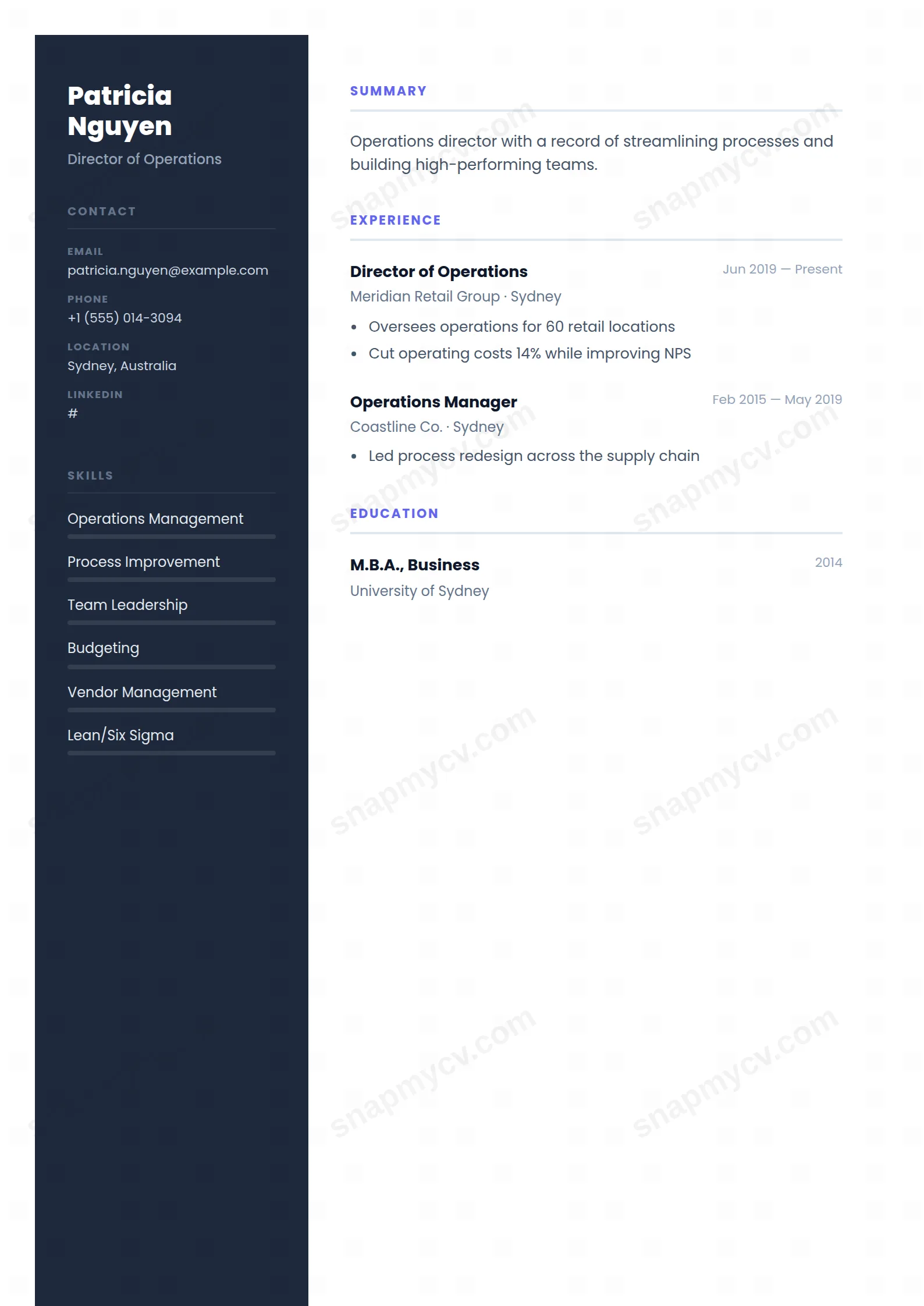
A bold two-column layout with a working sidebar: credentials and skills at hand, a clean main column for a substantial career. Modern weight without trend-chasing.
Best for: experienced professionals and team leads. Free to fill in, restyle, download as a PDF, or publish at your own SnapMyCV link.
Applicant tracking systems: Light styling. Mostly parseable but uses sidebars, columns or visual elements that may confuse stricter ATS.A template's styling never changes the advice that matters most — lead with achievements, quantify your impact, and tailor the content to each role.
New to writing a CV? Read our step-by-step CV guide and ATS tips, then come back and make this design your own.
Modern Executive is built on restraint with one deliberate anchor: a deep slate-blue sidebar (#1e293b) painted as an unbroken vertical band across a fixed 32/68 grid. That dark column is the design's centre of gravity. It holds a circular avatar and your name set in heavy 800-weight Poppins, so a reader registers a person and a position before they read a single line of history. The white main column stays deliberately quiet, which lets the slate carry the authority instead of forcing typography or rules to do it.
Colour is rationed to a single indigo (#6366f1), and that discipline is the point. Indigo appears only twice: as the skill-strength bars on the dark side and as the uppercase, letter-spaced section titles heading each block in the white column. Poppins runs end to end for one consistent voice, and dates sit in pale slate to the right of every entry so the eye tracks the role first and the timeline second. The grid is engineered so both columns fragment cleanly across printed A4 pages with the dark band held intact, which is where most two-column layouts fall apart.
This is a template for directors, senior managers, consultants and executives who need a contemporary, designed look without surrendering gravitas. The slate sidebar gathers contact details, rated skills, languages and certifications into one column, which frees the white side for a tight summary and a results-led experience history. If your value is judgement, scope and outcomes rather than a long tool list, the calm hierarchy flatters you.
Be honest about where it works against you. If you are early-career with thin history, the wide two-column frame will look empty and the skill bars will expose gaps. If you are applying through aggressive automated pipelines that flatten layouts, the coloured sidebar and graphical bars are a liability. And if your field expects a plain single-column academic CV, this design reads as too styled. Pick it for presence, not for maximum parsing safety.
Treat the slate sidebar as your fixed reference panel and the white column as your narrative. Contact lines, languages, certifications and rated skills belong on the dark side, but reserve the indigo skill bars for genuinely strong competencies only, because the levels read at a glance and a wall of near-full bars reads as over-claiming. On the white side, keep the summary to three or four sharp lines under its uppercase title, then lead every experience bullet with an outcome or a number so the quiet layout has something concrete to frame.
The common mistake is imbalance: people stuff the sidebar with fifteen skills and leave the main column short, or the reverse, and the 32/68 grid makes the emptier side obvious. Aim for four to seven rated skills, two or three roles with real depth, and let education, projects, awards, publications and volunteering slot into the same restrained format below. Because the columns break across A4 pages independently, end each experience entry as a complete thought rather than trailing a single orphaned bullet onto the next page.
The slate-blue band (#1e293b) drops to a solid dark grey and still frames the page cleanly, so structure survives. The indigo accent is where you lose information: the skill bars turn into mid-grey blocks whose fill levels get harder to read, and the uppercase section titles lose their colour cue and rely on weight and letter-spacing alone. It stays legible, but the visual hierarchy is softer than in colour.
Yes, within reason. The 32/68 grid and independent column page-breaks are built to flow across multiple A4 pages with the dark band intact, so a long senior history fits without cramping. The risk is not space but density: with that much to say, keep the sidebar to four to seven rated skills and trim older roles to a few outcome-led lines, or the white column turns into a dense block that undercuts the calm hierarchy the design depends on.


