
Raw, bold neo-brutalist aesthetic with strong visual impact.
Create a free account to customize and publish this design.
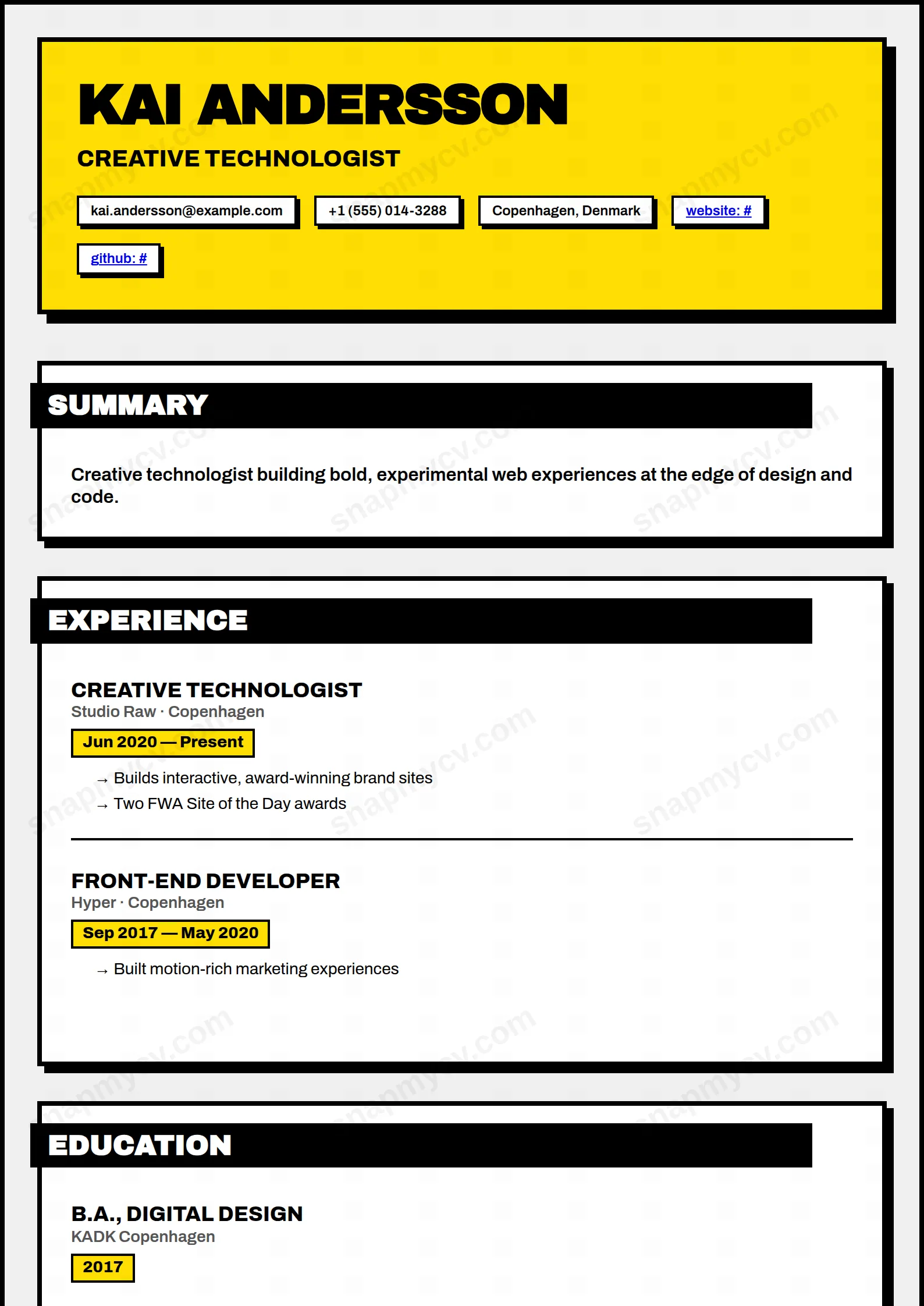
Raw borders, hard shadows, and unapologetic type. A deliberate pattern-interrupt of a CV for industries where standing out is the brief.
Best for: creative technologists and design-forward applicants. Free to fill in, restyle, download as a PDF, or publish at your own SnapMyCV link.
Applicant tracking systems: Visual only. Designed for human readers — heavy decoration, dark backgrounds or column layouts that often break ATS parsing.A template's styling never changes the advice that matters most — lead with achievements, quantify your impact, and tailor the content to each role.
New to writing a CV? Read our step-by-step CV guide and ATS tips, then come back and make this design your own.
Neo-Brutalist is a single-column layout that refuses to hide its seams. Every block is wrapped in a 4px solid black border with a chunky offset drop-shadow stacked underneath, so each section reads as a physical card pinned to an off-white #f0f0f0 board rather than text flowing down a page. That card-on-a-board construction is the whole design language here. It borrows the raw, unpolished aesthetic of brutalist web design, where exposed structure is the styling, and it stakes everything on contrast instead of decoration.
The typography is chosen to hit hard rather than whisper. Your name sits in Archivo Black, uppercase at 48px with tight negative letter-spacing across a slab of vibrant yellow #ffde03, so the header lands like a poster. Body copy drops to regular Archivo for legibility, section titles invert to white-on-black tabs that jut left out of their cards for a deliberately pasted-on, misaligned feel, and small details carry the theme through: skills become solid black badges with yellow category accents, dates sit in bordered yellow chips, and bullets are replaced by bold arrows. The hierarchy is loud on purpose, and the black-yellow-white palette keeps that loudness disciplined instead of chaotic.
This template is built for people who are allowed to be loud. Designers, art directors, brand and product people, front-end developers, and illustrators applying to studios, agencies, and startups will find that the yellow slab and offset cards signal confidence and taste before a single line is read. In creative hiring, a CV that looks designed is part of the pitch, and Neo-Brutalist makes that argument immediately.
It is an honest mismatch for conservative fields. Law, banking, government, medicine, and academia expect restraint, and the high-contrast yellow, the misaligned black tabs, and the badge styling will read as noise rather than credibility in those rooms. Senior executives after a quiet, authoritative document should also look elsewhere, because the poster-loud header competes with the gravitas they usually want to project.
Because the design shouts, your words should stay clean. Keep your headline to a single sharp line so it fills the yellow header band without wrapping and breaking the poster effect. Lead each role with a strong verb and a number, and let the bold arrow bullets carry short, scannable wins rather than long paragraphs, since dense text fights the card structure and the black borders start to feel heavy. Aim for three to five arrow bullets per role, each one line where possible.
Treat the black skill badges as a curated shortlist, not a dump. Ten precise tags with clear yellow category accents look intentional; thirty crowd the layout and drown the contrast that makes the style work. The most common mistake is overfilling: too many roles, too much summary text, and too many badges turn the deliberate whitespace between cards into congestion. Give each card room to breathe, keep the summary to two or three lines, and trust the borders and shadows to structure the page for you.
The underlying structure is a single column with standard section headings and no true sidebar, which parses cleanly in most cases. The risk is cosmetic: the inverted white-on-black title tabs and yellow date chips are visual styling, so before submitting to a strict ATS, paste the rendered CV into a plain-text editor and confirm every role, date, and arrow bullet still appears in the correct order.
It survives better than most colour-heavy designs because the whole system is built on contrast rather than hue. The #ffde03 yellow drops to a light grey and the black borders, tabs, and badges stay strong, so the card structure and hierarchy remain readable. You lose the punch of the yellow header, but nothing becomes illegible, unlike templates that rely on mid-tone colour to separate sections.


