
Warm teal and coral with rounded sections for nurses.
Create a free account to customize and publish this design.
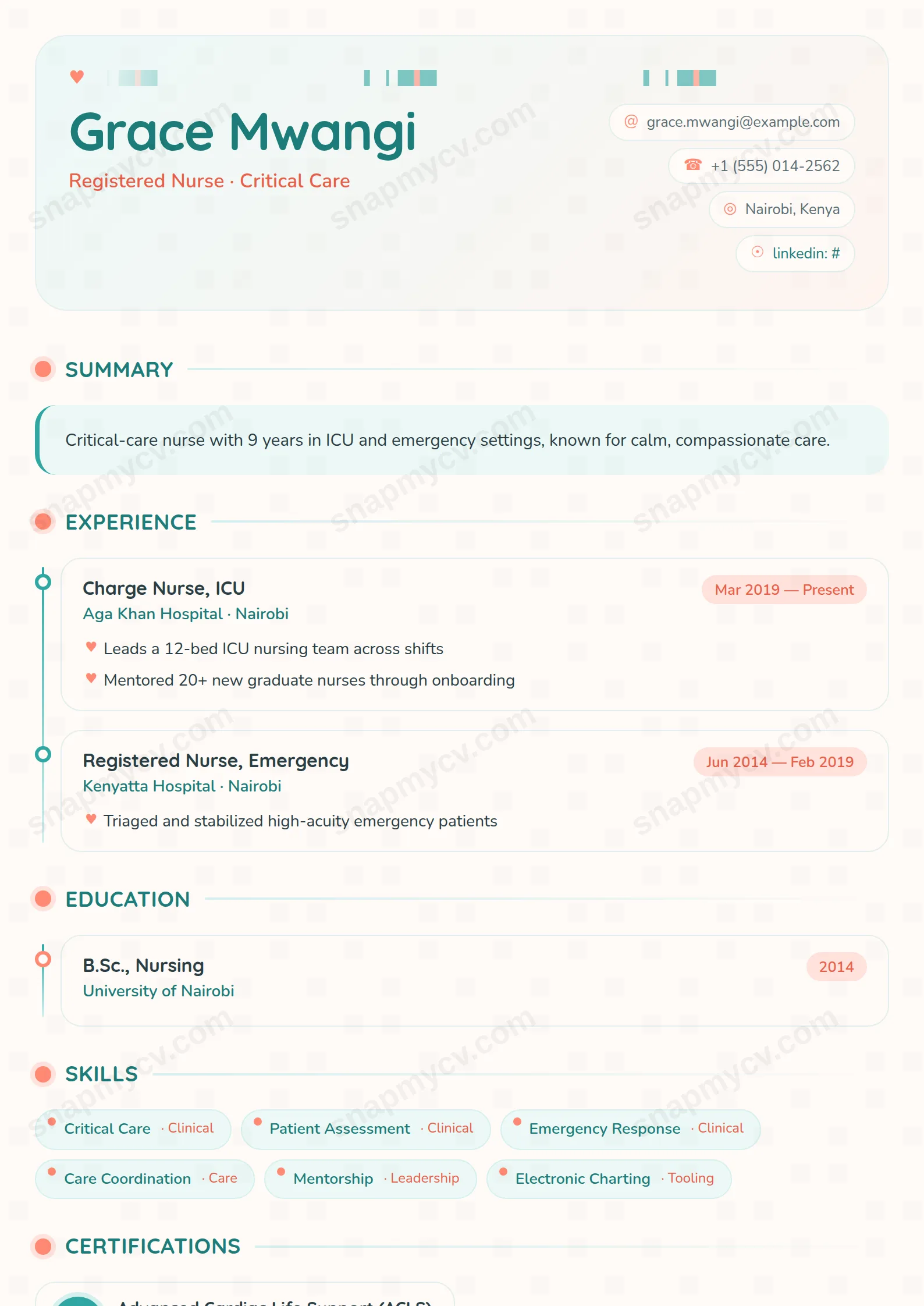
Warm teal and coral with rounded sections — clinical credentials presented with the bedside manner the job itself demands. Certifications and rotations stay easy to verify at a glance.
Best for: nurses and allied health professionals. Free to fill in, restyle, download as a PDF, or publish at your own SnapMyCV link.
Applicant tracking systems: ATS-friendly. Single-column, standard section headers, parses cleanly in most applicant tracking systems.A template's styling never changes the advice that matters most — lead with achievements, quantify your impact, and tailor the content to each role.
New to writing a CV? Read our step-by-step CV guide and ATS tips, then come back and make this design your own.
Nursing Care makes one clear bet: warmth signals competence in caring work, so the design leads with feeling before facts. The header runs a tiny ECG line stitched in teal and coral next to a coral heart, floated on a teal-to-cream gradient with deeply rounded 28px corners. Your name is set large in Quicksand, a rounded geometric sans, in deep teal #1c7d7a, with the headline picked out in coral #e85f49 and contact details tucked into pill-shaped chips down the right edge. The controlling colours, teal #2fa7a2, coral #ff8a73, and a warm off-white #fffaf7, are chosen to read as a hospital that actually likes its patients.
The body deliberately stays quieter than the header. It is a single column, and each section is announced by a coral dot in a soft halo above an uppercase Quicksand title that trails off into a fading rule, so the eye always knows where a block begins. Running copy is humanist Nunito at a comfortable 11pt, roomy enough to breathe on a ward-manager's screen. The rounded cards, heart-shaped bullets and generous whitespace do the emotional work; the timeline and consistent left alignment keep it from tipping into cute. That tension, soft shapes over disciplined structure, is the whole point.
This is built for healthcare and caring professions: registered nurses, midwives, healthcare assistants, carers, paramedics and allied health staff who need to look warm without looking unqualified. The round RN badge on certifications and the clinical pulse motif lean specifically nursing, though the people-centred structure also fits social care, early-years and support work. It reads as approachable and organised, which is the exact register ward managers and care recruiters respond to.
Be honest about where it works against you. If you are chasing a buttoned-up corporate, legal, finance or senior-management post, the coral hearts, tinted language cards and teal pills will feel too soft and undersell your seniority. It also assumes you have real credentials to show; the RN badge and certifications panel look sparse if you leave them thin. Anyone in a field with no registrations, licences or clinical training to display is fighting the layout rather than using it.
Front-load the certifications section, because the round RN badges are the strongest visual anchor after the header. Registration numbers, BLS or ALS, safeguarding and mandatory training all earn their place there, and four to six entries fill the badges without crowding them. Keep skills concrete, medication administration, wound care, patient assessment, so the teal pills stay short and scannable; long phrases wrap awkwardly and break the tidy pill rhythm. Let the teal timeline carry placements and rotations in strict date order, and treat the summary card up top as your bedside manner in writing: three or four lines, specific and human, never a generic objective.
The common mistake with this style is fighting its softness by overloading it. The heart bullets and rounded cards look calm with two to four bullets per role and cramped at seven, so edit hard. Reserve the coral-bordered panels for genuine awards and publications rather than padding them, and use the three-up language grid only if you truly have languages to list, since one lonely card looks unbalanced. Aim for a single well-filled page: this template rewards a focused mid-career nurse far more than an exhaustive dump of every study day you have attended.
The teal #2fa7a2 and coral #ff8a73 sit at similar mid-tone brightness, so in greyscale they can flatten into comparable greys and the heart bullets and RN badges lose some of their pop. The layout still parses because hierarchy comes mostly from the Quicksand size and weight changes and the timeline structure, not from colour alone. Names, dates and section titles stay clearly legible in black and white, which is what a printed screening copy needs.
The headings are standard and the underlying HTML reads top to bottom in a logical order, so most trackers cope with it. Still, this is a card, pill and badge design, so before submitting through a hospital trust portal run the plain-text test: paste the rendered CV into a blank document and confirm every role, date and certification survives in sequence. If a parser flattens the pills, your skills become a plain list rather than disappearing, which is the safe failure mode.


