
Evidence-list and file-folder aesthetic for paralegals.
Create a free account to customize and publish this design.
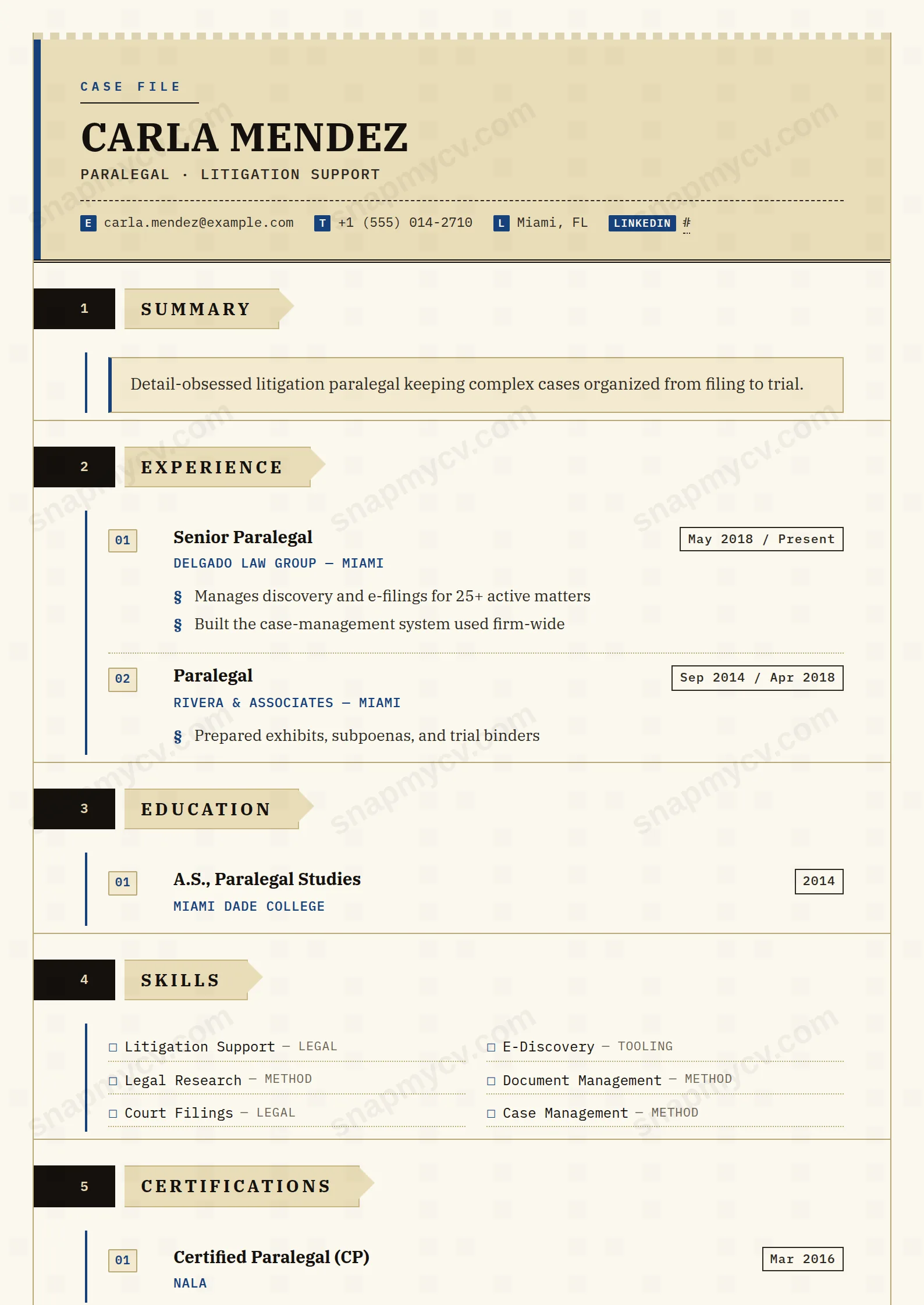
File-folder tabs and an evidence-list aesthetic organize matters, filings, and research skills with courtroom tidiness. Precision is the design language.
Best for: paralegals and legal support professionals. Free to fill in, restyle, download as a PDF, or publish at your own SnapMyCV link.
Applicant tracking systems: ATS-friendly. Single-column, standard section headers, parses cleanly in most applicant tracking systems.A template's styling never changes the advice that matters most — lead with achievements, quantify your impact, and tailor the content to each role.
New to writing a CV? Read our step-by-step CV guide and ATS tips, then come back and make this design your own.
Every choice in Paralegal Precise borrows from how a legal folder is actually kept. The palette is deliberately archival: a manila-tan banner (#e9dcb8) over cream paper (#fbf8ef), ink-black body text, and a single navy rule (#15407a) threaded through as the only accent. There is no second colour and no gradient, because the design wants to read as a trusted document rather than a brochure. The header earns its authority through structure instead: a double-rule border, a blue edge running down the left, and a monospaced CASE FILE stamp that sets the tone before a single line of experience is read.
The typography splits labour cleanly. Your name and section titles sit in uppercase IBM Plex Serif for weight and formality, while contact keys, dates and labels drop into IBM Plex Mono so anything resembling a reference number lines up like a docket entry. Hierarchy comes from the numbered folder tabs and angled file-folder edges that open each section, and from the EXH. 01, EXH. 02 exhibit numbering on every role. Whitespace is tight and ruled rather than airy, which reinforces the impression of order and document control without leaning on flourish.
This template is built for people whose value is accuracy and document control: paralegals, legal assistants, law clerks, litigation-support and e-discovery staff, contract administrators and compliance professionals. The exhibit-and-case-file metaphor is not decoration, it quietly signals to a hiring partner that you understand how files are indexed, kept and trusted. It also suits regulated-adjacent roles like records management or corporate governance, where a restrained, procedural look reads as competence.
Be honest about where it works against you. If you are pursuing design, marketing, product or any field that rewards visible personality, the mono labels and folder-tab framing will feel stiff and off-brand. Senior lawyers aiming for partner-track or general-counsel roles may also find the literal case-file styling reads as junior rather than commanding. And because the whole system hinges on legal vocabulary, using it for an unrelated field makes the EXH. stamps look like an affectation instead of a signal.
Write to the structure the layout already imposes. Lead every exhibit with a strong verb and let the monospace date chips carry the chronology, so your bullets stay free to report outcomes: caseloads handled, filings prepared, review turnaround times, error rates. Bullets are flagged with the legal section sign, which looks best in short factual lines rather than paragraphs, so keep each to a single clause. Route your tools into the two-column checkbox grid, that is where case-management and document-review software (Relativity, Clio, iManage and similar) belong, not buried in prose.
The most common mistake here is overfilling. Because entries are numbered as exhibits, a long list draws the eye to the count, so cap experience at the four or five roles that matter and let older positions collapse to a line. Keep the summary to two or three sentences under the header, since the banner and double-rule border already do the work of introduction. Resist adding a second accent colour in your wording or emphasis; the design's credibility comes from the single navy rule, and anything louder undoes the case-file discipline that makes it convincing.
No. The EXH. 01 numbering, section-sign bullets and folder tabs are rendered in CSS, not written into the text, so a parser reads a clean single-column document with conventional headings underneath. The one real risk is the coloured, panelled styling, so copy the rendered CV into a plain-text document and confirm every role, date and skill survives in the right order before you apply.
It survives better than most coloured templates because contrast, not hue, carries the design. The ink-black text on cream paper stays fully legible, and the navy rule (#15407a) drops to a dark grey line that still separates sections cleanly. The manila-tan banner (#e9dcb8) fades to a pale grey block, so the header looks quieter in black and white, but nothing important is lost.


